Welcome one and all, to another episode of Box Art Brawl!
Right then... Before we get cracking with this week's brawl, let's see how we got on last time, shall we?
We looked at the lovely Inazuma Eleven Strikers for the Wii, pitting Japan against Europe in a classic duel. It was a relatively close contest, but the European cover managed to take the crown with 60% of the vote. Well done!
This time, to acknowledge the launch of Mario vs. Donkey Kong for the Switch, we're going to check out the original game's direct sequel on Nintendo DS: Mario vs. Donkey Kong 2: March of the Minis. Interestingly, the game launched in the US first in September 2006 before making its way to other regions in 2007, starting with Australia in January.
It's another duel this week, with North America and Europe teaming up to take on Japan. So, everybody ready? Let's go then!
Be sure to cast your votes in the poll below; but first, let's check out the box art designs themselves.
North America / Europe
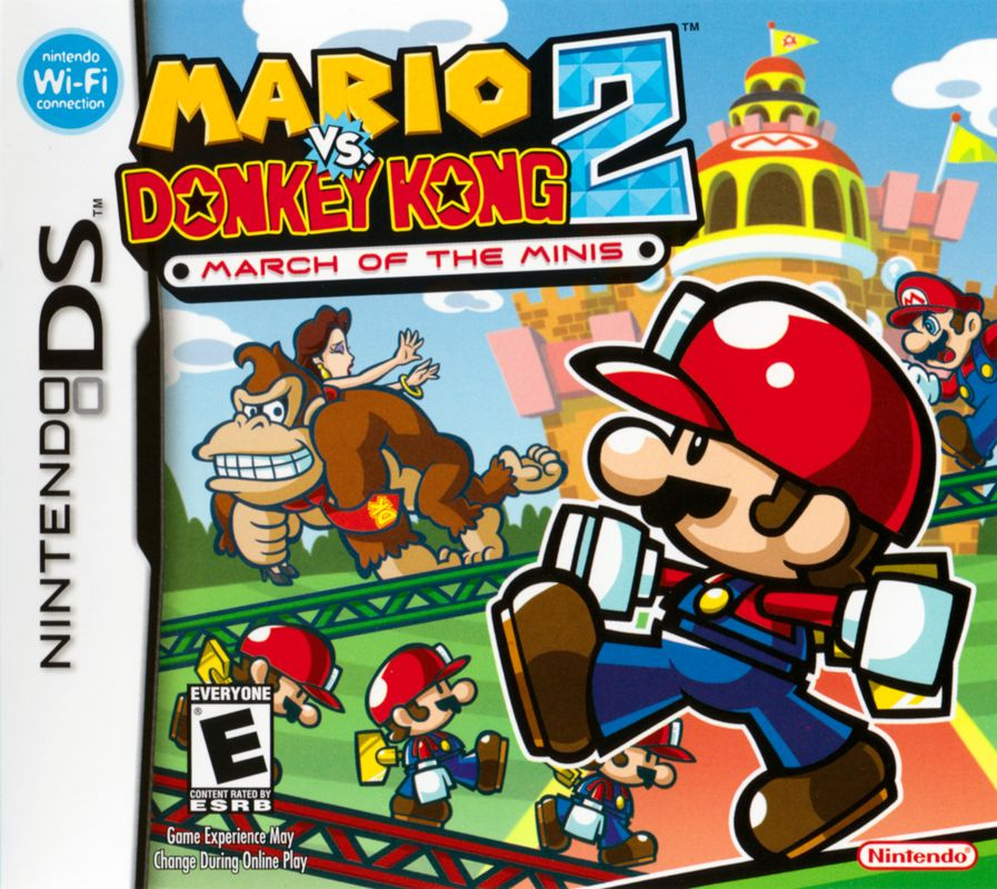
The Western box art is a great example of utilising both foreground and background. You've got one of the Minis right up in your face on the right-hand side, with two more in the immediate background. Meanwhile, all the way to the back, you can see Mario chasing after Donkey Kong and Pauline. There's a lot going on, but it doesn't feel busy. All in all, a great piece of artwork.
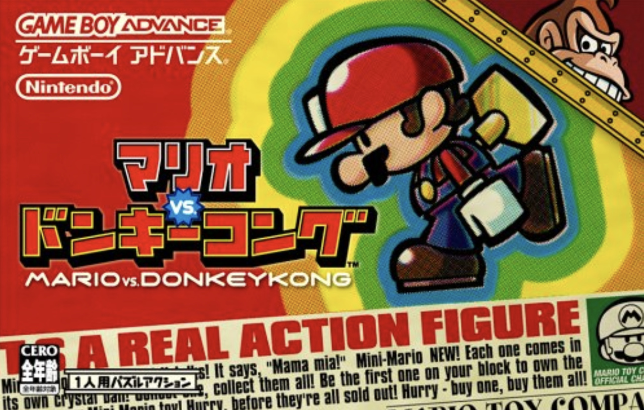
Japan
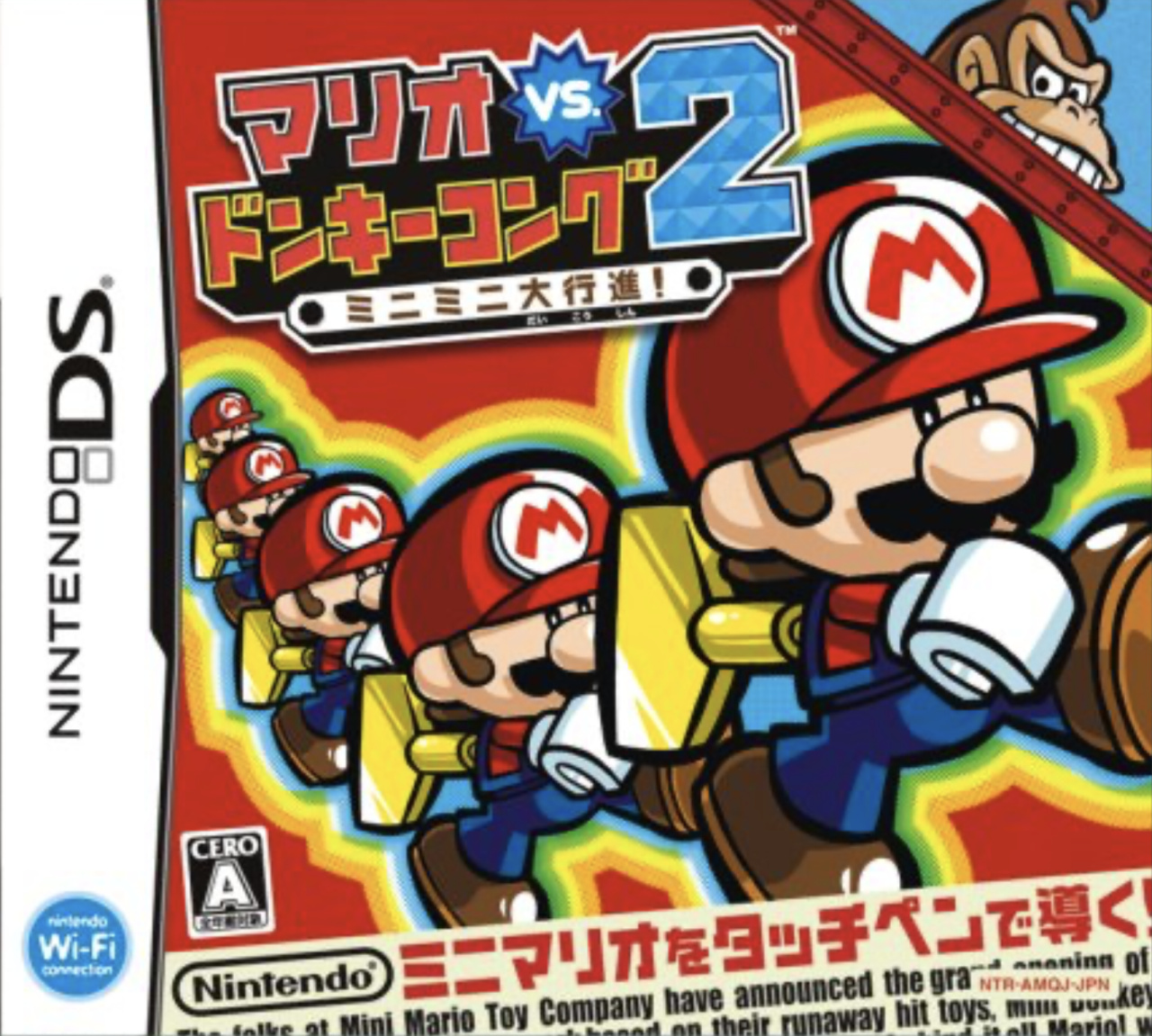
Japan's design, meanwhile, takes a few cues from the first game, presenting a more abstract piece of art that focuses solely on the Minis (with Donkey Kong poking his head out in the corner). It definitely captures the whole 'Marching' theme of the title and is incredibly eye-catching. Can it beat the Western design though..? Let's see.
Which region got the best Mario vs. Donkey Kong 2: March of the Minis box art? (1,816 votes)
- North America / Europe
- Japan
Thanks for voting! We'll see you next time for another round of the Box Art Brawl.


Comments 28
I can see where the Japanese covers are coming from with their literal advertisement - not only this one, but also the one for the first game as we've seen in a previous Box Art Brawl (although I'd say it worked better there thanks to the story of that game and the larger box) -, but I'm definitely voting for North America/Europe as Pauline being back is not only a major plot point of this game specifically, but also notable for the Mario series as a whole!
No contest. The Western version is superior.
Easy choice for me this week; Japan's cover being framed like an in-universe ad for the toys is such a cute and clever way to show what the game is about and I'm immensely charmed by it as a result. The NA/EU one is definitely a bit more visually interesting, but I'll always appreciate when boxart is used in creative ways
Man, Japan really got shafted on these covers. It's not quite as stark as the first MvDK, but still, I don't quite get the marketing on these sometimes. I'd love to talk to the person who selects these, like that gba Mario golf cover that's just a bunch of dudes.
Japanese version looks like it was made in 20 minutes
@Fizza I really think you're giving them credit they didn't earn. It's definitely not supposed to be a toy ad, that would be very cool though.
NA/EU definitely. Japan loses by a large margin for me this time around. Not because theirs is bad, the western one is just that much better!
The Japanese one is like:
"Whoops, this is a Mario VS. Donkey Kong Game and DK is not even on the Box Art. Screw it, just throw him in the upright Corner and make him barely noticable"
The US/EU Box Art shows much better, what the Game is about.
Loved this game. The Euro NA one for me easily.
NA/EU because it very clearly communicates what the game actually is. Plus it just looks much better!
@Poodlestargenerica It is though... the text at the bottom of the box art is advertising the Mario Toy Company grand opening and products that are the central focus of the plot.
Neither is bad, but the NA/EU version gets my vote. It's more of a visual showcase of what occurs in the game. Japan's abstract approach is fine, the other cover is just better IMO.
The North America/European one is leagues better.
@Fizza I am with you.
I don’t mind being in the minority, especially if I have a strong favorite.
Both have something going for them. Still undecided on which one to vote. It's important to note that this game marks the shift in gameplay that we have to this day (or at least as far as 2015 when we had the latest release in Mario vs. Donkey Kong: Tipping Stars), instead of following the classic Donkey Kong formula, it goes for something more Lemmings-like and focuses on the Minis.
Cartridge art.
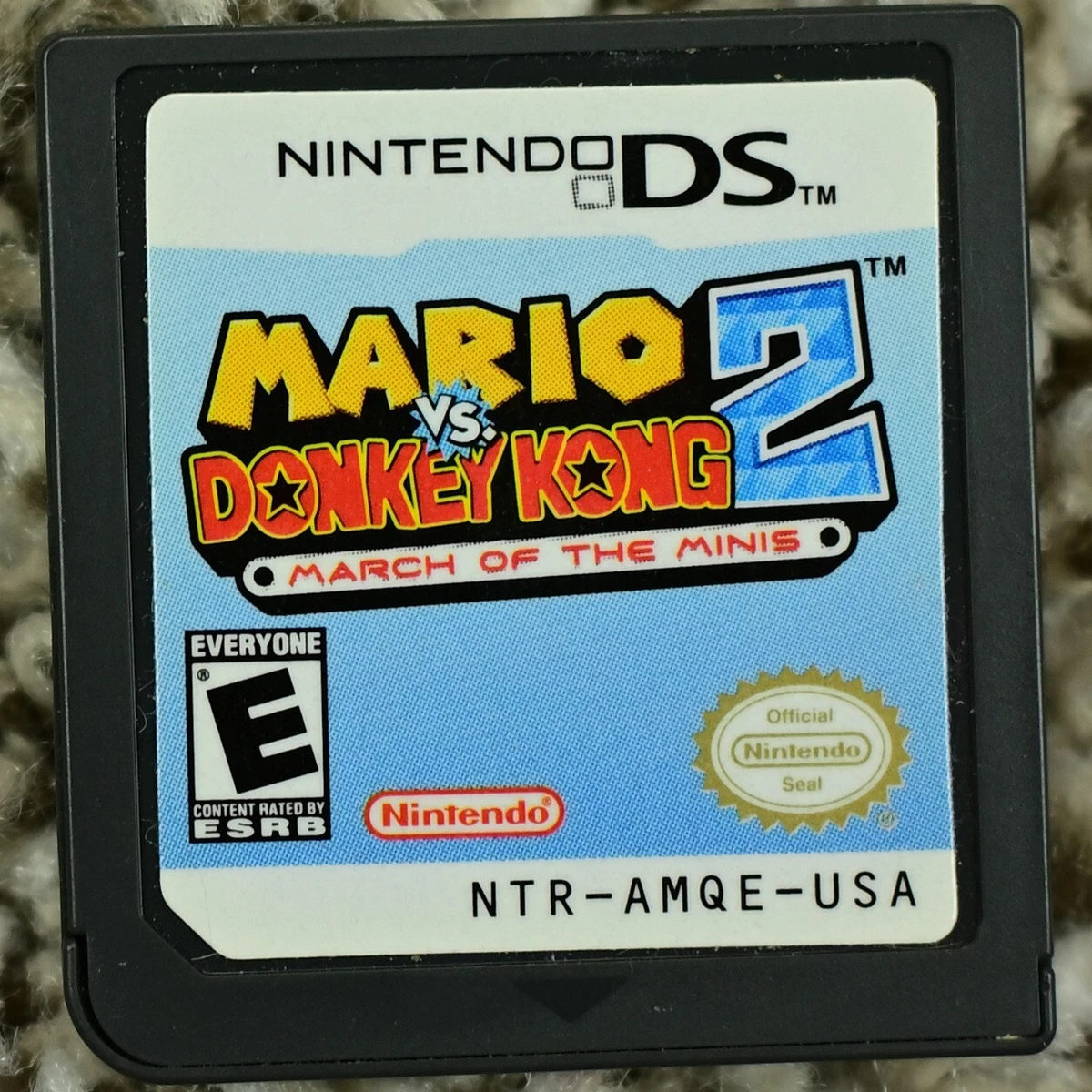
Notth America (the European one is similar, only with different logos)
Japan, whose title translates to Mario vs. Donkey Kong 2: The Great Mini Mini March!

As my mother taught me, always follow the crowd no matter what, so I'm voting for the western cover. Also, I think it's a lot better. The action in the background is really well done and the concept is just well executed. The concept for the Japanese one is more interesting in theory than the execution of it with the flat reddish background and that the minis are identically posed.
@HammerGalladeBro I do really like the Japanese cartridge!
I voted for the North American/European box art.
The Japanese one is very lame. Looks like packaging for the toys.
Box Art Brawls Current Total:
Europe: 72
Japan: 69
North America: 82
Australia and New Zealand: 1
The NA image captures the "Mario vs Donkey Kong" AND the "March of the Minis" more concisely for me, not that JP was bad though.
@TCKuma It is not in the style of an ad, it just says some of the text from the game, and in English for some reason. None of the other text is in any way trying to advertise the product either.
@CoastersPaul both the cartridge and the box art are in line with the Japanese version of Mario vs. Donkey Kong.
You can check the link and my comment on the Box Art Brawl of Mario vs. Donkey Kong, but I'll save you the search.

The text on both box arts is what the announcer says in the openings.
While the convetions of using red are ignored in Mini-Land Mayhem!, they come back in the boxed versions of Tipping Stars. Yes, in Japan they had physical versions of Tipping Stars that included a download code for the other version. In other words, you buy the 3DS version, it came with a code for the Wii U version and vice-versa.
Meanwhile, Europe got Code-In-Box versions (as well as a Code-in-Box combo of Minis March Again! and Minis on the Move) and North America got the game digital only.
Theres a clear winner here......
Again, why? Anyways, EUNA wins, clearly.
This one was so easy for me. The North American/European variant is far superior for me. Donkey Kong is a much more prominent figure in that one.
Japan's not bad by any stretch, but I like how there's more going on in the Western artwork, and that it instantly gives you a taste of the sort of game that it is.
With this one I gotta be a little bias since I owned it as a kid and go with NA/EU. Not to mention it is just straight better I mean just look at all that’s going on. Pauline and Mario and DK and the minis it’s just beautiful.
Leave A Comment
Hold on there, you need to login to post a comment...