It's time to judge some game covers as we dive into another edition of Box Art Brawl!
Last week we took it to the fairway as we matched up two covers from Mario Golf: Advance Tour. Reader, it was a washout. The North American / European cover took the competition by a country mile, snatching up 81% of the vote and leaving the Mario-less Japanese cover with the remaining 19%.
This time, we're looking at a different kind of green. Teenage Mutant Ninja Turtles III: The Manhattan Project (known as Teenage Mutant Ninja Turtles 2: The Manhattan Project in Japan due to the first game being published under a different title) was released in 1991 on the Famicom and 1992 on the NES. Continuing the same side-scrolling beat-em-up structure as the previous games, the title didn't make its way to Europe until 2022's Cowabunga Collection, so there are just the two covers to check out this week.
Ready to kick some shell? Let's shred it!
Be sure to cast your votes in the poll below; but first, let's check out the box art designs themselves.
North America

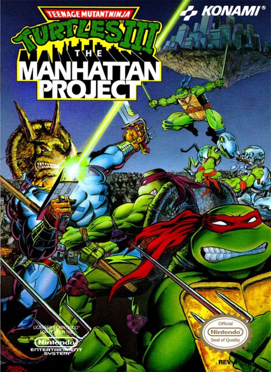
Coming off the back of the original animated series's fifth season (and more in line with the darker tone that we'd see in later episodes) the North American cover is all doom and gloom. Raph stands, grimacing in the foreground while his brothers take out foes big and small behind. The background even contains the titular Manhattan Project, with the iconic New York borough floating in the sky.
Japan

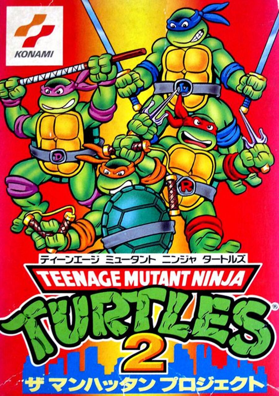
Now this is... different. Yes, the Turtles do look a little angry, but this Japan cover is worlds away from the grit of the NA counterpart. There's no fighting, no bleak background nor a floating city. It's all bright colours and chunky turtles over here. Perhaps not the most game-related cover out there, but it sure is eye-catching.
Which region got the best Teenage Mutant Ninja Turtles III: The Manhattan Project box art? (1,919 votes)
- North America

- Japan

Thanks for voting! We'll see you next time for another round of the Box Art Brawl.


Comments 53
NA one for me this week. It has some serious vibe. JP one is too much childish, imo.
Kinda wild of them to keep the title "The Manhatten Project" for the Japanese release lmao
The eyes in JP cover seem a little displaced, especially Donatello and Leonardo's
Even though the American cover looks like a great piece of artwork with a logo slapped on it, at least it's great art. Whereas the art on the Japanese cover looks a bit iffy, as already commented above, especially the eyes.
I wasn't aware that this game had a different numbering in Japan. Wow, it's just like another classic ninja-themed game, Shinobi III - which is "The Super Shinobi II" in Japan.
@EarthboundBenjy great art on the cover for that one as well. Even if it does look like it should be the cover for Shinobi X, on Saturn.
@Vyacheslav333 I wouldn't say the JP one is childish. It looks like the classic 1980s cartoon series, whereas the NA one looks more like the edgy style of the comics.
Both are good in their own right, although I went with the NA one, because we do kind of get a sense of what the game is about, what enemies we will be facing, and whatnot.
@AstroTheGamosian I understand. But... It still looks childish, imo.
I wouldn’t rate the JP cover down for the turtles looking more like they do in the cartoon, but the NA cover shows them in action and the floating island. NA got my vote this week.
Not even a competition
JP looks like it was made in the last 13 minutes before printing whereas US version has action, dinosaurs and robots and lasers and sht
I like the NA box art but there's no triceratons in the game, so I went with JP for not being misleading.
I love the classic Eastman-Laird art style. I remember being a kid thinking the graphic novels were so “mature” 🤣. They kind were (swears and gore). But they were just a more ironic kind of silly.
@Ryan_Again
Yeah that’s what brilliant about it really they were channeling that era of Frank Miller style gritty comics and combining it with a silly sounding concept and somehow it worked.
@SalvorHardin It was parody, that was missed by a lot of people back then and grew into it's own thing. Like Robocop.
Japan by a mile. The game is visually based on the cartoon, which this cover matches and there aren’t actually any Triceratons in the game, so why is one on the cover? They’ve just nicked one of the covers to the comics for this.
Preferences of the comic or cartoon artstyles aside, I would've said North America because it has more than the Turtles on it... but apparently there's stuff on it that actually isn't in the game according to a couple of comments here so I'm actually going for Japan!
I am primarily voting for the North American variant because of how the box art looks like it could be the cover art of a comic book. It looks pretty darn slick to be honest, even if not exactly representative of the final product.
I kinda like the JP cover in its own way, it has a charming simplicity to it, but I think the grittier, edgier version wins out. It's just a more interesting, dynamic composition.
North America for me. You could slap Japan's one on any TNMT thing.
Hmm...Tough one for me. I prefer how the TMNT are illustrated on the Japanese box, but the NA box art has a better feel in terms of what it show cases and has a decent background going for it too.
I gotta give it to the North American box art this week.
I'm a sucker for cute. Japan it is.
I would have told you that the American Manhattan Project cover was one of the best in the business… but I was ultimately won over by the Japanese cover and that adorably silly Raphael!!!
The Triceraton, which I just found out is actually part of the TMNT lore, but also not actually in the game, gave me some SERIOUS Megaman US art vibes, like someone explained to the artist they wanted Bebop or Rocksteady on the cover and the artist only half listened to the description and just made either one into this thing.
NA. I like the look of the Japanese cover better, but NA gives you a better idea of the game's premise. It is a little funny Raph's just glaring at the camera instead of fighting with everyone else, though.
Why was TMNT 3 released as 2 in Japan? Which earlier game did it skip the Famicom?
This was no contest. Between this and the OG NES Ninja Turtles game, I can't decide which one I liked more. This was more fun, and obviously better looking... but the original was so (almost unfairly) tough and hard-edged. Plus the cool overworld map. Hard to make a choice.
I chose from the perspective of how I would choose as a child. I would have picked the Japanese one, simply because they are more instantly recognisable, using the classic style of the cartoon. Its bold and pops out.
The American art is obviously cooler, but as a kid I think it would probably scare me, and I would think ''why are they all Raphael'' .. I know its a comic thing, but it would have confused me back then.
the Turtles created a nuclear weapon?
Tha art is just so much better for the NA cover. 'Nuff Said.
When I saw the NA cover, I immediately thought I'd be voting for Japan. Then I saw the Japanese cover and was surprised by what I saw. My vote immediately swung back to NA. I'm not fond of the Japanese cover. It looks really amateurish, or like a young kind who only recently started to discover their artistic talent but has a long way to go made it. The posing, the thick black outlines, the coloring all look unprofessional. Or as @Vyacheslav333 said, it looks childish. It's not that it's the cartoon style. It's the execution.
The NA cover is a decent piece of comic-style art. I don't like it as a cover. It doesn't have good composition for that. Too messy. Raphael's placement is odd and I think drags it down. The quality of the art is good, though. It looks professional because it is. The layout, inking, and coloring look great. Easy choice this week. NA by a mile or five.
Well, at least Europe got spared the then-usual British "Teenage Mutant Hero Turtles" treatment this time around, even though it was due to lack of a release at all...
@Don: The first game released in Japan under a title that translates as "Legend of the Radical Ninja Turtles"; the full TMNT license wasn't applied in Japan until the second game was released there.
Box Art Brawls Current Total:
Europe: 69
Japan: 69
North America: 79
Australia and New Zealand: 1
I know the NA one is better but the Japanese turtles are SO CUTE!
So Japan got my vote. Just look at Raph’s face!
I have to go with NA. Not only is it a nostalgia trip for me, I remember seeing that box art at Toys R Us and begging my dad to buy the game for me, but the Japanese one is just to plain. They could have maybe added Shredder or Bebop and Rocksteady. Just something a little more to the box art.
I definitely see going for either one. I like colors more and it's hard for me to imagine TMNT too seriously, so I went with Japan.
But that title though... WOW! With the things Nintendo was strict on back in the day about censorship, but they let something like THAT fly?
Then again, this is the same company that thought it was okay to make a 2000 Toys R Us promo video informing everyone "you'll go postal" playing Donkey Kong 64.
Do they not know the origin of these words?
Man I gotta say, I thought for sure the masses would go for the 87 look over the comic look, but I'm pleasantly surprised. A great cover, pity the game doesn't live up to it.
@DekuHero This is a really good point actually.
NA. But I have to detract points for having the Triceraton warrior on the cover as they are not in the game.
NA is the winner and it's not even close.
North America wins it for me. There's a lot more going on with details.
As great as the NA one looks, the fact they got the bandana wrong on 2 of them makes it a instant vote for JP
@AndyRogan Not wrong perse, just closer to the original Turtles (the comics) Honestly, they should have taken the blue off Leo and made them all red like the comics.
For me NA wins easily, fits with the vibe of the original Turtles (the comics) and leans more towards what I prefer. I'll admit I can be a unfair to the 1987 adaptation though since I don't like how it's taken focus away from the Mirage Turtles and colored popular perception of the TMNT. It's like if every modern Batman still looked like Adam West, just doesn't feel right to me
@smolsauce If they were all red, I'd agree with you, but 3 red, 1 blue looks like they forgot what the other colours were
@Vyacheslav333 Maybe. But that's assuming that the 1980s cartoon was itself childish. It probably was, but it's still a classic for many of us who grew up with it.
@EarthboundBenjy The Wonder Boy series: "Hold my beer"
@AstroTheGamosian Yeah, I understand.
Not a huge TMNT fan but I gotta go with NA on this one. At the very least it draws the eyes with like the floating Manhattan and junk.
No doubt NA for me. It has more going on than just the "hey we're Turtles!" image that Japan has.
It's a shame it wasn't Tom DuBois. But yeah how did they sell "the Manhattan project" in Japan? I suppose they wouldn't have been taught that project codename. Those more innocent times before the internet.
Definitely NA.
On a side note, maybe because it's been so long since I last played the game, but I don't recall Triceratons being in the game. Were they?
@piecez They have four different colors on the US cover. It‘s not the original „all are red“ design.
@AndyRogan Look closer. It‘s the four (correct) colors on the cover. Red, orange, blue and purple.
Leave A Comment
Hold on there, you need to login to post a comment...