Hello folks, and welcome to another edition of Box Art Brawl!
Before we get cracking with this week's rumble, let's take a look at how the votes panned out last time. We took a look at Professor Layton and the Curious Village for the DS and, holy moly, it was actually a rather close call. North America won out with 48% of the vote, with Europe just missing out with 41%. Finally, Japan wasn't quite able to win the hearts of our voters and pulled in just 11% of the vote.
This week, to celebrate the Switch release of Final Fantasy I-IV Pixel Remaster, we're going to take a look at the DS remake of Final Fantasy IV, launched back in 2007. The game was a remarkable critical success, and we here at Nintendo Life adored it, awarding it a score of 9/10 in our review.
We'll be checking out three different variants this week (though, admittedly, two of them are remarkably similar), so without further ado, let's get started.
Be sure to cast your votes in the poll below; but first, let's check out the box art designs themselves.
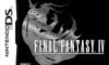
North America
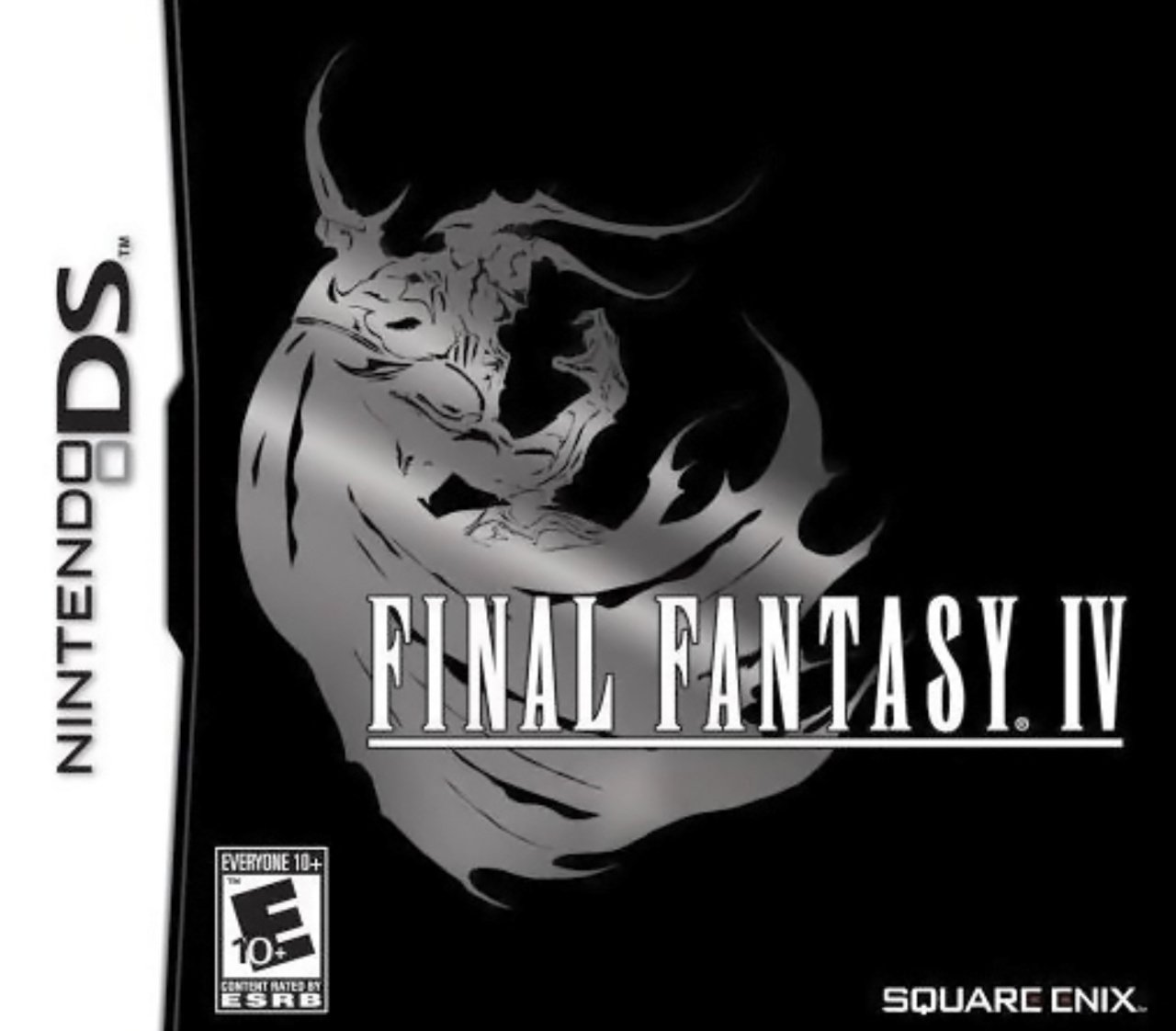
So this is very much your "quintessential" Final Fantasy cover, with the beautiful title font set against a lovely image of antagonist Golbez. What's interesting about the North American version, however, is that the standardised colour palette for Final Fantasy has effectively been inverted, with the title in white and the background in black. The image of Golbez, meanwhile, is all shiny and pretty. Ooh...
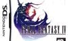
Europe
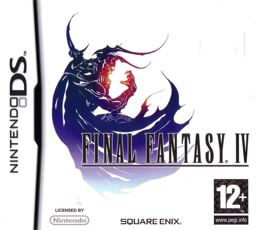
So for Europe, the composition is exactly the same as its North American counterpart, but the colours are much more in keeping with Final Fantasy's "traditional" image. The title font is now in black, the background is in white, and the image of Golbez is now mostly blue with hints of orange and red.
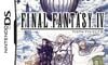
Japan
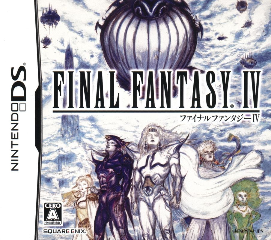
Okay, so Japan really bucks the trend with this one, utilising the skillset of Final Fantasy illustrator Yoshitaka Amano for the cover art. We see the game's core protagonists in the foreground with a whole bunch of airships and clouds in the background. It's a striking piece, to be sure, but is it as iconic as the European/North American approach..?
Which region got the best Final Fantasy IV box art? (1,947 votes)
- North America
- Europe
- Japan
Thanks for voting! We'll see you next time for another round of the Box Art Brawl.


Comments 55
I must admit that I'm not a big fan of the Japanese artwork. It has a strangely unfinished feel to it... looks a bit rough. I think that the other two covers are both iconic, but I went for Europe, as I prefer the colouring.
While there's definitely a charm in the North American and European covers (personally prefer the latter because of the white background and especially the colored Golbez) the Japanese one wins for me since it shows more characters and an actual background, giving me a better idea of the game!
I love the colours and simplicity of the Europe version
The logo covers will always trump in a FF game ... they are always great logos.
Early Final Fantasy official arts are from another dimension.
You know s**t's crazy when Europe has the best box art.
Can anyone recommend me the best way to play this game? SNES, DS, pixel remaster, etc?
Also that Japanese art is too unique to vote against it.
The Japanese one looks nice but it’s just a bit too busy for my liking
Box Art Brawls Current Total:
Europe: 53
Japan: 55
North America: 62
Australia and New Zealand: 1
My FF IV NDS is USA version but I admit the PAL version cover looks the best with colorful Golbez logo.
That North American art is class, but Japan has Yoshitako Amano's art looking fantastic.
So, Japan it is.
@Wheatly Because if I stumbled upon a game without knowing it beforehand (it can still happen at conventions for example) a box art that gives me an idea of what the game is about is more likely to make me check also the back of the box and buy it than one with just a cool piece of artwork!
Had to go with the character design one from Japan. While many might not like those designs they are classic to the series and we don't get them on the cover enough.
I want to formally inform you that choosing a logo over Amano art is a crime against the UN charta of boxart taste. Though I still prefer the GBA box-design over the japanese DS one. Probably one of my favorite cover designs ever.
@SpaceboyScreams
DS or Pixel Remaster.
Snes only with a fan Patch.
The DS Version is pretty neat, you can also get it on PC, but there are some Features left and it looks a bit cheaper graphicwise.
as the Hardware of the DS and how it displays it masks the low Polycount and Trickery with 2D Objects better.
But it comes with an Easy Mode.
But i am bad in Final Fantasy Games and proceeding pretty good.
There is especially one Encounter with the Main Villian where i needed about 30 Attempts.
Took a Video from Youtube as Help and the Person did it on first Try... But guessing from the Comments, the DS Version is less forgiving there^^
The Pixel Remaster has its great Soundtrack and polished Texts.
As said, the Snes Version has many Problems and needs some Patches.
I will choose the Japan version. I have this feeling now again I love games.
This week, I'm giving my vote, to the European box art.
The European box is the classic white with the logo art that FF games are known for.
The NA and Europe ones both look awesome, but my vote still goes with Japan on this one because I love Yoshitaka Amano‘s art.
@SpaceboyScreams I haven’t played the Pixel Remaster version yet, but out of the others that I have played, I preferred the GBA one because the Pixel art in that one is gorgeous.
Square, always flip-flopping on regional box art.
Sometimes it's just a logo on a plain background. And then it's Amano artwork. And then it's something else.
Rarer than a blue moon, it's a game that got the superior artwork in Europe!
Japan, easily. Never been a fan of those minimalistic FF boxes.
I picked the EU version because I am one of the five people that bought the game on DS
The Japanese one looks like a rock band from the 80’s
The US box for me this week (a reminder that Golbez isn't grey on the cover, but rather a nice shiny holographic effect, which easily trumps the EU version).
I was close to voting for JP though. I like the background, but the sketch like character design doesn't do it for me, as sacreligious as it sounds.
EU easily; the colors are beautiful and the characters in the Japanese version look a bit odd.
Japan, its the least boring.
Well I disagree with the winner in this poll. I say the Japan one is better.
The NA and Europe boxes are so stylized and snazzy, but I went with Japan for Amano-san’s pencils. I’ve admired his dreamy characters for a long time, even though I’ve never played a FF game in my life (waiting for my copy of the Pixel Remasters to arrive in the mail).
@Azuris Just wondering what is suppose to be the problems on the SNES version that need patching? I’ve played it a ton-and never noticed any detrimental problems to it. Is it the missing Japanese items and commands? That’s not really a huge blow, especially if you haven’t played the game before.
The PAL one is perfect
Europe. I really love the artwork on NA and EU boxart as much as I don't like it on the Japanese one (of the characters). I'm used to seeing the EU boxart so that shades the NA. The subtle colouring is nicer. If the NA one have a strongly contrasting silver to the black, that would get it. But it's not apparent on this boxart photo (think the contrasting gold and black on Prof Layton boxarts. The gold is "strongly coloured" against the black).
Still have the American copy but I gotta admit the European colors take the same art to another level!
I love the Yoshitaka Amano art but one thing that always bugged me was that it depicted things that weren't in the game. I get they are concept art but when I was a kid it was just disappointing.
Anyway, I voted for the NA version. The colour of the European version looks nice but Golbez just looks more evil in black and grey.
@mattesdude
Cut down Dialogs that happened, because english Text simply needs more Characters and with that more (screen) Space.
Translation of Spells and Items (i would call this a minor "Issue" ).
And i hope i am memorizing correctly, Bugs with some Spells.
Also, you can chose between different Difficutlies nowadays.
The US Version was easier (is not a bad Thing in my Eyes, especially for Adults with less Time).
So you can vary as you wish
Imo: There is not really a bad Version, every one gives you something special.
Be it the Soundtrack, more Story or new Graphics.
The DS Version is really fine imo.
I can recommend it blindly, it has some Playstation Graphics Vibe.
While I tend to prefer box art that features detailed art over minimalism, the Japanese cover doesn't really do much for me. It doesn't feel as polished as I expect cover art to be. As someone else mentioned, it feels like a rough sketch or unfinished. On top of that, it's not really dynamic either. And for Final Fantasy, the minimalist covers tend to work to some degree. I prefer the white background in this case, so I voted Europe.
@SpaceboyScreams As someone who has played only the SNES (Wii), GBA version, and a bit of the DS remake... I cannot suggest a "best" way to play it since every version introduces improvements... and flaws.
But I don't regret playing the Wii VC version, it's the same crappy translation as SNES but they patched out some flashing effects on top of making the whole game dim. But playing on Wii is nice because The After Years is there too.
Then I would suggest GBA, it has worse quality audio but a better translation, better pixel art and a unique intro animation that's not found anywhere else afaik. It also has some slowdown that SNES doesn't have.
Then finally the DS version, it has 3D visuals so it's a very different experience IMO, but has multiple difficulty settings, an epic cgi intro that looks 'ok' on the DS screen, but it also has probably one of the more accurate translations you can find of the game.
The PSP version is decent but I wouldn't bother with it, it's the same feel as the Ace Attorney Trilogy on 3DS, you get the same visuals... but without the iconic 'pixel' look, it just looks ugly and muddy. Like using the scale2x filter on pixel art. Not my cup of tea.
It's gotta be either Europe or Japan. The black background is not something I associate with Final Fantasy, unlike the white one.
I had to go with Japan on this one. Not only do I love Amano art but honestly if I saw that on the shelf as a kid I would probably have begged for that and be a huge fan of IV today instead of being wistful for it hahaha.
NA here. Honestly the picture doesn't do it justice here as the Golbez image is more of a hologram.
Japanese one wins if only because of my love for the artist and Vampire Hunter D. Took me decades to realize there was a reason why the artwork looked so familiar...
JP one for me. Yoshitaka Amano's artworks are cool, interesting, and beautiful. And his art style is memorable.
Surprised the Japan one went gold, with that image. It looks goofy.
As much as I respect Amano’s art style, I have to admit I’ve never really “liked liked” it. The European one wins this one for me.
Usually I'm not a fan of the box art being overly simplistic, but the Japanese art is so ugly I had no choice but to vote for Europe somehow.
@Tasuki true it is a metallic logo. However the European one somehow became the most recognizable one of the bunch.
Messed up putting Golbez on there for the logo instead of Kain!
Amano, every time.
I love all of these, but as awesome as the classic FF promotional art style is, it never graces Western marketing. I have to vote for the Japanese one.
This was a very easy one for me. I definitely prefer the Japanese box art though I am most used to the PAL version.
@JohnnyMind what is the symbol next to your username?
@Dr-M It's the Nintendo Life Supporter symbol because I've subscribed to this site, you can click on it for more information!
@JohnnyMind Thank you so much, I appreciate your response.
@Spoony_Tech Yeah, gotta go with Amano. Nothing screams FF more than his artwork.
Leave A Comment
Hold on there, you need to login to post a comment...