Hello folks! We made it through April Fools' Day, so it's time to say: welcome to another edition of Box Art Brawl!
First off, let's have a quick look back at last week's tussle. Super Mario Bros. 2 (or Super Mario USA) took to the stage, and while it was fairly close, Japan won this fight with 59% of the vote. We're fans off both, so we're not disappointed with the result at all.
This week, we're sticking with the NES and taking a look at Kirby's Adventure. This was only the second time the pink puffball had made his appearance, and it was his first on a home console. Most importantly, Kirby's Adventure is where our round friend could first use the Copy Ability, which is probably what makes Kirby so iconic today — particularly if you're a Smash Bros. fan.
This sequel celebrated its 30th anniversary just over a week ago, and you can play it on Nintendo Switch Online if you haven't tried it out yourself. The game would later get a GBA remake in 2002 in Kirby: Nightmare in Dream Land.
But enough history on Kirby's sophomore outing — let's get to the box art. We're pitting Japan up against North America/Europe, as the west received the same box art regardless of location.
Be sure to cast your votes in the poll below; but first, let's check out the box art designs themselves.
North America / Europe

...why is this so unsettling? Kirby is literally sucking up the entire world here, establishing his world-ending powers right from the beginning. We're kidding, just a bit, but it's a smart move to put the character's defining skill — his ability to suck in everything — on the box. The paper-like background is a really cool effect, too, uncovering what might be a nefarious world behind the curtain. It's bright, colourful, quintessentially Kirby, with the star dominating the box art as he should.
Japan
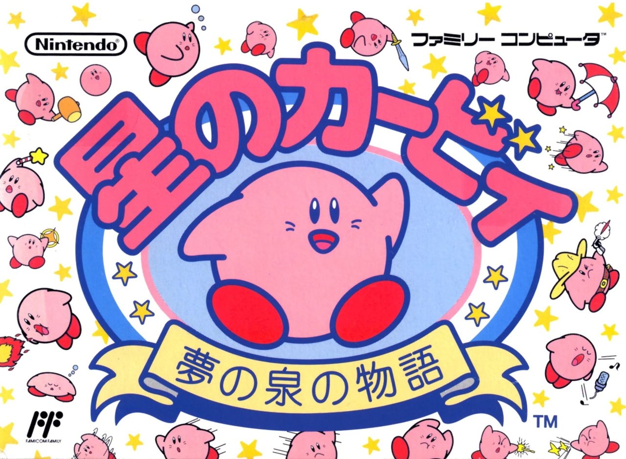
...why is this so cute? You might say "well, duh!", but we've just talked about Kirby's awesome power. Here, we just want to give him a cuddle. The Copy Ability is on show here with all of the various different Kirby's on the box, with the standard pink puffball in the centre. You can see Sword, Hammer, Sleep, Fire, Parasol, Laser, Beam, and many, many others. Some of the minigames, like Quick Draw, also get a nod on the box. And the white background helps make the pink and the yellow stars really pop. It's an overload of cuteness.
Thanks for voting! We'll see you next time for another round of the Box Art Brawl.


Comments 39
The NA cover is somehow disturbing, because it looks like he is going to choke! Japan all the way for this one!
Went with NA/Europe. There's just something nice about Kirby eating the boxart itself.
Ahh, I can't decide. "ours" is a classic and I love how Kirby swallow the edge of the box, in a sense but the Japanese one is so goofy and cute.
Probably just not gonna vote at all cause I'd feel bad picking either over the other.
Japan's artwork just looks like it is the cover of a sticker book instead of a game. West for me.
Usually I would've picked the North American/European one since it looks more like gameplay, has an actual background, a really cool effect and even a hint to the game's final boss, but I just have to go for the Japanese one since it shows the most distinctive feature of this game at the time that would define every Kirby game after it: Copy Abilities!
If you couldn't tell I REALLY like both box arts and don't absolutely mind whichever one wins!
I picked the US box art but I think both look great. Any Kirby box art looks great so its really hard to decide lol
The JP boxart features Kirby With A Gun, so it's clear who the real winner is here.
North American Kirby is sucking its own art box … what can be greater than that?
Most box art from the 80's (although I guess this game technically came out in the 90's, but it's still NES) is just incredibly corny to me, but the North American box art is iconic. I love how he's eating the background. It's an easy win for me. The Japanese one looks okay, but a lot of box art from back then just looks poorly drawn for some reason. Like some of those copy abilities on the Japanese one feel like they were drawn in 30 seconds. I'm pretty sure I could draw them better than that.
Definitely voting for the North American/European variant. Even with Kirby's color being different on that box art, I think as a whole, it is more colorful and fun to look at. Love the fact that he is sucking up part of the box art. And I love the color palette chosen for the Kirby's Adventure logo.
It was close, but I went with the Jpn cover this week, for the cuteness overload.
Kirby games aren’t something I played until much later in life, so I haven’t any nostalgic attachment either way. The NA box is really clever! But, I feel it’s cheapened by that big red NINTENDO ENTERTAINMENT SYSTEM overlay common on latter-year NES titles. I never was fond of that look.
Europe easily for me.
What's with Japanese box art and vomiting characters all over them lol? NA this week
Both are great and I like them for different reasons. Western box art is iconic and unique. I like the level they chose for the background. I wish the blobs behind the level were Gordos though. Japanese box art would be better with different coloring, I don't really like the white background, but the adorable ability showcase was enough to win me over.
While I think Europe/NA might be better in a vacuum, showing Kirby sucking up the paper gives a disturbing but intriguing effect. But Japan is cute and feels more Kirby for me
Looks like I went against the grain voting for Japan. I like the iconic NA/EU box art, especially with Kirby sucking in actual reality. But I also can't deny how cute the Japanese box art is. Not to mention that, despite how busy it is, it's an excellent showcase of what Kirby can do in the game.
I actually really like both this time, but I think the US art actually edges it out this week (and this is saying something, as I usually don't like western box art from this era).
Kirby unknowingly releasing darkness alludes to the climax of the game.
They're both so beautiful. This is the first time I'm not voting for either one.
A rare victory for NA/EU!!
This time I cannot decide if the clever box art sucking of the western cover or the cuteness of the main feature of the Japanese version. Guess I'll go with the latter this time.
At least the western cover doesn't have American Kirby (no, not Angry Kirby): https://youtu.be/mUeb9rwYb8g
Next time do one about the Game Boy Advance remake. That one is slightly easier for me to vote.
I feel like you can make a case for either this time. But I do prefer NA and Europe overall. But I do like Japan's cover as well.
The Japanese cover is so cute. Look at all the different Kirby!!
The art looks slightlu dated but I like what it's trying to convey in the NA one. So that wins it for me.
I'm sorry, maybe this is my bias for one of my favorite games as a kid shining through, but the international box art is much more creative. I get the Japanese box art is trying to showcase the copy ability and the multiple variations of Kirby that come with it, but it just looks like a freaking mess. Although I will say I just realized that the extra game unlocked screen is likely a reference to the box art, with a bunch of stars and Kirby's around the border.

I also voted for the western cover. It's eye catching due to how big Kirby is, but it's also a clever concept having him inhaling the background. But this duel is going to be a case, I think, where the result is an easy victory in the voting, though with a lot of those people actually having to think about it and considering the Japanese cover nearly as good. That was the case for me. I like both covers and did consider voting for the Japanese one and it seems others like it too regardless of their vote.
@HammerGalladeBro Angry Kirby explained:
https://hard-drive.net/hd/video-games/nintendo-reveals-that-kirby-is-angry-in-american-releases-due-to-cost-of-insulin/
Japan’s looks like a drink coaster
Kirby is eating the front cover. Nuff said, winner!
They're both cute, but I'm giving it to the western art.
I voted for the North American/European box art.
I distinctly remember the first time I saw Kirby's Adventure in a shop - it was in a "duty free hyper market" on the border when crossing from the UK to France for a school trip. I just stood there and stared at it. I LOVED this box art (which was blown up to a big hanging poster), the character design, and the TV playing the attract mode demo where it "teaches you" how to draw Kirby before going into the gameplay.
As a hardcore Master System fan at the time, this was the first game that made me actually pay any attention to the NES and see it as competition to my beloved European exclusive late era Master System games and 16bit ports. (For those not in the know, NES barely existed in the UK until a budget rebrand in 1993-95).
I bought a Nintendo magazine for the first time ever because I wanted to use an ad using this box art as a poster. The next year, 1994, I got a GameBoy and SNES... in 1997 I got an N64 on launch, and a second hand NES to "catch up".
So in a way, this game, and specifically the box art as a massive poster with the intreguing looking character started my love for Nintendo... (though Sega consoles were always right there too - in 1995 I finally got a Megadrive, alongside Mega CD and 32X, and in late 97 I picked up a Saturn).
Funny how all my favourite videogame box art (to the point I have them enlarged and framed) include 2d art cartoon characters, with vibrant blue/purple skies and water. Kirby's Adventure, Super Mario Land 1&2, Fantastic Dizzy, Land of Illusion, Sonic Chaos (the Master System version with Sonic & Tails flying).
And the cover for our Hazel Witch game follows the same pattern, with her flying her broom against a vibrant sky with dragons, beanstalk to a cloud castle, flying above the sea with sharks and sea monsters, castles on islands, etc. Its pretty much as if you took all those previous box arts and mixed them together, and added a little girl witch on a broom, ala Cotton/Magical Chase/Kiki's Delivery Service.
Now I think about it, I think this Kirby cover was the first of those games that I actually saw the cover for. I didn't own the other games til later that year, or early 94. So in a way, it started a whole trend in my head of "apparantly this is my taste in videogam cover art". Only just now made that connection...
Both good, but c’mon. It’s gotta be Kirby eating his own box art.
Why does the TM have an asterisk though?
Neither are that good, but as others pointed out, Kirby eating the box art on the North American/European cover is a better design.
Box Art Brawls Current Total:
Europe: 51
Japan: 55
North America: 61
Australia and New Zealand: 1
American boxart is my choice, and I also like the Japanese one.
It's cool how he is interacting with the NA/PAL box art.
I definitely like both, so I'll give the tiebreaker to the western version for the world inhaling 😆
Leave A Comment
Hold on there, you need to login to post a comment...