Hello folks, welcome to another edition of Box Art Brawl!
In our final edition of 2022, we took a look at the GameCube remake of Hideo Kojima's stealth masterpiece: Metal Gear Solid: The Twin Snakes. As expected, the Yoji Shinkawa designed cover for the Euopean and Japanese variant took the lion's share of the vote with 78%. That said, there were plenty of fans of the North American design who understandably thought that the stark red colour of Shinkawa's effort was a tad garish.
To kick of 2023, we're going to be looking at a classic title for the Nintendo DS: Metroid Prime Hunters. Though no where near as lauded as the mainline Metroid Prime trilogy on the GameCube and Wii, Metroid Prime Hunters was nevertheless an impressive showcase for the DS hardware. The 'First Hunt' demo packaged in with launch DS consoles more than proved the game's worth, though it's safe to say that the visuals and gameplay have not aged particularly gracefully by today's standards.
For this week's brawl, North America and Europe have identical designs and so will team up against Japan. So without further ado, let's get cracking!
Be sure to cast your votes in the poll below; but first, let's check out the box art designs themselves.
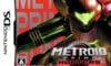
North America / Europe
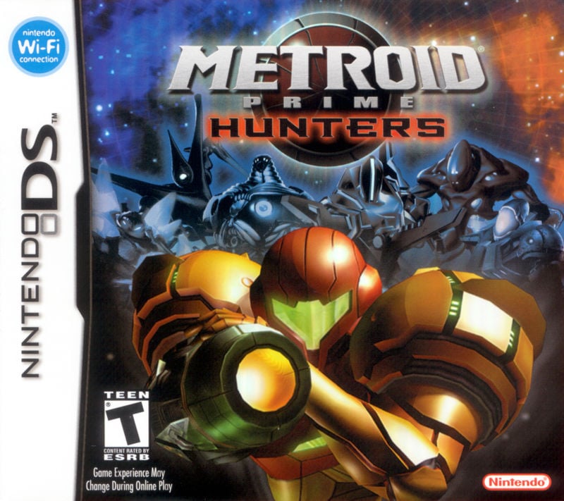
The western design for Metroid Prime Hunters is pretty nice, overall. It features Samus herself in the immediate foreground in a rather striking pose, with a selection of the game's other hunters in the background. There are a whole bunch of stars surrounding the characters and a pleasant colour gradiant from blue to orange; a tactic often used in movie and game posters.
We like this one a lot!
Japan
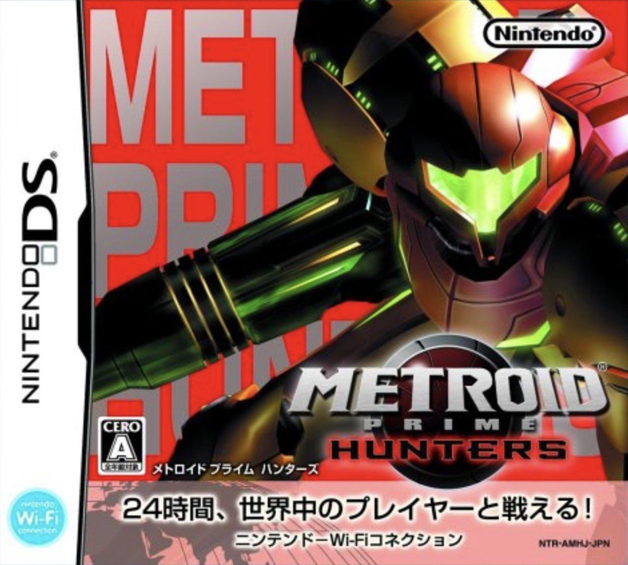
Japan's approach to the design for Metroid Prime Hunters is a lot more abstract in nature, featuring Samus in another equally striking pose, but this time the other hunters are completely absent. Instead, we've got the game's title in the background in a bold, silver typeface against a block of red colour. It's certainly very eye-catching and when looking at the two variants side by side, this one is probably more likely to draw our gaze, even if it might not be quite as visually pleasing as the western approach.
Thanks for voting! We'll see you next time for another round of the Box Art Brawl.


Comments 30
I was like... 100%? No way, but I was the only xD oh well... FIRST!
North America / Europe shows some Hunters in a Hunters titled game, so it is the obvious choice, duh.
The Japanese one is pretty generic Samus artwork and what was the idea with the background letters?
Voted for NA/Europe because it's just more interesting to look at and actually shows the titular hunters instead of just the title in the background in the ugliest looking way possible.
The NA / Europe one isn't even good and it's still miles better.
Actually seeing the other Hunters on the box is what makes it better.
I never really got into this game though - I think I completed like two areas and realised that it was kind of simplistic and linear and repetitive for Metroid standards, and I never had the opportunity to try it in multiplayer (especially now that DS Wi-Fi is dead)
Both covers look pretty sweet this weekend, it's a tough one, however, I think I'll give the slight edge to the North American/European box art.
Box Art Brawls Current Total:
Europe: 46
Japan: 50
North America: 54
Australia and New Zealand: 1
Like both to be honest, but the American/Europe just pips it.
i have to go with the american/european box art of Metroid Prime Hunters, since it show all the hunters(the main focus of the game), the japanese box art is just Samus Aran under a generic background.
NA/Europe in a layup.
Rare win for NA/Europe…still not great though. The only genuinely great western Metroid box art I can think of is the one for Prime 2
Going with North America/Europe this round. The background is covered with the other bounty hunters and a starry background instead of annoyingly huge words and a solid red palette.
NA/Europe. Japan one looks strange, like a magazine advert.
The western cover is consistent with the title, but the real reason I voted it is because you can see Samus' face in her glossy visor.
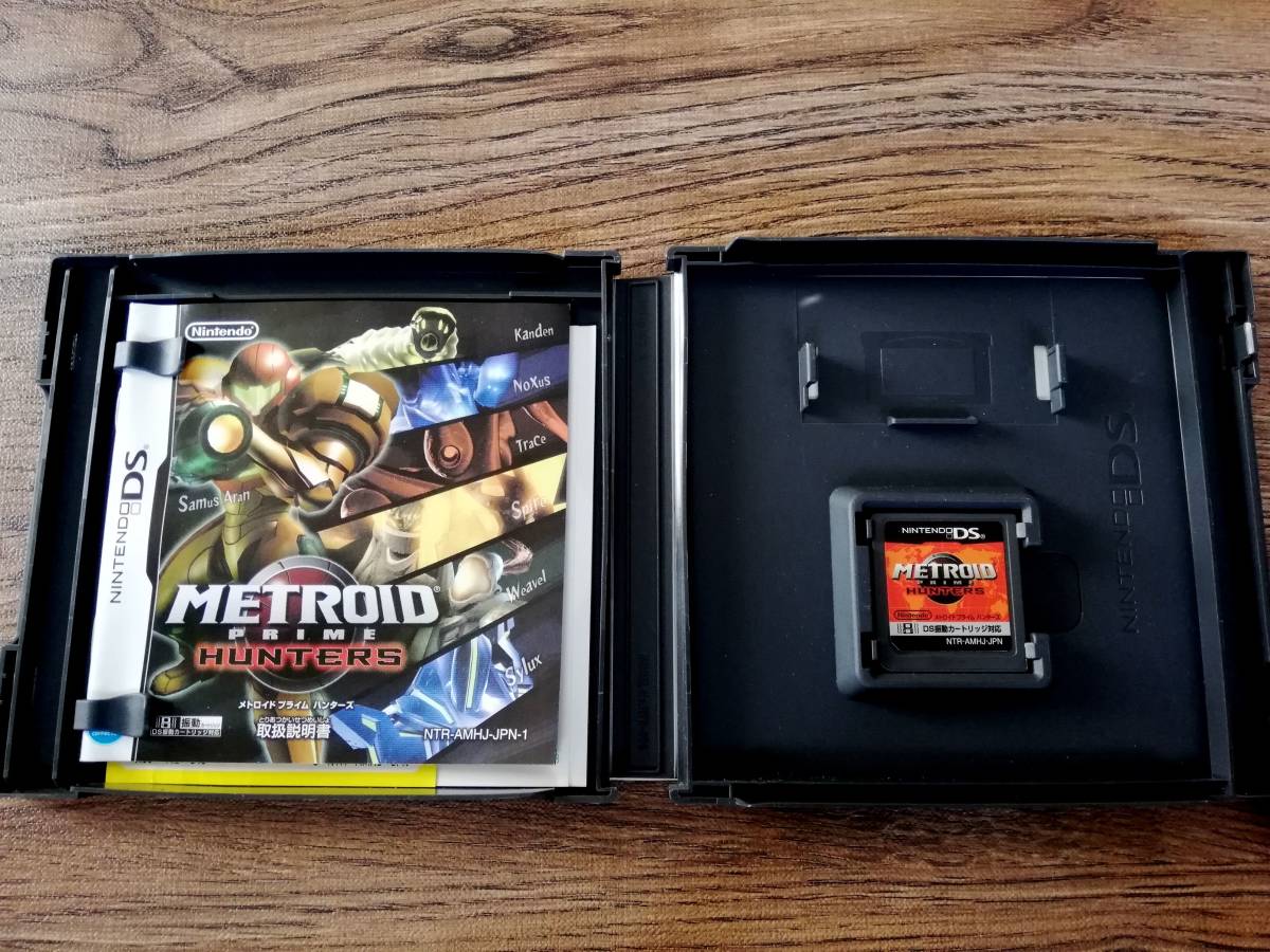
EDIT: Meanwhile the Japanese manual is consistent with the title. The Japanese cartridge art features a map of Earth, which in hindsight is weird for a Metroid game, but back then the Wi-Fi component was the most advertised element of the game in Japan.
The Japanese art is very attention grabbing
@Clyde_Radcliffe Yep, like a magazine cover to me.
Western cover, easily. That one has pretty nice composition and concept. The Japanese one is weird. The pose for Samus is good, but that background is not good. Why have the title on the background, mostly obscured at that, while having the title logo just below Samus? At that point, a solid color for the background seems like it would be an improvement. You could even find something to put over the empty space in that case.
NA/Europe all the way I'm confident even Stevie Wonder would agree.
On a side note I was big into this game when it released. It was one of my first games I got for my DS Lite.
First time I've looked at the Japanese one and thought it was outright terrible. Looks like the cover of one of those "tips and tricks" booklets you'd get free with magazines 20+ years ago. Awful.
I own the game, and while it's not the best game in the Prime series, it is a nice little way to take the Metroid Prime experience on the go.
The problem for completionists is that in order to get 100% completion, you have to scan EVERYTHING. Every enemy, every boss, and every form each boss takes. Forget to scan so much as ONE thing, and you can forget the 100% completion run.
Personally, though, I don't really consider this a Metroid Prime game. Even though the gameplay is similar, the game surprisingly doesn't have any Metroids, much less the Metroid Prime/Dark Samus itself.
Even Metroid Dread had a Metroid in the form of Samus herself, but this game had no Metroids at all. Based on that fact, I don't consider it to be a Metroid Prime game, if not a Metroid game at all.
Unless we consider Samus to be THE Metroid (in the Chozo language, the word Metroid means "Ultimate Warrior"), and was meant to be all along from her adoption by the Chozo; that the creatures we call Metroids were just called that, but Samus was destined to be THE Metroid, THE Ultimate Warrior. Then you might consider it a Metroid game.
Japan. The other is a standard, bland cover affair. Might as well have Samus walking toward the camera with an explosion in the background.
Metroid Prime Hunters is the best game in the Prime Series and in the overall Metroid Series.
What's not mentioned is that the western art is holographic and that the Japan art has a nice shine to it around light with the silver. Sure, it looks like quite a step down from the image above, but it doesn't do it justice. The Japan edition also comes with an absolutely gorgeous manual. I voted for the western box art in a close one as it features the other hunters, and I'm proud to own both of these in my collection.
I like the JP one artistically but the Western one just works better at communicating what the game is about.
Box Art Brawls are the best! Keep ‘em coming Nintendo Life. Maybe consider comparing the inside art of Switch games.
The Japanese box art looks like it’s been cut out from the front cover of Edge Magazine.
The Japanese one looks like a video game magazine cover page.
The fact that they decided to write Metroid Prime Hunters across the front of the box and then just obscure them completely with Samus, only to then write them again, is a horrible design choice on the Japanese box
North America / Europe because it shows the other hunters.
For those curious about the writings on the Japanese cover, the one between the rating and the logo is just the katakana transliteration of the game's title while the one on the bottom promotes the game's online features:
[You] can fight with player[s] all over the world, 24/7 (literally for 24 hours)!
European. It also helps that I have that one and know it's one of those "shiny" inlays. I love those. Only one better was the lenticular box art variant of Big Bang Mini. No DS game ever looked remotely as awesome as that one, even before actually seeing the game in action which was awesome as well.
Japan's looks like a bad magazine cover
Leave A Comment
Hold on there, you need to login to post a comment...