Hello everyone; welcome to another edition of 'Box Art Brawl'!
It's kind of mad that another week has passed already, right..? Where is the time going?! Never mind.
Last week, we took a look at one of the all-time greats on SNES: Mega Man X. It was a ruddy close one, too! Europe and North America teamed up to take on Japan, and the duo just managed to take the crown with 53% of the vote. Both designs are absolutely fantastic, so we're not entirely surprised you folks were a bit torn on this one.
This week, in celebration of the recent announcement of Story of Seasons: A Wonderful Life, we're going to be looking at the original GameCube release from 2003 (2004 for western audiences): Harvest Moon: A Wonderful Life. For many (this writer included!), A Wonderful Life was the gateway into the world of Harvest Moon, boasting the beautiful, tranquil setting of 'Forget-Me-Not-Valley' along with a cast of characters that has lived on in the minds of fans for many years since.
For this week's Box Art Brawl, Europe and North America are once again teaming up due to the overwhelming similarities between the regions' box art designs, so Japan will be at it alone! We reckon it might be a close one again this week, but as ever, the winner will be determined by you fine people.
Be sure to cast your votes in the poll below; but first, let's check out the box art designs themselves.
North America / Europe
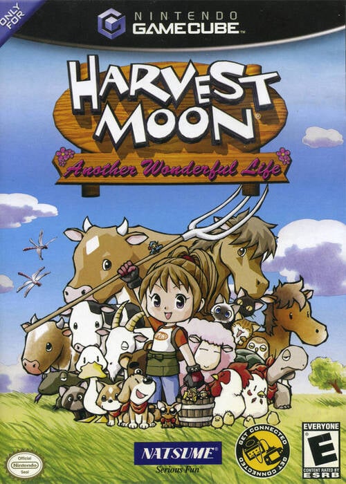
The North American and European design for A Wonderful Life is likely the one you're most familiar with. All regional designs are pretty similar in terms of composition — with the game's protagonist standing triumphantly in the centre, surrounded by a group of animals and fellow villagers — but what sets the western design apart is the inclusion of a full background (similar, but not identical in the two examples above), presumably set somewhere in Forget-Me-Not Valley.
It's a very peaceful work of art; certainly indicative of the kind of experience you'll be getting with A Wonderful Life.
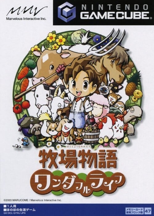
Japan

Japan's design for A Wonderful Life is, again, similar in composition, but the protagonist and animals are surrounded by a large wreath of flowers and vegetables; an indication of the kinds of things you'll be planting during your life on the farm. We must admit, despite the missing background, we do actually prefer the more vibrant, stylised approach taken with the protagonist and animals here; it's nice! This is going to be a tough one, for sure...
Bonus

Harvest Moon: Another Wonderful Life launched in 2005 and showcased the exact same gameplay and structure as the original release. The difference? You're playing as a girl instead of a boy, and your love interests have also swapped genders. Was it necessary? Mmm, maybe not, but it might have introduced a few more people to the series, regardless.
The box art itself is kind of a combination of the previous designs from A Wonderful Life. The animals from Japan's box art have been lifted straight into this one, but it's also taken a leaf from the western box art design and opted to include a background once again. It's a nice approach overall; kind of taking the best of both worlds!
Thanks for taking part in Box Art Brawl once again! Be sure to cast your vote below and let us know in the comments which box art you prefer!
Thanks for voting! We'll see you next time for another round of the Box Art Brawl.


Comments 40
NA has that community vibe to it, so naturally, I find it the better one.
Using the same art for the main character, but shrinking the head, was an odd design choice.
I voted the USA Gamecube version but I prefer the PS2 USA version since I played from PS2 version first.
Is it common knowledge that the Story of Season games are remakes of Harvest Moon games? I only just found that out
@DrewBA77 They're actually different drawings for the main character. Similar poses, but different pieces.
Is the PAL cover really washed out like that? Or is it a photograph problem?
NA art for me. I remember walking by it and the redhead (Nami) catching my attention. Bought it same day. Actually considering I was getting annoyed with Bokumono at the time (the girls version was usually hard to find and came out after the boys version and I was sick of playing a dude…ironically this is the only girl’s version I can’t play lol) this game kept me in the series and was a great way to chill before and after class.
@FantasiaWHT The PAL version is also zoomed out further and has fewer trees in the background. It also doesn't promote the gba link cable connectivity.
@Mattock1987 sort of I suppose. The Natsume/Marvelous split happened a decade ago so most people that regularly play the genre know that story of seasons games are the long running Bokujou Monogatari (Farm Story/ Farm Tales or bokumono for short) that was localized as harvest moon before Natsume did their own version. But a person that randomly played one or two in the past or just the newer ones might not put two and two together.
A hard choice, they are very close in quality to me. I voted for JA because the duck is more prominent in the drawing!
Man, Harvest Moon had such a pleasant art style, the box art was always a stand out in a collection of games.
Story of Seasons art style isn't bad but it has this stock-standard quality to it. Especially in gameplay holy *****, you could tell me Pioneers of Olive Town uses all free assets and I'd probably believe you.
I assume they changed it because Natsume owns the original designs, which is a shame since they're not going to do anything with it.
This week, I gotta go with the North American/European boxart.
I'm usually prefer original Japanese box art instead of PAL and NA ones, if there is a Japanese videogame, but this time... I'm prefer NA box art. So... I've chose a PAL/NA one. But, if be more honest - I'm prefer that bonus box art with the girl.
Man that game has been on my wishlist for the longest time.
Not really a big fan of the collage format of the JP version. It just looks too crowded. The NA/EU version is more spaced out, has room to breathe, and includes the most important element of the game: getting married and having a kid.
No joke, you HAVE to get married in this game; it's not an option. If you don't get married by the end of the first chapter, the game ends prematurely. Yeah, it kinda sucks, and it's especially difficult if you go for Nami, who is far more difficult to woo than Celia or Muffy.
Still, as my first Harvest Moon game, it is also my favorite. I cannot wait for the Switch remake. I just hope they add an automated watering system for the crops, as my current playthrough has me taking literally all day to water, leaving me very little time to do anything else, including woo Celia, Muffy, or Nami.
I like them both in equal measure.
I feel like the NA/EU one really captures the almost gritty feel to the game that I’ve always loved. Both are really great though.
@AstroTheGamosian, not to mention Lumina in special edition.
Can’t choose; they’re both good.
The NA/EU covers look like they're the same but from slightly different perspectives (other side of the same path). The path behind the cow on the NA and in front of the group on EU. Interesting.
Gotta vote for the cuter Japanese aesthetic.
Voting for NA/Europe for not being so cramped.
The western box art just feels more "complete" to me.
@Mattock1987 Yes it is. Story of Seasons is literally the same franchise.
They just had to change the name because Natsume lost the localization rights and so much refused to give up the English trademark name that they made their own series so they could keep using the name.
Can't decide between the two, so just went with the less popular one.
@MatthewYoung I don't think Natsume owns anything other than the name Harvest Moon and the translations they've done. The lead character artist for Bokumono is also still the same one from the beginning as far as I know, either her art style just changed with time or some higher-ups are demanding a specific type of design, I dunno.
@KingMike oh right, thanks for that, I genuinely didn’t know about the legal issues
I’m 50/50 on this.I think they’re both great
Box Art Brawls Current Total:
Europe: 38
Japan: 45
North America: 47
Australia and New Zealand: 1
While I like how many animals are featured on the Japanese cover, the circular layout and cluttered design of it make it less visually pleasant in my view. I do love the animals though, so it was spaced out a bit more, I might vote for it. But I chose the western cover this time.
Both are great, but NA/EU gets my vote.. it gives off that 'homely' sensation you get from placing this game; it also looks a little like a photo out of an album!
When I was a kid it was weird to me that the character had children because i thought he was a child!
Western this time. The Japanese one looks like they're posing for a magazine photo or something with that white background.
If I saw both at a store, I would buy the NA/EU version.
@Mrkittyhead Yeah, her too. But I'll admit, I prefer the GameCube version over the PS2 version. It runs a lot more smoothly, and I prefer the music in the GameCube version over the PS2 version.
I've heard that the PS4 rerelease of the PS2 version fixed some of the performance issues, but I have yet to check it out for myself. I have also heard that performance issues do remain, though.
But maybe we'll finally be able to marry her in the Switch version. And from the looks of it, we may also be able to play as the girl version of the player character, too, and marry the bachelors from Another Wonderful Life (although I did hear that there will also be a non-binary player character, and will allow you to have a same-s** marriage, making the game LGBT friendly). Taking that into account, maybe we'll also be able to have a daughter.
So it's possible this game will be a melding of the GameCube and PS2 editions, with some new features added in. But as I said, the one addition I want more than any other is a irrigation sprinkler system, so I don't have to spend all day watering my crops.
@AstroTheGamosian yeah, that makes sense. I had had a PS3, which I sold for a Wii U, which I sold for a Switch, so I’ve never been able to play the GC version. I own it, just don’t have something to play it on.😅 The additions to the remake sound awesome. I hadn’t noticed most of the ones you mentioned!
One of the few times I actually think the Western design fits better.
Japan because I love the animals. Can't wait for the remake since I never played the original.
I just like the simplicity of the Japanese one.
@Mrkittyhead Yep, it comes directly from Marvelous Games' website, regarding your choice of playable character, and who you choose to marry.
The Japan version is more prettier and classy, and it doesn’t give away the bachelorettes.
Leave A Comment
Hold on there, you need to login to post a comment...