Welcome back, you lovely lot, to Box Art Brawl — our poll-filled series to find out your favourite regional retro box art variants from two or more contestants. It's been over a month since the last Brawl but following some time off to train up and recuperate, we're back once again to wreak havoc on video game covers of yesteryear with our keen eyes and sharp wit. Huzzah!
If you recall, last time we witnessed a duel between the East and West when the cover of handheld remake Super Mario 64 DS went head-to-head with... itself. Winning over three-quarters of the overall vote, Europe and North America emerged victorious against an interesting but unusually directionless Japanese cover.
Subscribe to Nintendo Life on YouTube841k
We're sticking with the plumber and his pals for this round: Super Mario RPG: Legend of the Seven Stars celebrated its 25th anniversary earlier this week and we're here to see if the Japanese or the North American version is the real legend. Europe is sitting this one out because, sadly, the SNES game didn't see the light of day in that territory until it came to the Wii's Virtual Console in 2008. For shame!
This Square-developed classic is now available on the SNES Classic Mini, too, and one would hope that it's only a matter of time before it shows up in the Nintendo Switch Online subscriber pool of SNES games. Until then, let's take a look at what you'd have seen on store shelves if you were perusing the SNES section of your local gaming emporium back in 1996. And you didn't live in Europe.
North America

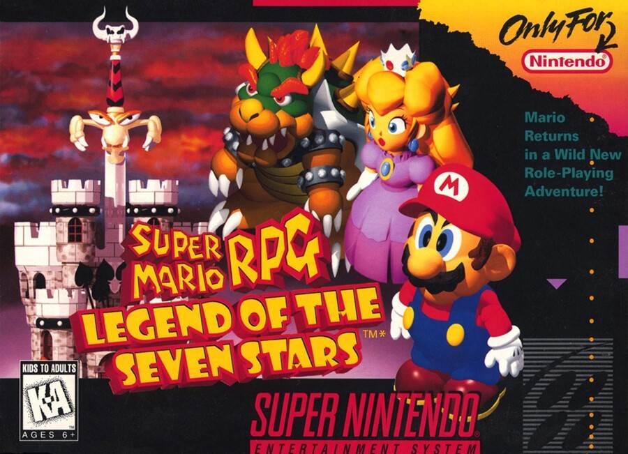
Mario Returns in a Wild New Role-Playing Adventure! The western version of the cover arranges the chubby little models of Mario, Peach and Bowser around the wordy title, which is yellow and embossed with thick red borders. Grumpy-looking sentient sword Exor sticks out between the castle turrets on the left, with ominous flame-red clouds filling the sky in the background.
Individually, none of the components are bad, although for us they don't really gel and this cover actually gets worse the longer you examine it. Still, for some reason we're tickled by the asterisk next to the trademark symbol. We like to imagine that on the back of the box it says *Not really, and in twenty-five years nobody will use this obtuse subtitle anyway. It's 'Super Mario RPG', innit?
Japan

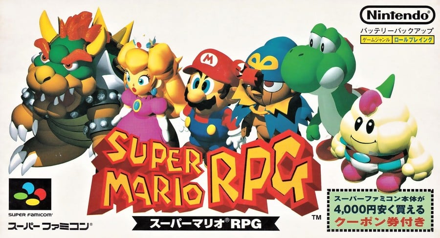
The Japanese box switches the background for plain white and displays a line up of six of the game's characters: Bowser, Peach, Mario, Geno, Yoshi and Mallow. The same logo as the NA box looks great without the deadweight of the subtitle dragging it down, and the relative visual complexity of these 3D characters is offset against the blank background — it allows the colours to really 'pop'.
The Super Famicom covers we've looked at usually have a portrait orientation, so it's refreshing to see this landscape effort. Not bad at all.
So, you've seen the two options, but which one deserves seven stars? Pick your favourite and hit 'Vote' to let us know below:
Twenty-five years, eh? Time: it passes. Before you know it we'll be back with another edition of BAB for you — until then, be excellent.


Comments 44
Neither of them are very good, but I voted for Japan just because they also have Geno and Mallow on the box.
I like the PAL packaging.......no! Hang on a minute!
I voted Japan version.
Simple and clean.
I'd go for the PAL cover if there was one but the NA is the clear winner this time.
Don't call it a come back!
NA has a lot more going on, how can I not love it more.
I think they're both awful! All the characters look like they're dead and standing in a museum, especially Mario and Peach.
The American one is slightly better due to the background image.
I'm not a fan of plain white backgrounds on game covers. They remind me of the posters for many bang-average Hollywood comedy films, which often have the main characters doing weird poses in front of a white background.
https://tvtropes.org/pmwiki/pmwiki.php/Main/RedAndWhiteComedyPoster
Warning - the link above goes to TV Tropes. Do not click if you have anything important to do today.
Japanese one. It actually has the the whole party. And yoshers.
@larryisanassman
Ironically the EU version would have had a hand drawn piece
Japan. Because more graphic and less generic
Box Art Brawls Current Total:
Europe: 27
Japan: 29
North America: 33
@Snatcher North ‘murica?
I guess the characters are supposed to look like dolls? Or 3D renders like that were a big deal back then and they wanted to show them off?
There was no excuse not to release this game in Europe, at least in English speaking UK.
Both are horrible with those dead-eyed, expression-less models, but Japan's looks unfinished with its white background.
They both suck, like the game.
@Markiemania95 LOL I have a bad habit of say merica instead of America, it should be fixed now.
The Japanese cover looks so bland, I voted for the North American boxart.
I'm suddenly reminded of this one Brazilian (I think it was Brazilian) board game "based" on SMRPG, "based" as in the designer probably saw just the box art and decided to make something off of that
Yes another box art brawl. Keep em coming Nintendolife!
NA because the Japanese one is misleading to include Yoshi amongst the playable characters.
Neither one is particularly great, but I at least appreciate how the box art looks a little bit like the visuals in the actual game. I remember feeling misled by the game covers of so many SNES and Genesis games as a kid.
They both like pretty basic to me, but NA has a background, which gives it a bit more depth than the Japanese version.
I wouldn't say the American cover was great, as was said, but I still think it's a little better than the Japanese cover.
Would make you think Yoshi is a main character, and yet, he's in the game so little you could actually miss him.
Only putting Green Mario on the box could be more displeasing.
If I remember, the Japanese Chrono Trigger (SFC) boxart also did the character lineup thing.
Or was it just Final Fantasy V?
I picked North America because I hate geno
I went with NA. Partially because nostalgia. Partially because I hate white backgrounds. Partially because I think having Yoshi on the cover with the other playable characters is misleading. Yes I know, you can ride him in Yo'ster Isle, but c'mon, that doesn't count. He ain't a party member.
Both are not the best...but NA is more appealing to me.
Remember actually seeing this IN Europe, in Computer Exchange around 1996 in the import section. I wanted it so badly, though knew nothing about it, and it was £50
"this cover actually gets worse the longer you examine it." I totally agree, and I think that applies to both of them. The visual style of the characters doesn't really work on game covers, in my opinion. I don't like either, but I prefer the NA cover since I find having the castle background to be more visually interesting.
Gaymer’s love the Japanese art
Neither? What the hell was the art department thinking!
The 3d models are terrible. I'm tempted to give the win to NA just for having fewer of them. Without the models: it's a spooky castle versus the white void of Japanese sadness. Again, I think NA wins.
Neithers great but the NA ones a bit more interesting. I suppose it do an ok job of selling the fact it's has 3D-like isometric gameplay on SNES.
Neither are that good IMO. I think the NA has more background which makes up with the unappealing 3D character artwork. So I voted for that.
Great game though of course
It's hard to pick. The American one has a nice background, but the Japanese one shows more of the characters.
The Japanese one looks like some sort developer model testing image they used because they had nothing else. Then America added a background.
America gets an extra point for taking it one step further.
North America is our winner this time. The plain white background and deceptive Yoshi kill Japan's cover.
I love both, because of my bias towards
this game. I wish we could get a new Mario RPG with these characters.
I went with Japan. The background may not be the iconic one showcased on the NA/EU variant, but it earns brownie points by the sheer virtue of including all the playable characters.
@Eel - "The Japanese one looks like some sort developer model testing image they used because they had nothing else. Then America added a background."
And a border with some general box-art stuff, but yeah, that was pretty much my thought as well.
North America wins this one, the castle in the back looks nicer than the plain white background.
I find the blank white background to be rather ugly rather than something that makes the colors pop. The castle and sword look much nicer in comparison.
I like how the Japanese cover will forever include a message stating "this game includes a coupon for 4000 Yen off of a new Super Famicom". Think it's still good???
The NA cover has a more less is more approach which I kind of like and has the tone of something big with the background image.
The Japanese cover is pretty bland in comparison but having the whole party of characters there is pretty cool.
Show Comments
Leave A Comment
Hold on there, you need to login to post a comment...