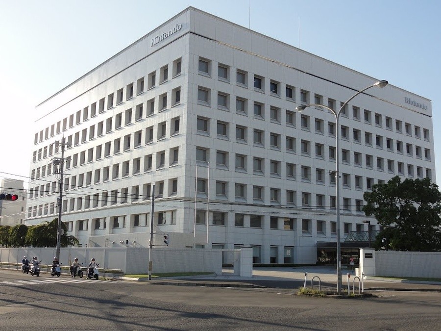
Many of us are familiar with the half beautiful, half corporate-looking appearance of Nintendo's Japanese headquarters from the outside; this huge, white, cube-like building has likely been the subject of thousands of online searches and probably the first place many of us tried when opening up Google Earth for the first time. What we don't often get to see, however, is the inside.
The latest episode of Nintendo Minute, a weekly show on Nintendo of America's official YouTube channel hosted by the very loveable Kit and Krysta, gave us a rare glimpse inside Heaven itself. Naturally, you won't get to watch Miyamoto making his morning coffee, but you do get to see both the official headquarters and Nintendo's Development Centre - the home of all the games we've come to know and love.
For us Westerners, just getting close enough to the building for a cheeky selfie is often pretty high on our bucket lists (this writer included), so having this little glimpse inside is very welcome indeed.
Have you ever been to Nintendo HQ? Do you have any stories to share? Let us know down below.
[source youtube.com]


Comments 26
I hope that Miyamoto is spending gradually less and less time in that building. Much as I love the man- it’s time to step aside.
I wonder what the canteen is like...
If it wasn't those two guys i might watch it, but would rather just keep my imagination of something similar to Willy Wonka and Chocolate factory (with computer games not chocolate)
@Bunkerneath But instead of oompa loompahs it’s a sweat-shop style production line of Toads and Goombas assembling Switches, with the Mario Overworld theme playing on an endless loop.
Wow, those reception areas are huge..... and so empty!
@FragRed
I'm... I'm WARIO!! I can't live in something like this!
Great ad.
So Nintendo HQ is a grey brick.
Not quite the Santa Claus Toy factory i always imagined.
Genuinely, there was nothing really of interest to see in either of those headquarters at all. it's not like this for example:
https://www.youtube.com/watch?v=cV3HcxiHwrY
https://www.youtube.com/watch?v=8sOtjBDPQdU
Now those are awesome workplaces.
@impurekind Here's an old one, but this one shows at least a somewhat more interesting and artsy look including Miyamoto's 90's desk: https://youtu.be/V52Fto40syM
These Nintendo Minute video's were clearly taken more restricted.
Those are thirteen minutes of my life in never getting back.
I'm sending an interest invoice.
I’m glad that I’ve seen as much of the Nintendo HQ as those two.
@Bunkerneath I don’t care for those two either.
They have two buildings like that....they are much bigger than I thought. Good for them. After being nothing but a Sega fan until the death of the Dreamcast...I still wanted to play video games, so I jumped to the company I despised in the 80's....Nintendo. Now I want Nintendo to crush Sony and Microsoft....and Apple while they're at it.
@erv Yah, not what I expected either....pretty boring.
@Mr_Zurkon Yah, they are pretty much duds.
@FragRed
really, that's a lot of wasted space...lot of dough to make a building like that...
@Slaz Well, every game company lets you set up and mess up your desk however you like, so that doesn't exactly make it stand out as a dream place to work in terms of the actual office design and stuff. From what we've seen in these videos it seems very typical of most offices and quite sterile and bland a lot of the time. I know it's not going to look like that everywhere but they're not exactly selling the place as a cool workplace.
I don’t get why everyone hates the Nintendo minute people. I love watching their show every week and I don’t find them cringy at all. Why all the hate?
To everyone disappointed, it's a Japanese corporation, what did you guys expect, comic book convention cluttered halls?
Clean, large, open spaces clad in all shades of bright white (or occasional Earth tones) with clean squared off, or curved lines is pretty much the ideal workspace for a Japanese office. Anything else would be beneath the stature of an ostensibly high profile company.
I'm sure the restricted areas are restricted in part because they have a bit more "character" (Yarn Yoshi's lining some shelves, etc.) , but even there, I imagine it's mostly uniform tables and cubes. Uniformity is king. It's Kyoto, after all. All the fun comes from in their imaginations. Which is probably why what they make is so fun.
@SimplyCinnamon53 Personally, Kit is kind of cringey in that he seems like a permanent prep school kid. Give him a cardigan and Daddy's BMW and a country club backdrop and you're golden. He's probably not at all like that, but he just seems it in the videos. Krysta is a bit more sketchy in that she comes across as this nice likable fan, but in reality she's management....social marketing manager I believe (IIRC above Kit).....so it's just really awkward watching this thing where she's kind of in character as this excited fan when she's really the management overseeing some of it... She's good in the "role" but it's a little off-putting that it's kind of a character she's playing.
So heaven is real huh...sigh.
@Wichtel: Now we know what the original Game Boy was modeled after....
@SimplyCinnamon53 That's the spirit! I've always liked them myself - I think they do a pretty good job each week.
Great and loveable guys. They should have them every week in the European News section of Nintendo Switch, as well.
I love those videos, shameless product placement and all.
@SimplyCinnamon53 I find them a bit cringy, but for me that's part of the appeal.
Square Enix - now THERE’S an HQ: https://en.m.wikipedia.org/wiki/Square_Enix
Show Comments
Leave A Comment
Hold on there, you need to login to post a comment...