Hello folks, and welcome back to another edition of Box Art Brawl.
Before we get cracking, let's see how things panned out last week, hm? We looked at Super Monkey Ball Adventure, one of several entries for the GameCube. As we'd expected, the busier, more vibrant box art from North America sealed the deal, winning a healthy 79% of the vote.
This week, we're back with the 3DS to check out Square Enix's Bravely Default, the debut title in what would become a popular, albeit still rather niche, franchise. Launched back in 2012, we've got a bit of an interesting fight on our hands this time. You see, the game originally launched in Japan as 'Bravely Default: Flying Fairy', before receiving an expanded version in 2013 called 'Bravely Default: For the Sequel'.
'Flying Fairy' has the same box art as the North American version, whereas 'For the Sequel' shares its box art with Europe. So basically, whichever variant you vote for this week, Japan wins!
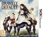
Be sure to cast your votes in the poll below; but first, let's check out the box art designs themselves.
North America / Japan
The original box art, which North America would adopt, is arguably a bit more reminiscent of Square Enix's more abstract designs typically used for classic Final Fantasy covers. It features a fairy against a black background, and Japan's variant amplifies this with its black 3DS border on the right. It's a subtle, classy design that's sure to draw the eye, and we love it.
Europe / Japan
The 'For the Sequel' design meanwhile, is equally delightful in our book. It's a lot more colourful, featuring the game's main cast of characters arranged upon a grassy hill with the logo tucked away neatly in the top left corner. Personally, we do prefer the black border featured on Japan's variant once again; it just looks cooler, y'know? Either way, this will be a tough choice.
Which region got the best Bravely Default box art? (2,038 votes)
- Flying Fairy (North America)
- For the Sequel (Europe)
Thanks for voting! We'll see you next time for another round of the Box Art Brawl.
Comments 73
Europe/Japan will probably win here, but I like the minimalist bravely boxarts.
I much prefer the minimalism of Japan, but Europe isn’t bad
Europe/Japan for me as it shows more characters, but purely aesthetically I quite like also North America/Japan.
I think this is the first time in a while where both are gorgeous, I reckon I'll cast my vote to NA this time
I like both a lot. I'm a sucker for bright colors though so I think I'm going with the European cover.
For maybe the first time ever in a Box Art Brawl, I really cannot decide! They're both amazing. I think I'm ever so slightly leaning towards the NA cover. This is going to be really close, I bet.
Both are great but I voted for Europe. One of my favorite games of all time. It has its shortcomings but I still absolutely adore it. One of the many reasons is its soundtrack which is my favorite soundtrack of all time. I'm currently waiting for Wednesday so I can try to get tickets for Revo's next concert. I wasn't able to get them from the ticket lottery that happened earlier this month. There's going to be a mix of Bravely Default, Attack on Titan and Sound Horizon music as well as some other stuff he's made over the years.
Flying Fairy's just so much more striking an image.
Also they really should've stuck with that subtitle. For the point they're making with it "Flying Fairy" works much more organically than "Where the Fairy Flies," does.
They both look good. I chose Europe/ Japan, because it reminds me of the four heroes of light theme.
This was my first 3DS game. The 3D effect in the towns was so beautiful.
Both are good… but NA is classier.
Come on NL, I’ve been tracking your polls lately and either they are bugged or rigged.
When I voted it was 50-50 with 209 votes.
At the time of this edit there’s 439 votes and there’s NO way it’s still 50-50.
I’ve seen this case where the results are not updated in at least 3 polls now. One for Zelda and the other for Pokémon where the results stayed the same from the start even after having thousands of voters later. Same thing happened. And I reported it on the 3 occasions.
So, what’s up with that? @Olliemar28
Oh... They're both looks awesome! I like that fairy on the original box art, but I also like that the 2nd box art shows more characters. Original box art is aesthetically appealing, while the 2nd one looks more traditional... I haven't played Bravely Default games, so... It was a hard choice, but my vote comes to the «For the Sequel»/2nd one. Sigh
Didn’t know Japan had two versions of Bravely Default. Agnès and crew looking cool.
Box Art Brawls rule!!!
I think North America / Japan looks better with the black spine whereas Europe / Japan looks better with the white spine
50/50 so far!
50/50 after 240 votes. Haven’t seen that before!
Btw: what does ‘for the sequel’ mean?
50/50 still at 251!
I like the colors in EU better but NA is a very well done box as well
Also those black border 3ds boxes are really cool
I'll go with North America/Japan for Bravely Default. Not too flashy but simplistic.
On Bravely defaul I like the american cover since in the QuickStart guide sheet features the other cover anyway. Bravely second is a completely different story.
@solarwolf07 @Friendly @Olliemar28 50/50 with 377 votes... that's crazy!
lol 50/50 still at 412 votes….
….are we sure this poll isn’t busted?
As someone who has never played the game, Europe/Japan appeals more because it represents what I know of the game.
I’m guessing the flying fairy is more iconic to those who have played it and know what it’s about.
Both great though.
I vastly prefer the Europe box art. I remember getting my copy here in the US back in the day and wanting that European box instead lol. Surprised it’s 50/50, but I guess they’re both nice in their own way.
Still 50/50 after 433 votes.
I went with EU/Japan for the characters on the box. The fairy is ok but tells me nothing about the game.
I like seeing Agnès and co on the cover. I do enjoy seeing the cast of characters for an RPG cover
50/50 488 votes
I went flying fairy, other one not bad
Holy *****, we’re finally at 51/49, with US in the lead.
I have always liked that the NA cover, just like the subtitle, slaps you in the face with the twist. Makes it sting a little more when you pull the box from the shelf. Also feels like something she would do as a PR move.
Ooh, this is a hard one. I ended up choosing the NA box art, just because it looks a little less generic and something about the other one just looks somehow slightly off, but I like them both.
Okay I voted EU but I've got to be honest there, US is very classy, probably better and I love it.
The thing is though, EU has Agnès front and center and my unwavering loyalty to Agnès commands that I vote for EU so there you are. Any other vote would be unacceptable.
The NA/JP version (especially the latter due to the subtitle) wins to me for being much more meaningful to the narrative.
...THIS one is hard. I really like both, but I finally went with EU/JP. Namely because it showcases all four playable characters without getting too busy. I quite like the cover with Airy the Fairy too. Especially since there's a subtle hint on it; said nod is one of the reasons why I liked Bravely Default and Bravely Second. I haven't played BD II yet.
I think it's deliberate that the NA/JP cover is reminiscent to Final Fantasy. If I recall, this series began life as a FF spinoff.
@Lizuka You can read this "Where the Fairy Flies" without the Fs.
As of my vote, 754-754, wow.
NA/Japan for me. Europe's is good looking, but also fairly generic. Could be any RPG.
Both nice boxarts.
Unfortunately I genuinely disliked Bravely Default, and neither of the sequels have convinced me to give the series another shot.
This is a hard one.
Both are great but I voted for NA/JP.
@Lizuka -FF
(IYKYK)
They’re honestly both peak Square box art (seriously, Bravely Default, Octopath, Triangle, etc… just stunning art). I voted for the Flying Fairy. It’s a more iconic image, but they’re both ridiculously good box arts.
Still 50/50! Never played the game, but the cover with the fairy always seemed very cool.
I really like both. But if I had to choose one it would be the NA/JP box art with it being more aesthetically pleasing.
As I cast my vote it sits at 50/50! Fantastic! They really are both great covers, but with this series I want to see the crew of adventurers. One vote for Europe!
North American/Japanese box art for me.
Hmm, a tricky one this week for sure. I usually prefer RPG boxarts like For The Sequel's where the party's all together in one collective image, but at the same time I almost always associate Bravely Default with the minimalistic stylings of Flying Fairy's art. Think I'm going to give the edge to NA/JP this time round but both are excellent honestly (and remind me that I really should give the series a go sometime down the line XD).
After 1000 votes still 50/50!
I don’t think I’ve seen such a close brawl yet. Awesome!
I'm going North America because it reminds me of the classic Final Fantasy boxarts. Love how the Bravely series is an homage to that series so makes sense the boxarts would be like that.
@Lizuka I agree with the subtitle.
I say North America/Japan!
I also chose NA, but I had expected EU to be ahead. Surprised it’s so close! Only NL knows which one is winning by a couple votes… 👀
wow, 50/50 at over 1200 votes. I'm thinking there should be an option on these box art battles for
"I like each version equally."
For a moment, with it 50/50 at 1231 votes, I was the deciding vote. But that's in the past now.
I voted for Japan!!!
Seriously, I chose Europe. I think the NA cover is pretty good, but I think the Euro version accomplishes more as a cover. It appeals to me more. I like the slight low perspective looking up at the four stylish people who just look like they're adventurers.
@TotalHenshin You can see how many voted on each by hovering over the percent bar.
After my vote (1,298 ) still split down the middle. I’ll be back to see how this unfolds.
50/50 at 1,310 votes!
50/50 at 1333 votes, damn!
I like both designs, but i love seeing the main characters at the front. They look really cool and, along with the job system, it's the most memorable part of the game. mgrgrgrgr
Never seen box arts that are so different yet both so good.
I think I instinctively went with the fairy, as that's the one I recognize, but who am I kidding it was probably because the striking pose is pleasing to my eyes.
The European art feels more telling that it's an RPG, though!
They are both really bad but at least the US one doesn't have a girl crotch in my face
Still 50/50 when I just voted for Europe/Japan (For The Sequel), never seen this before! 😮☺️
Wow I had never seen one of these go so perfectly 50% 50%
It’s impressive really.
Most exciting Box Art Brawl ever? It seems like my difficulty in choosing a favorite is in sync with the community as a whole!
This one is tough.
The US cover is definitely weebier than the EU cover but it is also more characterful and unique, stands out a bit more.
Though I do detest that flying pest.
Saddened that Square and Silicon Studio didn't manage to re-capture tha magic with the sequels, never really spoke to me like the original.
Especially not the music, the OG had a sublime soundtrack.
Even the third entry fell flat in spite of getting Revo back to compose, shame.
@IceEarthGuard Can't hover on mobile though.
Woah... it's currently at 50/50 with 1670 votes.
@IceEarthGuard Oh interesting. I pretty much exclusively peruse NL via my phone, but good to know!
Nah, I’ve gotten to the conclusion that NL’s polls are super bugged…. I came here with 200 votes and it was 50/50 …. There’s NO way nothing moved after 1,000 votes… and it’s not the first time
And it’s impossible that not even a 1% has moved
Theyre both perfect
Let’s be honest here, this poll is 50/50 only because this is a European platform…
Tricky one to decide. Both equally good. The NA/Japan one looks better because of the cool art with the wings but I went for the Euro/Japan and cause of more character models.
I'm surprised it's 50/50, the colourful, characterful Europe one is much better.
Woah, an exact even split with 1750 votes!
I like the water color coloring in the international cover, the art of Airy is nice in the other one but the black background with no depth or gradiant of any kind makes it fell a bit flat in my eyes.
I love that this is a tie as of Monday morning 9:30am est. They're both amazing. I went with the North American / Japan one. There is something engaging about it, and I could imagine it being a poster on my wall as a kid.
Box Art Brawls Current Total:
Europe: 78
Japan: 75
North America: 89
Australia and New Zealand: 1
@Yoshif3 I know it seems odd, but here's the thing: 50/50 is no less likely than any other specific outcome you could bet on, like 62/38 or 71/29. It's just more noticeable. In fact it's more likely in a case like this, where both options seem to be equally popular. This is why voting is important. OK, not so much here, but in elections, absolutely. Candidates have won or lost by a single vote before, and it will happen again. YOUR vote matters! OK, civics lesson over. : )
@Olliemar28 I have a feeling the black "3DS" logo on the Japanese art was a ratings thing. In Japan, I think Nintendo liked to contrast games with a "D" rating, at least. But maybe "C" as well?
Leave A Comment
Hold on there, you need to login to post a comment...