Hey everyone, welcome to another edition of Box Art Brawl!
Last time, we took a look at Mario Party Advance for the GBA (fittingly). There were only two different covers to take in, but it was the North American/European design that walked away with the gold, taking 63% of the vote and leaving Japan's rectangular variant with the remaining 37%.
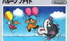
This week, we're throwing it back to the '80s as we take a look at Balloon Fight for the NES. Developed by Nintendo and HAL Laboratories, this airborne arcade game launched on the NES in 1985 and would later fly over to a handful of other Nintendo consoles including the GBA, the 3DS/Wii U Virtual Console and NSO. Heck, it even makes a prominent appearance in Nintendo World Championships: NES Edition.
There are three covers to choose between this week, so pump up those balloons and let's drift into it.
Be sure to cast your votes in the poll below; but first, let's check out the box art designs themselves.
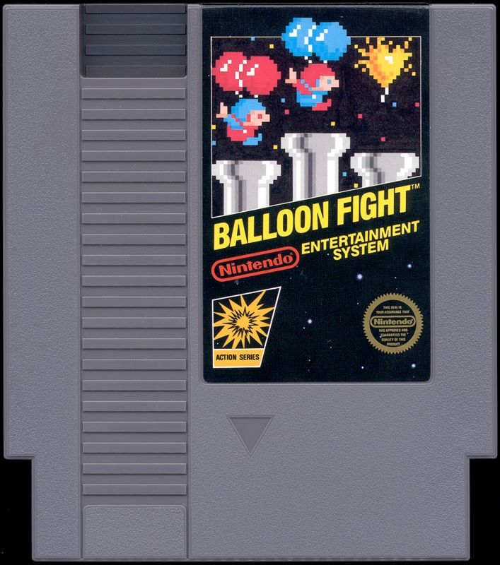
North America
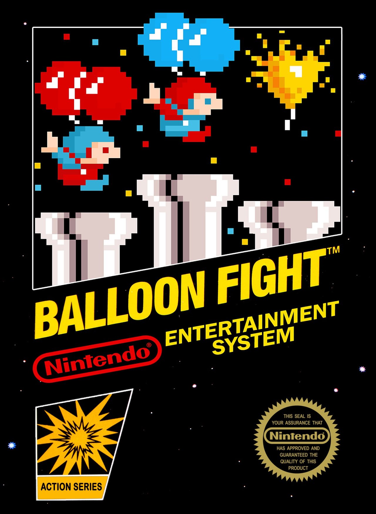
We have to give it to the North American box art, that is one iconic design. Pitted against the NES-staple black background, our pixel art pair floats over a trio of pipes as a separate balloon pops in front of them. It's pared-back, yes, but it tells you everything you need to know about the game at a glance.
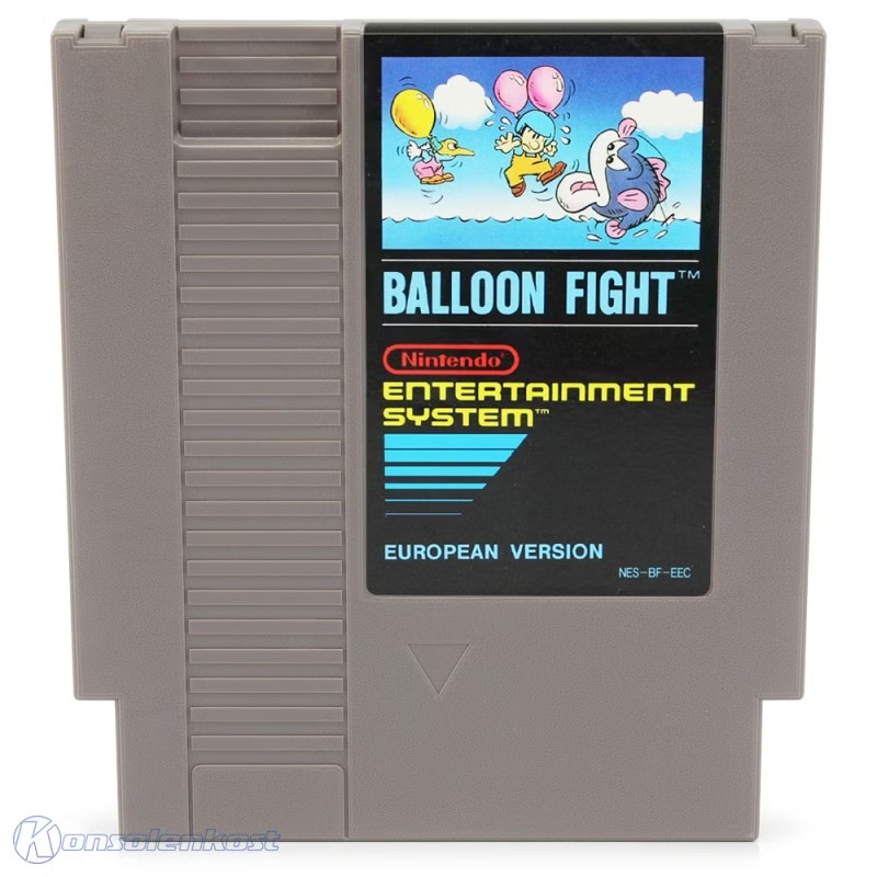
Europe
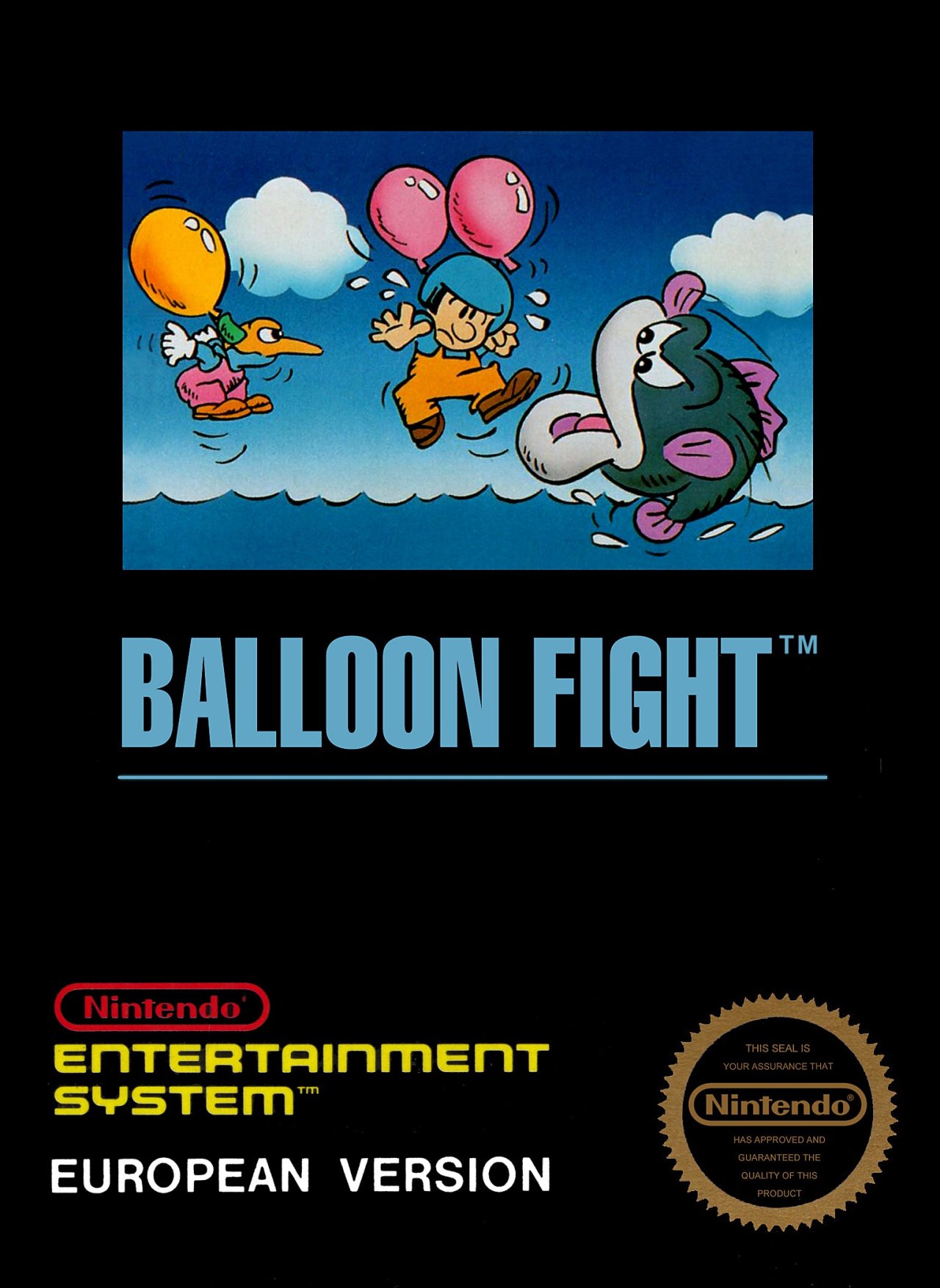
The European design retains the black background that adorned many-a NES game (albeit with horizontal text rather than NA's cool diagonal slant), but the pixel art is replaced with something far more detailed. A sharp-beaked bird, an open ocean and an angry-looking fish? Now this sells the peril.
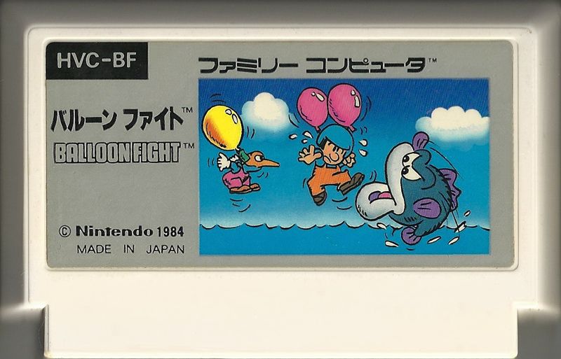
Japan
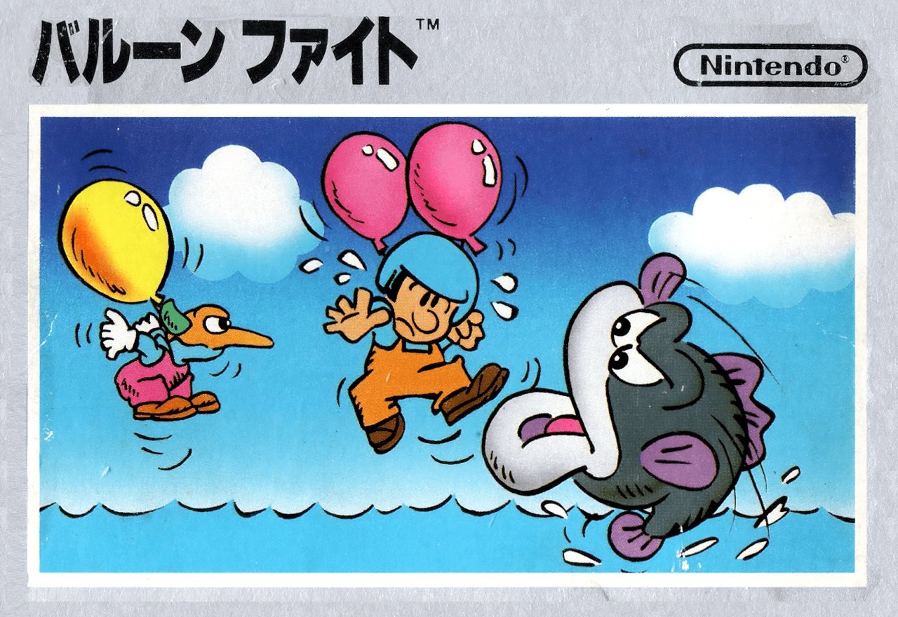
And for those who wanted an even better look at that art, the Japanese design puts it front and centre. There's no distracting black background to be seen here (a thinner grey border isn't the end of the world), just a man, his balloons, and the endless threats of the open ocean.


Thanks for voting! We'll see you next time for another round of Box Art Brawl.


Comments 41
Please stop calling it the European version when that one only released in parts of Europe. The box art you chose to represent the US box art is literally a European one (the Seal of Approval is round instead of the US oval).
Anyhoo, nostalgia wins for me here. "US" one it is.
Definitely inclined to go Europe here, kind of mixes the best parts of both of the others.
I prefer the Japanese one.
Very clean box art for its time.
@JimNorman The term is ‘pared-back’, not “paired-back”.
I like that the next frame in the art(JP&EU) would be of the dude getting chomped to bits by a big fish.
Japan for me (immediately followed by "Europe" since it has the same artwork, but personally I've never been a fan of the black boxes) because it shows the contents of the game just like the North American box art - even more so arguably since it shows an enemy and the infamous fish instead of a second player - and does so with a simple but still pretty cool artwork instead of just in-game sprites!
I prefer the Japanese one.
The European one almost reads like a 1980s movie poster to me, with the original art framed by thick black borders and simple yet impactful text treatment.
@valtianeea
Welcome to NintendoLife! I am playing Visions of Mana now and I love your avatar. What a great Mana game.
I choose Japan, because I prefer their cassette-like boxes and it looks nice.
The Japanese box at least makes the game look vaguely funnish, but I don't harbour a tremendous deal of nostalgia for NES games.
Europe and Japan are essentially the same, but might end up splitting the vote for 2nd and 3rd. ☹️
@Jhena Thank you! So glad to hear you're playing Visions of Mana. It is indeed very good, and sadly way overlooked and underrated.
Japan for me, I'd probably have chosen North America if they had a regular level and not a bonus stage.
Cartridge art
North America
Europe
Japan
Bonus
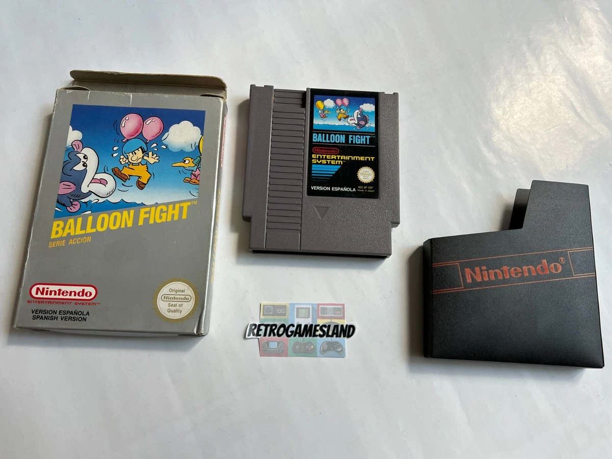
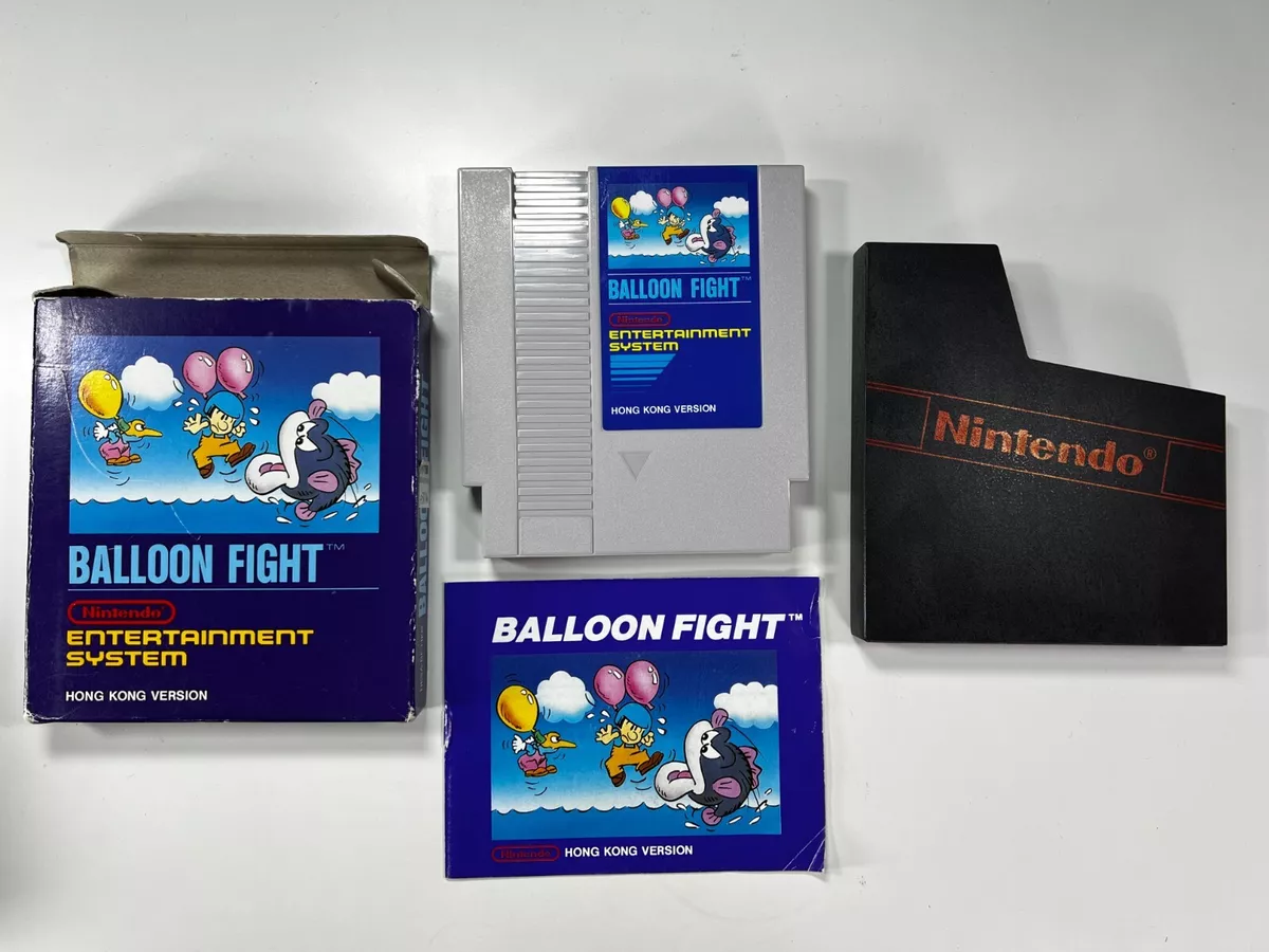
Apparently there are at least 2 other covers of the NES version
Spain (with the art flipped on the box and a gray border)
Hong Kong (essentially the European version with a dark blue border instead of black and a light gray cartridge)
Too much nostalgia for me with this one. North America all the way ..
Have to go with NA this time. I also like the JP cover, but the colours really pop on the NA one so that's why it gets my vote.
EU is litteraly the best of both worlds.
Europe. It has the superior Japanese art with the classic black border and background. Exquisite simplicity. Fantastic.
@Daniel36 It doesn't look like that method, circle vs. oval, can be applied to these early games. There are many images out there showing early US boxes with the circular seal logos.
@sdelfin Okay, fair enough. Didn't know early games had circular everywhere.
But I've seen a fair few box art brawls where we, the Netherlands, got the same box as the US ones, and never the "European" ones.
If I see a black-box game in one of these polls, there's a 99.999 percent chance I'm voting for a different option. I don't think they have very good design, much of that coming from the blown up pixel art. That applies here. I think the European cover is not a good use of the available space. So Japan wins for me!
Why was last week skipped?
@valtianeea
I hope it will be coming to switch 2.
I always thought it weird that they try so hard to make this series a non nintendo thing. Legend of Mana? Didn't work. Dawn of Mana? Didn't work either. And now this.
Meanwhile we're getting the spinoffs and the remakes and of course the remakes and ports still to this day work really well on nintendo platforms. It seems to me they've been targeting the wrong audience this whole time.
@Daniel36 You're definitely right that there were sub-variations of the boxes within Europe. I just wanted to correct that one thing as Nintendo was still refining their US box designs. I think there's a bit of editorial discretion that applies with these for the sake of making a better poll/brawl when it comes to selecting the European boxes.
In doing a quick check on this one, it looks like the Scandinavian box was also the pixel graphics like the US box.
@sdelfin Dutch were too. I do not know why certain countries have different bixes, or which ones and why. Seems like nobody has done research on it.
@mlt
I agree.
Visions of Mana would have sold much better on Switch than on PS4/5. However, the game is so technically demanding, it'd never run on Switch. Maybe they should have waited to release it until the Switch 2. If they made it a launch title for that system, it might have been much bigger.
But maybe it still will. I see no reason why Square Enix wouldn't port it to Switch 2. If this ends up being a launch title, who knows how big it might become?
I like all versions of it, but I voted for the Japanese one. The illustration is very cute.
I like Europe best
NA for me. I remember playing this game every weekend at my friend's house.
See. This is what first past the post brings. The European and Japanese box are almost identical. Yet by splitting the votes between them the NA version wins.
Honestly, ive never been super nostalgic with Nintendo (Sega kid) but i did always like their black border backgrounds. So obviously, I went with the US release.
It's hard to beat the American black box design.
I like the font on the EU version. So wonderfully overdramatic for the conceit of the game.
I almost always prefer the Famicom cover art to the NA black box art, but not this time. The Famicom art isn't that great, and the blue/red/yellow font and graphics really pop with the black background.
@Daniel36
Different headquarters and/or publishers, i am not sure how many exited.
You can see it with Pokemon, the german and french Headquarters wanted to make own names for Pokemon, meanwhile those for spain and italy did not.
Box Art Brawls Current Total:
Europe: 85
Japan: 83
North America: 100
Australia and New Zealand: 1
I'm not the biggest fan of the simple sprite work on box arts, and the European one wastes way too much space. Japan wins clearly here for me.
@Azuris Yep, that makes sense historically. German, French, Spanish and Italian were often language options aside English.
Guess no research was needed. ^_^
@sdelfin Incorrect. My family owned this when I was a kid (I'm Swedish) and we did indeed have the European artwork
@ITAFTRS First of all, thank you for the correction. I saw a listing for the game showing the pixel art that was stated to be Norway and/or Scandinavian. I don't know if Norway got a different box from Sweden. It's also possible the listing I saw was just totally wrong. Looking further into it, it appears it may have been the French box.
I've always preferred the pixel art on the boxes of NES games. Really let you know what you were getting before you were getting it.
Do really like the official artwork though, but I prefer the NA Box Art. Worked on my family because they picked it out along with the NES in the 80s!
Never liking those pixel covers. They are pointless as the back shows actual screenshots, and they just look corny.
Leave A Comment
Hold on there, you need to login to post a comment...