The first Castle Conqueror game was one that we definitely felt comfortable recommending. It mixed cutesy aesthetics with fast and addictive gameplay, and while seasoned RTS veterans no doubt found the game a little too simplified, the amount of fun it offered was difficult to resist.
Its sequel, Castle Conqueror — Revolution, feels like a direct and specific response to the first game. It seeks to correct and redefine the Castle Conqueror experience, and that's both a good and a bad thing.
For those who didn't play the first game, you take control of an army that occupies a certain number of structures at the beginning of each level, and desires to occupy them all. The concept couldn't be simpler, and the execution was designed to match. Simple sweeps of the stylus sent invading armies or reinforcements wherever you sent them, and the controls worked very well for what they needed to do.
That was, more or less, the entire game. What we liked was its replayability, its deceptively deep challenge, and its charm. Revolution attempts to add a few new layers to that onion, but it succeeds more in complicating the game than in improving it.
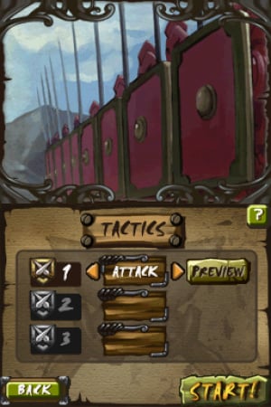
The changes to the gameplay are largely — but not exclusively — down to the amount of customisation available. Rather than soldiers simply following your stylus around the battlefield, you can now also hold down the stylus for an increasingly focused attack, or draw a circle around a fortification in order to "target" something. Additionally you can change the number of soldiers in each squadron, change their default priorities, manage their morale, capture different soldier types from neutral factions and...

...well, you can see how this would get complicated. And while complication in itself isn't a bad thing, coming so closely on the heels of a game that flourished by its gleeful simplicity, it's difficult not to see this as a step backward. Rather than being engaged in battle after battle, you'll find a good deal of your time spent navigating menus between skirmishes. Even a simple "retry" of a failed mission requires the navigation of three separate interim screens, and that's something that used to be instantaneous.
The complications don't add much to the gameplay, and they seem to try to appeal to every type of gamer at once. Those who prefer simplicity, however, won't be pleased at having to navigate so many screens just to play their game, and those who prefer complexity will correctly see these options as a token pandering in their direction, rather than providing any real, rewarding evolution of the strategy in the original game.
There's also a reduction in the number of missions available per campaign, from ten to six, with a hidden seventh. This mean's the original game's already-steep difficulty curve has just spiked even further, which is probably not going to win any new converts.
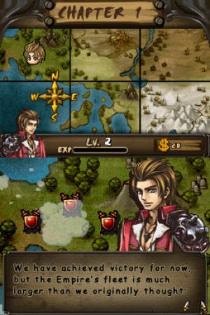
And should we discuss the elephant in the room? Of course we should. The change in visual design is perhaps this game's most glaring misstep. The original game had a cute, quirky art style that blended extremely well with the simplified nature of the battles. It gave the game a great deal of its personality, and the adorable between-battle illustrations were reward enough in themselves to keep playing. Here, though, the visual style is far more generic. In an attempt to appear less kid-friendly, we suppose, the game just appears less friendly, period. Whatever "feel" Castle Conqueror was attempting the first time around has been totally disregarded here, and that does not serve the series well.

However, with all of that being said, there is one great, important thing we can say about this game: it's still, overall, just as fun as its predecessor.
The mistakes Revolution makes are many, but they're pretty minor when you consider that the game itself is still just as fun, addictive and challenging as ever. It's lost its visual flair, its default simplicity and a good deal of its style, but it's still a very good game at heart, and if you can stand clicking through a few more menus and suffering through its drearily charmless visual design, you'll find a game worth playing. The only real difference is that in the previous game, you didn't need to dig nearly as deeply to find the gold.
Conclusion
Castle Conqueror — Revolution feels like change for change's sake. Much of what worked in the previous game has been retooled here, often with disappointing results, but the core experience hasn't changed. Those in search of a fast and fun RTS to carry in their pockets are well-served by this release, but we'd be remiss if we didn't point them toward the original Castle Conqueror instead, which offered the same experience in a much cleaner, and cheerier, package.


Comments 9
I was looking forward to this game. Meh, I'll just get TwinBee...
Hmmmm, might have to try this one out then. Great review Phil!
Thanks for the review Philip. I was interested in getting this game but I think that I'll just try out the first one instead. I do agree about the art style. The first game has a nice charming look to it while this one looks plain and generic. Oh well. Maybe their next game, Castle Conqueror Heroes will be an improvement over this one.
taking my time i got to chapter 3 in 3 hours (just beat level 3-1)
if the first game (50 maps can be beat in 5 hours) this game has to be harder...
Still tempted to buy the first one but someone really needs to tell me WHY i should buy the first one if i already have this one and 5 hours seems VERY SHORT for the first one... Tempted to buy the first one if someone could talk me into it .
graphics on this game remind me of the art of Fire Emblem:
I thought the first one was extremely fun game! It gets really tough at the end even with all the perk upgrades. You really have to be fast and almost not try to take over to much at once otherwise the computer will over run your forces way to easily. I will give this one a spin based solely on the first game. I forced my way through the first one in basically one day. Fun times.
Still tempted to buy the first one but someone really needs to tell me WHY i should buy the first one if i already have this one
Personally I think this is a case of either/or. I see little need for anyone to own both, unless they loved one so much that they were just dying for more. I'd recommend the first over this one, but that's due to the small stuff mentioned in the review. They're both a lot of fun.
5 hours seems VERY SHORT for the first one
The first one gave me a lot more than 5 hours' worth of fun, and I still play it so I'm not through with it yet. Your mileage may vary though.
What other games on the Dsiwere service right now would match something like this the longer the better (even cart based games)
wow once you start buying the upgrades the game gets very easy... took me around 5 hours to beat the first 3 chapters.. blew right though chapter 4 in less then 30 mins
EDIT .... WOW just wow ...
so i thought what is another 5 bucks to toss away if im enjoyin this game i might as well put 5 bucks into the first one since people are saying the first one was a little better.... HUH?
First minor complaint there is no in game clock in the first game compair to one in the 2nd (i like to know how long i played to see if i got my money worth)
2nd the AI on the first one compair to the second one seems STUPID .. map 1-1 on the first game the ai dont come out for like 5 seconds compair to the 2nd game they are out when the game starts..
3rd. there are no star ratings telling you how hard these maps are (minor complaint) at least in part 2 you know what maps are going to be hard before you even attack
4th.. there is no detail of what the cards even do in the 2nd one it tells you what the cards do in the game
5... LAck of items to buy (biggest complaint ) FIrst game 10 items second game 24 items to buy meaning more grinding
6.. people in your army First game they start at 5 second game start at 10... (minor grip)
and finally
Graphics... first one is too cartoonie looking , i love the graphics on the 2nd one a lot more ....
first one your red AI is blue Well some of the unclaimed towers are red as well so you have no clue why your not moving until you see you only control the towers that are RED with a STAR
Overall of the little i played 20 mins on the first one map 1-5 5 hours on the 2nd one Chapter 5-2
First game i would give it 4 out of 10 (too easy) lack of items to buy and the AI just seems stupid
Second game I would give it 7 out of 10 ... more items to buy and the games AI seems better...
so in closing i would say BUY the 2nd one if you dont have either .. first one is just too cartoonie looking and the AI seems very stupid
I will be first in line to buy Castle Conqueror - Heroes BUT sadly if the rate of these games come out that game will never see the light of day till summer 2012 or later probally
(since part 1 came out sept 2010, Part 2 Oct 2011)... hopefully sooner or i can find some sort of cart based game or other games like this
@slidecage The first one does start out really easy. However it get brutal towards the end. Also I found the girls story in the first is much harder. Yes the first doesn't have a lot of thing the second does but that's what makes it first. Room for improvement. I have gotten much further in the second one and am racking up the cash. I really have only used the first set of troops so I can maximize my money. Yes both are easy but I'm guessing hard mode is just that really hard. I enjoyed the first one a lot and its not to long so I would recommend at least playing to the end. If its the AI your worried about they get tougher as the game goes on.
thanks ..yea i like both of them and hopefully the next one doesnt take a year to come out. they are better then most stuff i downloaded on the ds
Show Comments
Leave A Comment
Hold on there, you need to login to post a comment...