Welcome to another edition of Box Art Brawl!
In last week's brawl, we checked out Mario Golf for the Game Boy Color, pitting the Western Design against the rather quirky effort from Japan. In the end, Japan won the vote at 72% - well done!
This week, we're moving onto the Nintendo DS with Super Scribblenauts from WB Games and Konami (Japan). Released in 2010, it carried on the original game's premise of allowing you to create a vast array of objects to solve puzzles by simply writing them out.
We've got three distinct cover designs here, so without further ado, let's get cracking.
Be sure to cast your votes in the poll below; but first, let's check out the box art designs themselves.
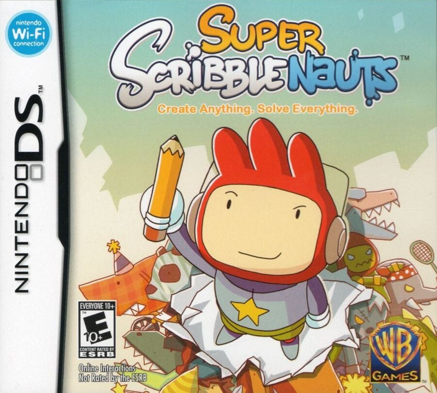
North America

There's a lovely almost-sunset kind of vibe going on with North America's background, while the game's protagonist, Maxwell, is showcased front and centre, wielding the mighty pencil up in the air. It's also made to look as though he's bursting through the paper display itself, which is a nice little touch.
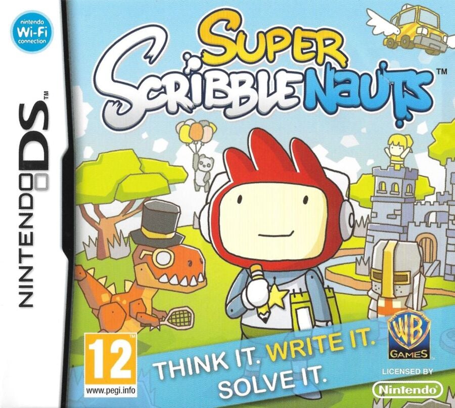
Europe

Europe's design is quite similar, though the colours are simultaneously brighter and yet more muted, somehow. Maxwell is also situated directly within the game's world, with various characters making up the image's background. Also, there's a flying car. Nice.
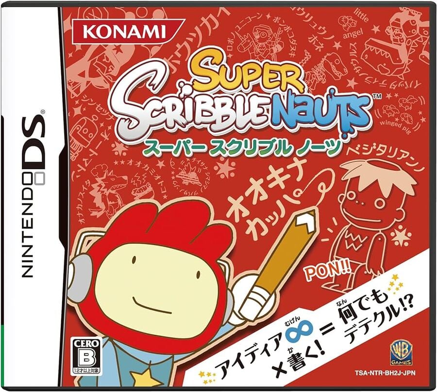
Japan

Japan's design takes on a more abstract approach, showcasing Maxwell in the bottom left corner against a red background filled with doodles. It makes sense given the overall premise of the title, and it's certainly a bold, eye-catching design.
Which region got the best Super Scribblenauts box art? (1,380 votes)
- North America

- Europe

- Japan

Thanks for voting! We'll see you next time for another round of the Box Art Brawl.


Comments 36
Definitely have to go North America on this one. It's the best both in terms of layout and art quality.
I think Europe looks nicest, but NA is a lot more creative, and the difference is small enough for me to go NA here.
The color tone of NA is best. It's close though. But not with Japan, that one is awful.
If I played Scribblenauts and asked myself how it can be topped, I think Europe’s fancy tennis playing dinosaur does a great job of showing how goofy verbs and adjectives can change the game. It also just looks wicked.
I actually really like the Japan one with the schematics/sketch book kinda vibe.
I don’t know why everything is angry on the US one and the heroic pose is overdone but it’s not bad. Europe is cute but just a fairly standard scene, again not bad.
Japan is trying something different and it might not work for everyone but I respect it for that.
The US art for me this week. EU is similar quality, but the banner at the bottom takes away some points (plus, the "bursting through the paper" on the US art gives it a few points).
The Japanese one is inspired and arguably more "arty" than the other two, but has perhaps a bit too much text.
Japanese box wins, because it gives a sense of what the game can do.
I'm undoubtedly going for Japan, ironically by having more words on it it shows instead of just telling what the game is about!
Europe has a T-Rex in a top hat. Instant win
PAL one for me this week. It looks closer to the actual gameplay, and in case of Super Scribblenauts, I like it. Sigh I would like to try to play Scribblenauts Remix again, but I can't redownload it.
Dude got kirbyfied in the US cover
Europe's is not bad, but that blue strip is too big and takes away from the cover art. I get that it helps explain what the game is about, but I think they could have and should have included that message in a less intrusive way. I don't know if I'd pick the European cover without that, but it would be a closer race. This week, the NA is the easy winner for me. The perspective is really nice, as is the concept of Max busting through the paper. Plus the pencil is funny looking.
Not to leave the third cover out, Japan's cover is also there.
NA for me, the “think it write it solve it” on the European one ruined for me, hate slogans on covers. The japanese didn’t even stand a chance.
@Poodlestargenerica Color tone is wholly dependent on the quality of the picture NL has chosen, so shouldn't be taken into account.
I like Europe's best. It looks like it is drawn without being touched up afterwards. NA is too clean in that respect. Japan's is boring... again... they don't really do cover art too well, many times.
One of my favourite games ever. I have such good memories of this.
I went with North America this time for the reasons other comments outlined. Europe's is good but is messed up a little by the text up front. This is one of the few cases where Japan's is awful.
shame on anyone who voted against upper class dinosaur.
Not going to lie, I really would have dug the Japanese title with English over the different objects. Really explains what the game is about in mind.
Japan's dominant red is great
Wow, I didn't realise it ever came out in Japan! That must have taken forever to get working, seeing as the writing systems are so different
Gonna have to go with Europe here. Definitely captures the essence of the game best, what with the dinosaur and the car, and there’s something about Maxwell taking in the sights of the game world that gets to me.
It's close but Euro for me , nicer layout than the American cover which is a tad messy around his feet plus the unnecessary attitude face just loses it for me.
Box Art Brawls Current Total:
Europe: 74
Japan: 70
North America: 85
Australia and New Zealand: 1
First of all, I really love this game! It’s a lot of fun! That being said, after having played it for many hours, I think the European box clearly communicates what this game is about with literal art from the game in the foreground and background. So that’s my pick! Plus I think it is the cutest.
I think the Japan one would have been better with a blue background because it could've looked like a blueprint and Maxwell's head wouldn't blend into the background.
Scribblenauts deserved better than it got. It went from a million-seller DS classic that players raved about, to completely dried up and forgotten a decade later. You can often find loose copies being sold cheap in eBay lots of shovelware games, alongside its brilliant cousin, Drawn to Life: The Next Chapter. A darn tragedy, 'tis.
Ha. Adored this game. European one for me actually. The NA one background "characters" are a little too IN the background. Easy to ignore when glancing at boxart
So now I am wondering if I can create a kappa in the NA version.
I'm voting for the North American art work this weekend
Great game. Must have to play with young ones.
Partial to NA, personally.
Also, these games are a great way to help kids with words/spelling.
Happy 10 year 4 month and 1 day anniversary of Nintendo Life publishing my review of this game
@Daniel36 Yeah their picture is a weird scan, but I looked it up and still think it's better by a tiny bit.
NA easily, but I quite like the Japanese one too (which looks similar to WarioWare: DIY).
North america is the more balanced..
anyway the japanese slogan is about the same as the NA one (write everyting,...).. bonus point form using the infinity symbol
EU easily as it shows how you can alter nouns in fun ways. That’s what the game is about. US cover is ok but generic.
Show Comments
Leave A Comment
Hold on there, you need to login to post a comment...