We are back, back, back for another edition Box Art Brawl!
Last time we matched up three regional covers for the DS' Super Scribblenauts and it was North America's character-focused design that walked away with the win, receiving 55% of the vote. Europe followed in second with 33% while the Japanese variant brought up the rear with 12%.
This time, we're heading back into the sewers as we match up two different covers for Konami's totally bodacious SNES fighter, Teenage Mutant Ninja Turtles: Tournament Fighters ('Teenage Mutant Hero Turtles' for those in Europe and 'TMNT: Mutant Warriors' in Japan — yep, it's confusing). Released on the SNES in 1993, this was one of a trio of games that Konami developed for the NES, SNES and Genesis respectively, each with their own unique story and characters. You can check out all versions on the brilliant Cowabunga Collection, we might add.
Subscribe to Nintendo Life on YouTube841k
With Europe and North America sharing almost identical covers this time (aside from the title change, obvs) we have ourselves a good old-fashioned head-to-head with the spicy Japanese design. Let's check them out.
Be sure to cast your votes in the poll below; but first, let's check out the box art designs themselves.
North America / Europe
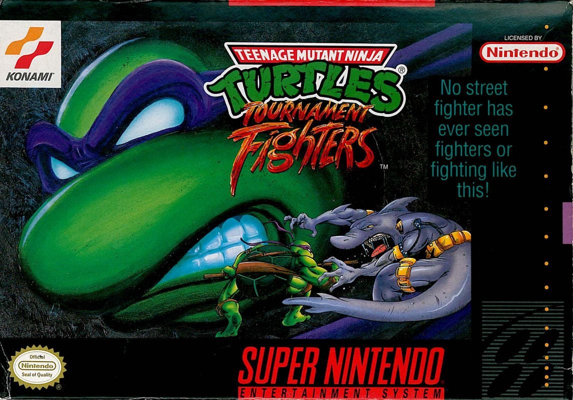
It's gritty. It's dark. It has surprisingly little focus on actual fighting. This cover is dominated by a grimacing Donatello in the background as a much smaller sprite faces off against Armaggon in the bottom right (the NES and Genesis versions had a similar format but with different match-ups — Leo vs. Hothead on NES and Raph vs. Triceraton on Genesis, if you're wondering). It's all pretty nice, though that slogan of "No street fighter has ever seen fighters or fighting like this" could do with an edit.
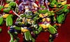
Japan
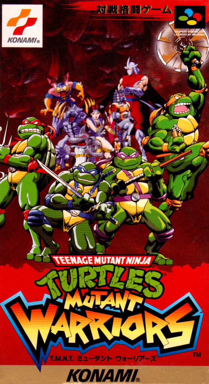
Japan's design goes for something completely different. The dark tones are here replaced by vibrant reds as the four Turtles stand front and centre while a collection of their enemies lurk menacingly behind them. It might lack some of the grit of the former cover, but we like how eye-catching this one is and it's interesting to see the Turtles looking like their 2003 animated counterparts a decade earlier.
Thanks for voting! We'll see you next time for another round of the Box Art Brawl.


Comments 38
The Japanese one is pretty awesome. And that line on the US/Europe one is dire. "No street fighter has ever seen fighting or fighters like this. Or streets like this. And these streets fight. Real street fighters. Or fighting streets. The likes of which no street fighter has ever seen."
I love easy votes like this. Japan looks vibrant and cool. Very fitting for a fighting game cover.
Japan actually shows all four turtles, and some others in the backgrounds. And for a fighting game, showing the roster is the way to go.
Also there was really no need to take a jab at Street Fighter in the US/EU tagline. I guess attitudes were different back then, with rival devs always trying to one-up each other... feels so petty lol.
I actually like the JP one over the NA/EU one, because it reminds me a bit of a retro anime. I've always been fond of the retro anime art style, so for me, there was only one choice here. And speaking of the retro anime art style, I wish we would get more modern anime done in that style. That's not to say that some anime today doesn't look beautiful, but there's a unique charm to the retro style that is sadly missing from many anime today.
The tagline on the US/EU cover is one of the most unintentionally funny lines ever written. It's so bad! 😂
You must be joking if you didn't vote Japan this week!
Japan by a country mile. A lot more going on in a good way in the cover art. A boxart that would make "a decent wall poster" for that time.
@Woderwick Ah yes, Fighting Streets. The sequel to Fighting Street.
...wait.
https://www.youtube.com/watch?v=VnFb4Stc7CI
Wow İ did not expect this game here. İ had this game when İ was a child. My father buyed this game for me. İ and my father have played together this game a lot many hours.
İ liked this game.
İ think it is a good and fun game.
İt is a fighting game like Street Fighter 2 not a adventure game.
There was 1 or 2 Ninja Turtles games but that was a adventure game on the Super Nintendo.
While I dislike the red and the logo, the art on the JP one is amazing. The US one is just... dull.
I respect everybody’s opinion but if you voted for the American one you should be sent to the gulag post haste
I really like the cleanness of the NA box, and I love the SNES layout as a whole, but the Japanese one just does more justice to the actual game. It does border on being too busy, as was the case for most Japanese cover art.
the common japanese approach of "lets draw every character posing as a blob" doesn't do it for me the way it seems to for y'all. boring!
(i also have hardcore "blockbuster nostalgia" for the NA art, sue me 😆)
When scrolling down obviously you see EU/NA first and I thought that was a nice cover......yeah Japan for me as well! Looks more like a comic cover than anything else. Easy week.
Not Japan. The way the artist has drawn the bottom of the turtles shells has me concerned. The shell extends too far down and, particularly in Raphael’s case, you can observe that the shell curves under. This indicates the two halves of his shell are fused. Normally a port would be there to allow for a tail to exit, among other things.
What i am trying to say here is we have turtles with no tail who probably have no discernible way to, and excuse my outrageous breach of etiquette, but they have no way to spend a penny.
Awash in their own shells!
North America.
I really dislike both covers, but I dislike the Japanese one less.
Leonardo and Donatello have thongs in the JP one
I gotta go with the Japanese artwork.
Super cool that the SNES, NES and Genesis had different matchups for the NA/EUR cover art. The quote is poetry.
Box Art Brawls rule!!!
Wow. Man, I never know how this is going to go. I'm almost always with the minority, and I'm surprised every time.
As much as I appreciate the actual fighting on the North American/European box art I have to go for the Japanese one since it shows more characters, including all the Turtles first and foremost, other than being cooler aesthetically.
The Japanese one is awful. So busy
Neither of these are great, but Japan wins just by having all 4 Turtles at least. The art still isn't great and why blur out the rest of the line up? I understand they're in the background....but it's supposed to be enticing, not photo accurate effects on a drawn picture of mutant turtles.
Don't know why NA isn't doing better. Yeah the slogan is pretty stupid, but it really just looks better.
Neither are very good.
Not a fan with the blurriness with the background for the Japan box. But I chose it anyways due to having more characters on the front.
I am extremely nostalgic for NA but it got completely blown out by JP on this one
Don't really like either to be honest. Donatello's giant head takes up way too much visual real estate in the NA one, and I don't like how all the characters behind the turtles are out of focus in the JP one.
Japan’s is far less interesting and far more by the books. Even with the line that trips over itself, NA/E easily. Which means it will get crushed. Although I do like Japan’s font.
Despite the blurry characters in the background, I gotta go with Japan.
Both covers are flawed. For the Japanese cover, I am not fond of the focus effect that has the background characters blurred. However, the layout and art style are vastly superior. The turtles look very nice.
The western cover is a mess. It's a terrible layout for a box cover. The dynamic match up between Donatello and Shark+guy+thing is tiny and not posed for a cover shot. The giant disembodied head is also a poor concept. As for the tag line, let's just say that game enthusiasts have never seen cynical marketing or pandering like this.
Japan by a mile.
Box Art Brawls Current Total:
Europe: 74
Japan: 71
North America: 85
Australia and New Zealand: 1
That Japanese cover is so much better than what we got in the west. I also love the name Mutant Warriors. This one is easy.
Japan once again going for the all-character-front-facing action pose, but despite its lack of imagination, it’s still better than the NA/EU design.
I like the simplicity of the western cover.
The Japanese variant is far superior in this instance, at least to my eyes. And it seems an overwhelming majority of voters agree. This was a fun vote though!
The NA and EU covers should not have been lumped together for this one. The european version have those iconic Konami silver boxes that they used for a lot of their NES and SNES titles, which makes the EU box superior over the NA box
I had this game as a kid and I really loved it back then. I even prefered it to Street Fighter and Mortal Kombat. I haven’t played it for probably 25 years tho, so I don’t know if it holds up today 🐢
@Tayrailbridge "how do you even do that?!?"
I'm not sure what method they used or what was possible at the time, but one way to do it would be to use a multi-plane camera system like they used for cel animation. It's how they achieve a parallax effect. You'd have the images at separate levels with the foreground image on a clear animation cel. You could position the background layer so that it would be out of focus while the foreground one is in focus. Then you'd photograph that and end up with a composite image.
Show Comments
Leave A Comment
Hold on there, you need to login to post a comment...