Hello one and all, and welcome to another edition of Box Art Brawl!
Taking a look at last week's procedings, the lovely Trace Memory went head-to-head as North America took on Europe and Japan. The former won the vote with a respectable 58%, so well done North America!
Moving on to this week, we've got Viewtiful Joe 2 entering the ring. The second (and sadly, final) mainline entry in Capcom's franchise landed in 2004 but sadly didn't set the world on fire. Weak sales turned Capcom away from the franchise and we've yet to receive a third game to this day (though Kamiya really wants to make one, apparently).
We've got different designs from North America, Europe, and Japan this week; a full three-way brawl, so let's get cracking!
Be sure to cast your votes in the poll below; but first, let's check out the box art designs themselves.
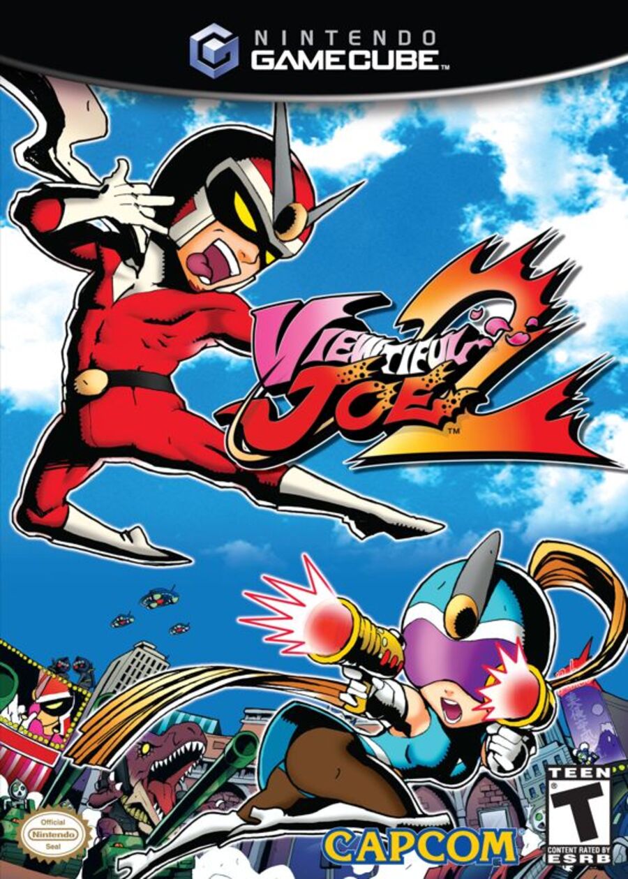
North America

The North American design is somehow more action-packed than the others, with Viewtiful Joe and Sexy Sylvia (yes, that's her actual name) leaping into the fray against a beautiful blue sky in the background. It's a colourful image and really sells us on the general premise of the game. Good stuff!
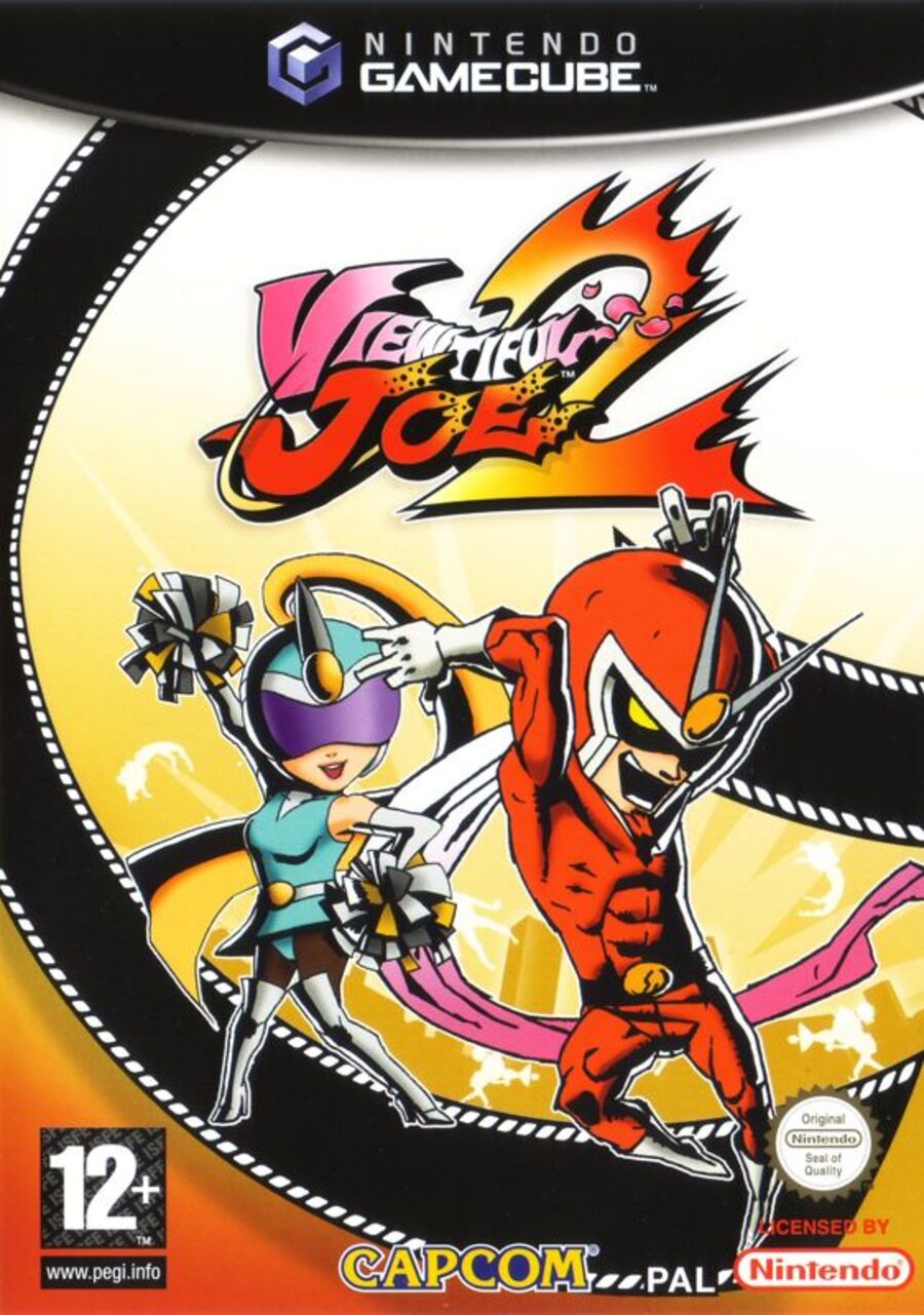
Europe

Europe's approach, meanwhile, is a tad more abstract. We've got the two protagonists striking seriously cool poses once again, with a film reel floating around in in the background. The overall colour choice here is similar to the first game in Europe (unless you wound up with the pink variant), so it's a nice continuation.
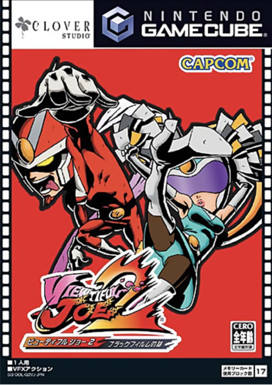
Japan

Japan's is perhaps even more abstract, and showcases a heavy black outline around the two characters. We've got a film reel border along the sides of the box in a similar approach to the first game, and the use of red here is visually very striking. We like it!
Thanks for voting! We'll see you next time for another round of the Box Art Brawl.


Comments 43
JP one for me this week. Joe's goatee better seen on this one.
Can’t see his goatee on the US one (at least it’s there but blends seamlessly into his neck shadow)
Im with NA. It's so alive and fun.
What kind of weird pose is going on with EU?
European one looks least... vulgar
absolutely not the brightest moment of studio Clover though
@Princess_Lilly Where is the vulgar? Joes tongue sticking out?
A series that needs to make a comeback
North America. T-rex.
Way prefer the NA cover. Sylvia looks cool as she is attacking and no crotch shot or cheerleader pose. While Sylvia does have cheerleader themed powers and is even wonder cheerleader in w101, the NA cover highlights that she fights as well which is great.
@Quiet2down upskirts
North America for me because it has the most evident action pose and also an actual background.
@Friendly I hope that's a joke if not. Sigh...this era...
One of the rare occasions where my vote goes to north america.
None of the 3 are great of bad but NA is the most ok IMHO.
I think I'll give it to Europe because I like the background the most and I really don't like this series' character design.
I think NA takes it, it has the most dynamic poses, and I like the blue sky with the city scape in the BG. Europe feels oddly static and flat, whereas Japan is just kind of cluttered.
Can't say I'm very fond of any of them, but NA this time. The dinosaur helps the case lol.
I never really got into the anime for this franchise. I had no clue there were games then. No GameCube anyway.
I went for Europe for having the least (but not none) upskirts. And I do like the swish of film reel in the background.
NA
classic Joe pose
hottest Sylvia
more details
colorful
People keep using the word 'upskirt' but I don't think they realise that's just how Silvia's outfit is designed. The dress skirt thing isn't meant to cover her hips.
She's not called Sexy Silvia for nothing!
Anyways, going with NA this time. It's got one of my fav Viewtiful Joe poses, Silvia looking cool and a decent background. Only thing it's missing a movie/camera reel reference or something.
@Tyranexx The games were on PS2 and Gamecube. They came before the anime.
Rare North American win
@DDFawfulGuy No need to explain. Peeps nowadays are so obsessed with purifying the world that silly stuff like this is enough for them to find something to be offended about.
Definitely going with the US art this week. Gives a good sense of the action & gives a good indication of the colorful world they inhabit.
Out of the other two, I'd give Japan the edge, with EU at the bottom. While they take similar approaches, the poses & shading on the JPN art really pop & add a level of dynamism lacking in the EU effort.
I thought the NA cover was kinda risqué, but then I saw the JP one... those were different times, indeed.
Though I love the facial expression on the JP one, NA is by far the coolest.
I love the JP and NA covers... not so much the EU one. Alas, Red Hot Kick + Sylvia with guns wins out
For me, the Japanese cover is the worst. There's no background. Joe's pose is......weird. Joe and Sylvia are jumbled together and it lacks visual clarity in terms of composition. Europe's is better, but Joe's pose is....weird. For me, NA is easily the best. The background is nice. I like the composition the most. And I like the poses for both characters, especially Sylvia.
Gotta go,NA on this one I absolutely love the look with the characters and the cityscape behind them. Always wanted to play these games. Come on Capcom port it already heheheh
I can’t decide which part of the NA cover I like best:
Sylvia’s up-skirt
-or-
Joe’s bulging package
🤣
@Princess_Lilly
Guess you shouldn't visit European Museums with Classical and Renaissance Art
To the Topic, i like them all, i take US because i like the Color Blue.
@Vexx234 The Viewtiful Joe games seem fondly remembered by many. Sadly, I didn't have easy access to a PS2 back then either. I would like to try them sometime, but I don't think that'll happen unless they get ported in some way.
Definitely the us version probably because joe’s and Sylvia’s poses are pretty cool looking. Also can we get some remakes on the switch please (or any console nowadays?).
They need to "Reboot" this Franchise or an Indie DEV needs to make a similar game. This IS SUCH AN AMAZING SET OF GAMES, I played them when they first came out in late highschool/early College. The gameplay is amazing but the artwork was also a masterpiece of the time.
The NA one shows them in action AND looking viewtiful, so that gets my vote. All of them are nice to me at least.
NA for me because the background is really good. Also I should really try the Viewtiful Joe games, I have them, but I never got to try the games out yet lol.
@LikelySatan is that the tank’s cannon or does the T -Rex have something in its pocket?
Box Art Brawls Current Total:
Europe: 68
Japan: 68
North America: 77
Australia and New Zealand: 1
NA. There's a larger number of interesting things going on in the boxart.
@DDFawfulGuy no I get that but there’s the angle where you just see how that’s her costume is and it’s no big deal and there there’s the poses that really focus on the ‘look at her butt/panties’ which just feel a bit too much for me.
One is a little bit of fun pushing the boundaries and adding to her character, the others feel a bit more pervy and objectifying, less about building her as a character and more just making her something to be viewed. At least that’s how I perceive it, and I don’t think of myself a prude.
@Ogbert
Man, you're so close, yet so far.
An object to be 'viewed? It's literally called VIEWtiful Joe.
She's literally called Sexy Silvia. She's meant to be viewed.
If you can't see Silvia as a character that's meant to be sexy and a cool gunslinging heroine at the same time, I think that's a you problem honestly.
Granted, the JP version looks like it's trying to be an upskirt and is clearly provocative, so I understand if that's not to everyone's taste. But a major theme of the games is having a 'beautiful view' of the characters as they do ridiculously cool poses as they beat up bad guys. If it's not for you, that's fine. But to me it's about the same as Bayonetta does her own sexy poses as summons demons and beats up angels and the like.
Basically, being ridiculously sexy to the point of being comical and being an object are two different things.
@Ogbert Those are not panties. See that's the problem with some of the comments here. You are finding vulgarity where there is none.
What she is wearing is called spankies. Her costume is that of a cheerleader, and spankies is something cheerleaders wear everyday on the field. If it were actual panties, I doubt football would be allowed to air on public television where millions of families gather to watch every season.
The game was rated "T" for teens. I highly doubt stores would've allowed boxart featuring a woman panties aimed at kids to sit on their shelves.
Agree with everyone that says there is nothing pervy about this. I went NA because the action looks intense. It shows Sylvia as an action person that is doing damage, and not just eye candy. I have no problem with her being eye candy. I do not see where we have gotten to a point in society that violence is fine, but finding someone attractive is bad. haha
This one is easily the North American variant. The blue sky background really pops in this one, and add so much to the art style.
Leave A Comment
Hold on there, you need to login to post a comment...