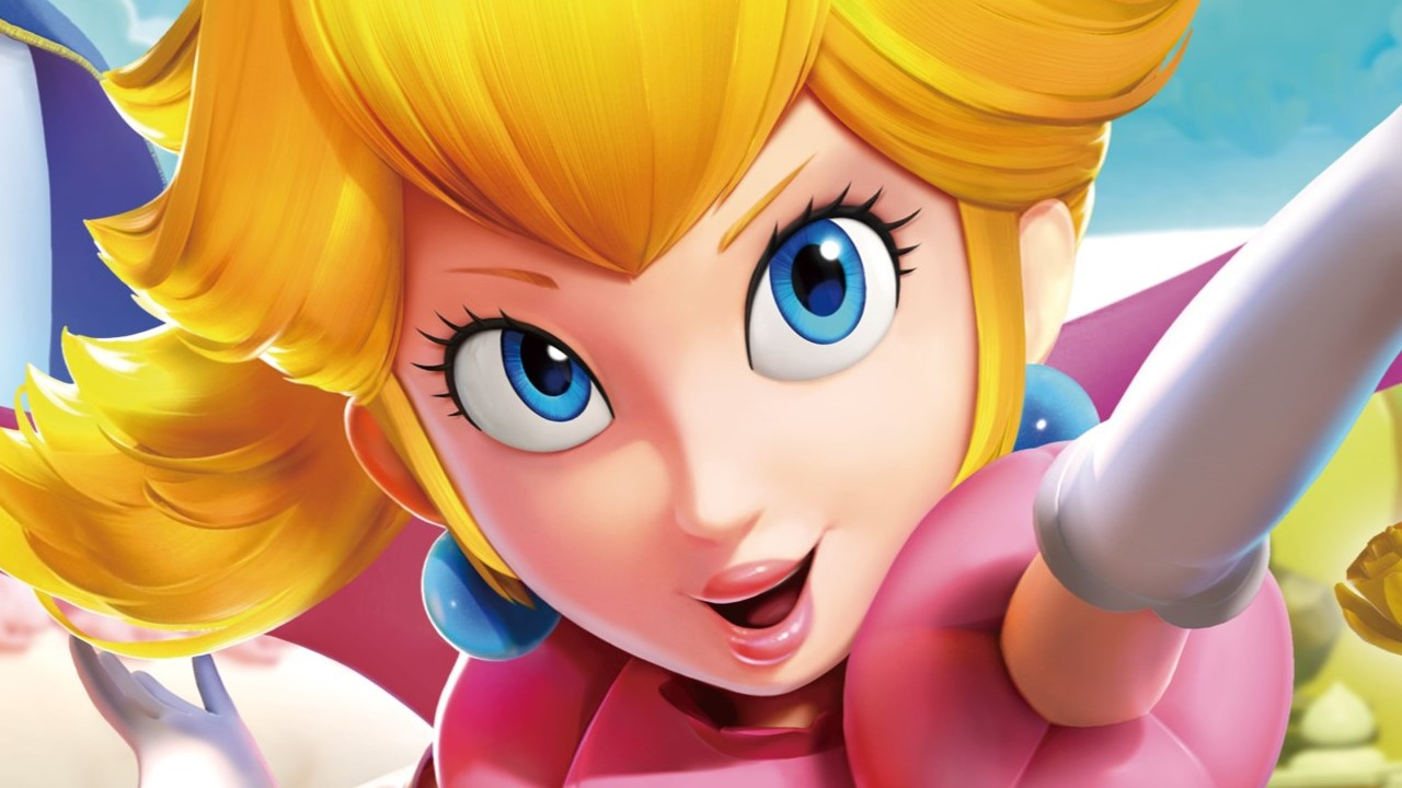
The upcoming Princess Peach: Showtime! will put the Mushroom Kingdom monarch centre stage and it seems Nintendo is still busy tweaking elements of her presentation ahead of her March 2024 premiere, including making some changes to the previously-revealed key art for the game.
As spotted by No Context Super Mario on Twitter, it seems the princess has gotten a minor makeover to make her look less surprised and a little more...hmm, we're not sure exactly what that look is. See what you think:
Determined? Sultry? Just found a fiver in her pocket? Whatever that look is, it's not quite the 'Angry-eye Kirby' phenomenon where Western covers of Kirby games would give the pink ball a miffed expression to make him look a bit tougher. For one thing, this key art facial tweak seems to apply across all territories.
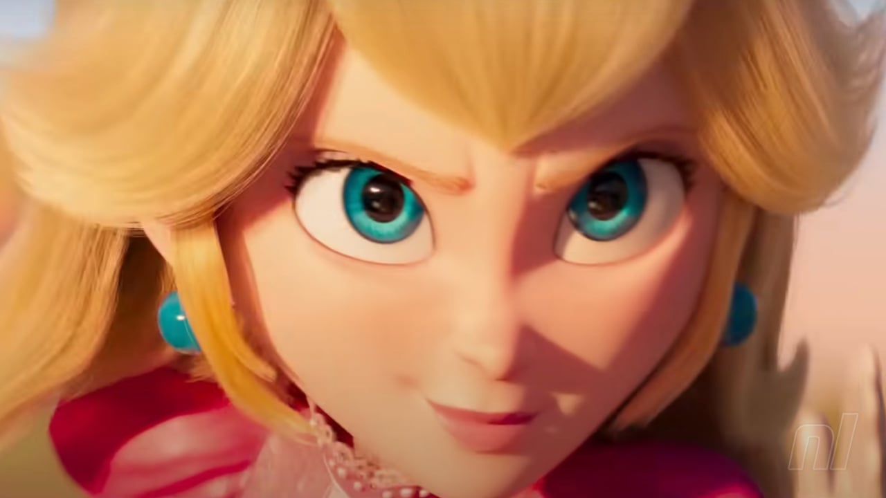
In fact, Peach now arguably looks a little closer to her Super Mario Bros. Movie counterpart. Observe Movie Peach:
While the front-and-centre Peach isn't angry, Kung Fu Peach to her right has definitely been tweaked in the traditional Kirby manner. Here you can check out the changes to the official box art:
Flipping quickly between the two makes it easier to notice some other minor compositional changes to the overall layout:
An improvement? A travesty? Total and utter indifference? Let us know which Peach you prefer in the poll and comments below.
Which version of the Princess Peach: Showtime key art do you like best? (3,266 votes)
- OG for me
- The tweaked version is better
- Meh, they're pretty much the same


Comments 139
I like it. It gives off someone seriously committed to their role vibes.
is Nintendo trying to make Peach look like her movie version?(it seens so)
I’m okay with it. I like the princess peach design in the movie. Felt more lively and less doe-eyed.
I can't really decide honestly. I like the tweaked version more. It makes Peach look very expressive.
The CG renders have looking so samey for the longest time that this is refreshing, too bad this didn’t happen to Wonder where all its renders and box are don’t reflect the actual art style of the game.
A bit more ‘tude and an asymmetrical smile
The tweaked version is better as it shows Peach's emotions - no, not à la Super Princess Peach - better... but I'm still a fan of Peach's classic look, too!
I definitely prefer the new expression for Kung Fu Peach over the old one
The tweaked version definitely holds a little more intrigue, if only for the fact that the greater variety of facial expressions pulls you into the role of each costume a little more.
In the first one she’s wearing the same inoffensively vacant peachy expression across most pictures. In the tweaked version, she looks more actively engaged in each activity.
At the very least, I certainly wouldn’t want to mess with Neo Kung Fu Peach.
I see they learnt some lessons from Illumination on how to make garbage ass character designs
MUCH better than the sterile look that she (and the other Mario characters) have been encumbered with for years now. I hope it's permanent.
Adds more personality to it. Which Peach lacks a lot of in the games.
Nintendo... as many already said in the past, if you want an aggressive princess with an attitude you got Daisy that is just begging to get more roles in games, even just as a co-star with Peach.
Peach is a super bubbly happy go lucky girl, no need to "Daisify" her.
While I prefer the new expression for Kung-fu Peach, I miss vanilla Peach's old joyful expression. It fits the Peach I've come to know much better, especially since she's not playing any particular role in her original form.
While it didn't bother me at the time, I'm worried that Peach's portrayal in the movie will cause her to gradually stray further from her established demeanour in the games, especially when we have another princess, Daisy, who fits the bill of more active and assertive princess already.
Makes her look a bit more realistic, so a good change.
@BakaKnight I don't see as her having an attitude though. It's just making her seem more expressive which in turn translates that the game is a big adventure starring peach. It's more "this is gonna be epic."
Mario throughout the years has had a variety of expression on his covert art. Some similar to this tweaked version, yet you don't get "This is an edgy dude with a bad attitude" when you see him.
Peach should be allowed to have various expressive faces without a negative stigma attached.
Love the change for the expressions for the background art (kung-fu), but updating the main art on the front to look more in line with the Movie Peach? Ewww. No thanks.
It was a bad enough design in the film that didn't work (for stills at least), but you don't need to litter your main games with illuminations tripe Nintendo.
I understand them capitalising on the success of the film, but this makes little sense when the in game peach model doesn't look like that.
Bit weird to change the expression to be similar to the movie version of Peach when the game is very clearly using the regular Peach design we've had for ages now but it looks fine enough. I suppose it'll all depend on whether you like how Peach looks in the Mario Movie though (I'm personally kind of indifferent towards it).
She looks less like a sex doll now, which could have been the point of changing it.
Really looking forward to this game. I love those quirky spinoffs like Captain Toad or this, AS LONG as Nintendo makes them in-house. The outsourced stuff has been okay at best. Latest Yoshi, Luigi‘s Mansion 2/3, the Princess Peach DS game, Yoshi‘s Island 2… all quite meh.
looks bad. looks like a regular person, which every AAA game these days attempts to do. So it looks generic, when they had something original.
Absolutely prefer this more confident facial expression. Not even close.
@Nintendo_Thumb lmao this is the first time I've ever seen Peach's design called "original". She's built top to bottom out of tropes.
"...the princess has gotten a minor makeover to make her look less surprised and a little more...hmm, we're not sure exactly what that look is."
I know what I'd call it. Better.
"where Western covers of Kirby games would give the pink ball a miffed expression"
I think you mean North American covers. Pretty certain Europe was also classed as "Western" the last time I checked.
Anyway, yeah, looks fine.
The original has her mouth hanging open and her eyes more goo goo eyed if you get what I'm saying. I like the new look better. Peach is saying she's tired of baking cakes for mario and being a helpless damsel. It's time to kick butt!
I mean I loved her movie design, so I see this as an absolute win! She just a lot looks less static in the updated one.
@Nintendo_Thumb She indeed looks like person, not a fantasy of a damsel in distress. This is indeed an improvement.
Not sure if I like either cover more than the other, but there’s no denying the tweaked version is much more expressive.
Hmm, I like the change expression for the kung fu Peach but I prefer the OG look for the one in the center. Not too much of a big deal for me regardless, still getting the game.
I like the newer version better. She does look like the movie version, not really an issue for me. OG is not too bad, there’s something about the newer one I like better.
ill be impressed any moment nintendo takes the time to render a faces just a liiiil bit diff, rather than the stockphoto face they all do. plus the new one fits the perspective better
Both are great. Maybe the new one is a slight upgrade, but the OG one is very consistent with her look throughout ages
Even though the new design arguably looks better, I kinda got used to the weird lipstick Peach so now to me it loses something of her character.
Kinda hate the new one but it’s not something that I care much about lol
Edit: I do like the new kung-fu face, that’s a lot more expressive.
I like both. Anyway... Can't wait to play this game, it's actually my second most-anticipated on Switch after Super Mario Bros. Wonder.
Nintendo gives Princess Peach a facial, lol
@RasandeRose 💀
I’m split. I’d keep Peach’s OG face for her normal Princess form but keep her hilarious kung fu face. Not surprising that a Peach game would get the Kirby treatment, even in this day and age. I’m not convinced Peach’s game portrayal would ever come close to her movie one though. I hope not.
@NinjaNicky my thought exactly
Woah! Yeah I definitely think they're retrofitting her to match the movie. But it's so different. Peach has a really unique look, and it's been that way for a long time. Now they're making her look more realistic, sort of. More idealistically realistic. Like an Instagram filter. Seems like they're trying to appeal to people's more natural understanding and attraction to the human face. Not a fan at all, mostly philosophically.
@Frogspree lol
@Nintendo_Thumb word.
ugh. no. the original is Peach. the tweak is "movie Peach." I liked that movie, but that version of Peach was the worst part. oh well, I was already 50/50 on this game. if they lean too much into the movie version it might slide me off.
@sanderev She's not a fantasy of a damsel in distress, she's been captured by bowser so many times now that you associate the two because that's how it's been for so many years. If she looked like anyone else, that's what people would think a damsel in distress looks like. You can't get kidnapped that many times without people associating your face with "damsel in distress".
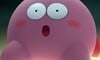
Reminds me of Japanese Kirby vs American Kirby.
new looks ugly, not as cute
Prefer new for the kung-fu Peach expression, but prefer old for the central Peach expression. I want to see Peach become more proactive and assertive going forward since she was the poster girl for the outdated "damsel in distress" trope but I hope they don't do a complete 180 and change her to become 'generic girlboss who needs no man #2876' that's prevalent in modern Western media, especially considering they LITERALLY already have a princess (Daisy who practically everyone loves and from a fandom perspective has always been more loved than Peach) that fits that mold.
flashbacks to Kirby: Squeak Squad boxart
I'm digging the Angry Kung Fu Peach for some reason.
@dartmonkey Does this count as this week's boxart brawl or just a bonus? 😆
Movie Peach is what I got out of this since movie Peach had all this 'tude, so marketing is driving this. I'm either or on this, but it does make me wonder how she will look going forward. On a side note, the characters in Super Mario Bros. Wonder have a "different" look as well but I can't put a finger on it yet...
As you guys mentioned it looks like her movie counterpart, which is good IMO.
The tweaked version looks more like a Disney princess now though I do agree it also looks like her movie counterpart.
To be honest, I thought they'd portray Peach like this from now on.
However, I voted for the original look.
I just hope they bring back Peach's bum, as seen in Mario Football for GameCube...
Kung Fu Peach looks ready to break faces.
Love it!
Peach has a whole: “underestimate me at your peril….” vibe going on. She’s the sole, adult ruler of an entire nation. The vacant stare being her main look was always weird, but the current look doesn’t make her less socially feminine (never understood the school of thought that clothes, hairstyles or personality make a female less feminine…no girl comes out the womb wearing a pink tutu y’all especially when all of those standards change over time). She still likes pink and baking cakes. And if she was still a DID the entire game would be her calling Mario to handle things for her.
WHAT THE HECK DID THEY DO TO HER FACE!? Did they hit her with the ugly stick!? She was totally fine! Everyone liked the original box art! Why change it!? Why did they give her the Dream Works face!? Was this to make the game appeal to a male demographic?? Please tell me this is only the North American box art so I can print out some other region's box art and put it on the game instead...
Yeah, I like it - it's in keeping with the Wonder art where they're leaning into actually having the characters make expressive faces and not just look like posable dolls
@Nintendo_Thumb She looked like every Disney princess ever created. Just look at a comparison of Disney princesses. (Which is why they originally made her look like that)
Now she actually looks like a normal human. Honestly, I never really liked the way they (Nintendo) made her look. So, for me at least, this is an improvement.
She looks fierce with her new facial expression.

The tweaks go really well with the new art style that Wonder brings in. Consider it a series-wide refresh.
Her OG face automatically reminds me of her gutless damsel-in-distress persona. If she is going to be a main character that fights back, I like it that her eyes show more confidence
She always had a dumb expression on her face, including on the original version of this box art. Now she looks like a human.
Really good change. Peach is like the most generic princess ever, anything to give her a bit more character is great in my book.
@MeloMan Ha, a cheeky Thursday bonus.
Movie Peach has just enough attitude to be interesting. I’m in favor of taking inspiration from that.
I love it! My only issue is I fan’s imagine the icon Peach “Yay,” or “Woohoo” coming from that face😅 Hardly a complaint though.
She just looks more determined; ready to get rough and tumble with some bad grapes! This definitely represents what the game is better as it highlights a sense of conflict.
While I don't find this to be a dealbreaker or anything, the change was unnecessary imo, minor or not, and I’m writing this as someone who do like Peach’s movie design.
It's better. Actually, Kung-Fu Peach looks way better on the newer cover.
Actual personality for the girl. Never thought I'd see the day.
I like the new one a lot more, much more expressive.
@VideoGameBoy Exactly. It's an Americanisation because of the movie and Peach's personality was just fine as it was.
Not every female character needs to be an extrovert or a "girl boss" Being kind, sweet and shy is also a personality. I would prefer her as a reluctant hero to something closer to what we got in the movie.
The movie made her a cliche like every other modern Pixar or Disney Princess.
Happy Peach is 100% better (just like happy Kirby)
The center face is not an improvement, I hate her movie design. Kung Fu Peach has been improved, the fierce expression matches the action.
I don't understand all the pearl clutching about how she's finally being given a personality, not a damsel in distress, etc. Those critiques have been outdated for decades now. Peach has been shown to be competent, brave and self-possessed since at least Mario RPG in 1996. You could argue Mario 2, but that wasn't meant to be a Mario game at all. Since 96 we've also had her Paper Mario appearances, Smash Bros Melee, Super Princess Peach, the twist at the end of Mario Odyssey and many other examples where she doesn't simply default to a helpless spectator or prize to be won. She's still girly, sure, but not portrayed as a useless airhead. She's been only a part-time damsel in distress at most for a long time now. I'd hate to see her become yet another copy-paste yass kween stereotype when she's already carved out her niche as a capable protagonist over the decades.
But most likely this is just goofy marketing logic, the assumption that fierce sells ala Kirby's American box art, and not a genuine change to the character's portrayal.
They just gave her the dreamworks face lmao. Prefer the original but its not that big of a deal.
What a weird change, the original one seemed to fit the tone of the game better based on the trailers, the new one seem to try to make her look like illumination Peach.
OG is better. It's classic and the character's identity. You can't change that.
You change it, and it's no longer Peach, it's a different character.
The argument that she needs a "fierce face" to work falls flat when we've had the character function in action games like Smash Bros. or the Olympic Games countless times.
But I must say, it's the fact that they went and changed it that really irks me, this means, like, even the designers didn't want to make it like that but were told to change it late.
She looks awesome!
I like OG better for the front-and-center Peach, but I actually like the updated facial expression on Martial Arts Peach
I just want her to be cute and innocent, looks and personality.
Updated looks less doll like and less gormless (lol) , so better.
OG is so much better for me the other one is ugly Princess Peach OG one is so cute and beautiful.
For me I prefer the First one for Princess Peach but prefer the second one for the martial arts one.
Meh... I just hope, that the counterpart of Peach from the film will not influence the game version too much. Peach from the film was actually the most boring character for me, because she was just a generic modern action girl.
The 1st one is way better 2nd one looks awful my lord looks look like the crappy art style from illumination
They pulled a Kirby and made her slightly more angry! 0.0
I love it! Way more expressive and less like a creepy blow-up doll how she usually looks!
After reading these comments, I wonder when did everything become so extreme? It's always either or.
Why can't Peach be both? Being fierce or a girl boss doesn't erase her girly girl traits at all. I just wonder why does she have to be one or the other?
I just don't see this angry look people are talking about. The same look you see can also be applied to people who simply look confident. Here to me she simply looks confident and ready to save the day.
I like the new face. Peach needed a bit more expression for her new role in the spotlights. The original face is a bit doll-like and that makes it harder to do subtle emotions. I have nothing against the original face but I won't really miss it either if this is their new take on the princess.
"Nintendo gives Princess Peach a new facial"
Nice
@Clyde_Radcliffe Exactly! I liked Peach because her kind, sweet, girly personality. It reminded me of myself! She was always my favourite. It's not like she was a pathetic girl who was helpless, she could fight and stuff too. Saying that girls have to be masculine or give up feminine characteristics in order to be powerful is actually kind of a bad message. I was excited for the game because I wanted to go on adventure as someone I related to
... May I remind people that we are talking about a design change in a videogame cover, we don't know her personality in the game yet aside from the trailer. People here assuming that she is somehow less feminine because of this feel off to me because the game is not even out and what we've seen until now just look like Peach to me.
And It feels so weird to me to see people saying that Peach has been "emmasculated" somehow because they decided to change her face in a cover art. In fact, this "trend" of people calling women character designs in videogames "too masculine" and "ugly" feels wrong to me in so many ways. Like... look at Peach in this new cover art and tell me with a straight face that she is ugly somehow, same with her design in the movie. I don't even see this change as a way to make it more "masculine", just the typical make a character look determined in the box art that is as old as time.
Fun fact too, Peach character design changed multiple times. Just saying for some people here that consider the mere fact of Nintendo changing their characters is a cardinal sin. Same with Mario, that also had multiple slight design changes over the years.
Mario fans becoming just like Sonic fans, getting into meaningless debates over minor differences in 3D models and voice actors.
"...BUT WHY, THOUGH?"
Anyways, I liked the original better.
Nothing wrong with the "tweaked" one and I liked it for what it is, but I prefer her "movie" look to stay separate from the game universe.
Still interested in the game, though, and I still liked the movie.
I mean, I don't really care one way or the other. Its a facial expression on a boxart for crying out loud. But if I had to pick one, I'd probably go with the new one, and this is coming from someone that hated Peach's portrayal in the Mario movie. And I'm not even a "girlboss hater" I like girlbosses in the right context. But they cranked that sh*t up to 11 and it was almost like a parody of itself. It was my only real gripe with the movie, I liked it a lot otherwise. But anyway, I think this new face is fine. She looks way less like a blowup doll as many others have pointed out
The old one all the way. Peach should be happy-go-lucky.
I'm surprised the reception is so positive. I think it looks very obviously like a quick sloppy photoshop that is incongruous with any other depiction of Peach in this.
She looks more human.
@SykoMuffin Yeah, this facial change is because a select few people have a problem with Peach in general. They can't outright say it because it will really cause a storm but by making a subtle change like this they can slowly make changes that won't cause a massive backlash. Luckily the game is likely to remain how it was originally intended and if enough people speak up now about this in places where Nintendo can hear them then they will figure it's not worth the trouble to split up an audience over such a small detail in the future.
@jowe_gv
Some people can spot the "movie face" a mile a way and this new poster reeks of it. Not a lot of people liked Peach in the movie, for most she was the worst part.
@GooseLoose1 It's not about her being both, the "girl boss" personality in most media is simply unlikable.
@Noxide what are you talking about? What even are your sources? YouTube comment sections?
What is even so wrong about movie Peach? That she wears pants in a scene? Is that what makes her a "girl boss"?
@jowe_gv
The term "Girl Boss" can mean a lot of different things for people but for me it comes down to the way they act so smug, snarky and how the writers make sure the audience knows she "won" every single conversation. In the movie it was at it's worst when Peach and Mario were walking out to go see the Kongs and she goes "They're all counting on us.. No pressure!". Like why? We know she cares deeply about the toads, that's the big central pillar of her character and what the movie is hanging multiple emotional moments on later, so why make her so smarmy about this? Why not have her just say something sincerely? Mario and Luigi are sincere from the beginning to end and they come across better in the film as a result. You don't even have to change any of Peaches actions but instead change her dialogue to be sincere, sweet and a tad cheeky and Peach becomes more recognizable.
Sorry for that rant but those were the issues in the Mario movie for why people thought Peach was out of character and acting like a "girl boss", so to use that facial expression tied to that portrayal of her in the film has people worried for the future.
The redesign looks like it has more "attitude", which I'm really not a fan of. Can't some characters just be nice?
I prefer her old look, but I would like her to look more expressive like in the new changes. Still much prefer her original face and character, just give her normal look more expression instead, no?
@Noxide ...it's a joke. Like... that phrase was literally a joke. The trailer that showed that phrase even did the whole "epic speech with music in the background that gets cut in the end with a joke" using this exact phrase.
You yourself said that she has actual motivations and emotional moments in the movie so the issue is that she is "too snarky" at some points? Is that all that it takes ? Like, maybe you are overexaggerating a little bit? A character being a girl, snarky and capable is enough to be a "girlboss" and therefore bad?
Removed - inappropriate; user is banned
https://tvtropes.org/pmwiki/pmwiki.php/Main/DreamworksFace
LOL, peoples getting upset / disappointed for Princess Peach have confident / fierce face.
You are not open minded to accept the slightly changes that doesn't even change the Princess Peach persona.
In my opinion, Princess Peach look better to have some confident and able to kick some butts of enemies rather than being helpless damsel in distress all the time.
@Noxide
I personally prefer Princess Peach have confident in her action and her speech like a Boss according from the movie version rather than being helpless damsel in distress all the time like game version.
And I personally already bored and tired with helpless Peach who get kidnapped all the time.
Now, she can kick some butts and I would like to see fierce Princess Peach like this for the next games.
@Noxide After reading your comments, you are the exact thing Im talking about is wrong. Everything is on a extreme spectrum.
Showing a little attitude or confidence? Oh snap she's a man hating masculine female who's rough around the edges.
This is what I mean by taking something minor, and running away with it. People are doing the same with this box art. A slight change to her facial appearance, and suddenly Peach is a whole new personality. She's no longer a sweet princess, but some hyper masculine dudette.
I don't why people keep jumping to the most extreme conclusions all the time.
Peach can still kick butt and drink her afternoon tea as well. Two things can be true.
I like the original more. I always loved how peach could be anything, like a soccer player, smash fighter, kart driver, etc., while being super feminine and happy-looking (like in smash, where she seems super happy that she can KO you with her butt tackle).
In super mario rpg, she hits you with an umbrella, fan or a frying pan, and has healing powers... but she also has a AOE bomb attack and is the best character in the game.
I feel like it's more fun when she can do anything (like fencing and cooking in Showtime) and still be happy and feminine.
EDIT: btw, is her in-game model changing? if it's just the box art, then it's all just a kirby situation and nothing else
Were folks this opposed to the Luigi death stare?
I can definitely see the difference, but yeah, I'm in the "meh, they're pretty much the same" camp.
She looks like she has an itchy nose, but she’s moving her face instead of using her hands to scratch it.
That’s just the first thing that came to mind when I saw it.
It’s so weird that people think that a woman can’t have more than one facial expression.
Would like to see how it looks like with the original nose/mouth on the second artwork. (Just see if it would look good or not.)
I prefer the new version, it makes Princess Peach more of a character, not a blankly smiling prop. (As she is in most Mario-games)
New version definitely, she looks confident and determined which makes perfect sense that it's her game/adventure!
I like Kung Fu Peach. And if they are retiring the old peach design (the old face is very distinctive) then I guess that's that.
And now I can happily say that Peach has finally received American Kirby Syndrome.
Kung fu Peach was an upgrade, but nah cover Peach seems a bit too cocky for her character. I expect her to kick Goomba ass like it's no biggie. I agree with the Daisy comparisons.
Kung fu peach looks cool. The main one looks 30 years older. Or like they slightly used that scrunch up effect on her face.
The OG doe-eyed expression has not aged well, and always made her appear lifeless and uninteresting. The tweaked face finally modernizes Peach. The old lip design was always too narrow and stereotypically Bratz-esque.
Purists and sexists will come out of the woodwork to decry this, and I've already seen plenty of not-so-subtle sexist cliche's spread around on Twitter regarding this change.
They finally realised how slightly unsettling and unpolished the original face looked, that was a minor nitpick I had back in September.
Oh and I forgot to mention, there's a reason why the current Mickey Mouse looks vastly different from the original Mickey Mouse. Standards change over time, and legacy characters must evolve with the times.
only thing that changed is that the eyes look better and the lighting of the character is reminiscent of the movie, of course it’s better.
First one looks like a blank stare. There's more thought and expression in the second. She looks more intelligent now.
@Anti-Matter Except she wasn't always kidnapped to begin with. she was a hero too.
@BakaKnight How is peach aggressive? Because she showed a different face. The game isn't even out yet!
And daisy is not aggressive all the time. you're only basing that on how she was in Mario strikers. Because after strikers came out everyone was obsessed with daisy.
@Tarolusa So you don't want peach to be a generic girl boss but you think daisy should? wouldn't that make her even more unlikeable since girl bosses are hated.
Removed - flaming/arguing
@staradventures I said "assertive" in my original comment, not "aggressive."
According to Google (courtesy of Oxford Languages), assertive means "having or showing a confident and forceful personality," and that definition fits Daisy as well as Peach's depiction in The Super Mario Bros. Movie.
I'm not jumping to conclusions like you seem to think. I just expressed concern that minor changes like this might be a sign of a gradual shift in Peach's character from being sweet and docile towards being more bold and dynamic, which would be redundant as we already have another character who not only fills that niche, but has been criminally underutilised for the past three decades until just recently. Also, take one look at Peach in the Mario movie and tell me that she isn't depicted as being more active than in the vast majority of Mario games.
I don't know if you meant to, but for all your talk about aggression, ironically, you're the one who comes across as aggressive here. I saw that you've made multiple comments replying to people, but maybe learn to slow down and read things carefully next time before lumping everyone in with your response.
Removed - flaming/arguing
@Eggolor well of course they made her active in the movie. She is the princess and it's being threatened by boswer.
besides it's hollywood they would do that considering they're "woke "now. why shes not as soft spoken in the movie she isn't daisy. shes a warrior in the movie.
you think modern hollywood would out a flawed kidnapped girl in a movie nowadays?
@sanderev wdym? shes is still a person regardless what she looks like. what's your idea of a damsel in distress look?
Removed - flaming/arguing
@staradventures Did you just go to a 3 month-old article to look at old comments you don't like and reply to each and every single one?
@staradventures Actually she's not a "person" she is a character in a video game. She is designed to look like a person, and that "look" was usually that of a "damsel in distress". Which is a very distinct design trait of a young lady / nobility who is either kidnapped or a attacked (etc) and needs to be saved by a strong (male) hero. (See: https://en.wikipedia.org/wiki/Damsel_in_distress )
This updated Peach looks like she doesn't need saving, which means her design is more "realistic" like what I wrote in my original comment
@sanderev i know shes not a real person. She is obviously human in the video game. But how does the remake make her look less of a damsel?
The first one make her look like a damsel because she bubbly and happy?
Is being happy unrealistic?
Are you saying bubbly and happy people need a man to save them? Do they need too look “angry” or “smug” to not be a damsel because thats not a good mindset
How do you know that she still wont be a damsel with the remake? Even with a smug face she can still be a damsel.
Also the link you put looks nothing like peach in the cover. I know what a damsel in distress is.
Edit: im sure shes gonna be the hero anyway because this is her game.
@staradventures I never mentioned the words "bubbly" or "happy". Those are your words, not mine. Also very clearly, you didn't read / understand the wikipedia article. It clearly explains my point.
@sanderev i told you i already knew what a damsel was. The link had nothing to do with the game. Since i assume shes not going to be a damsel anyway.
I just wanted to know what makes the remake of the cover more “realistic” and the first one “unrealistic”?
Leave A Comment
Hold on there, you need to login to post a comment...