Hi folks, and welcome to another edition of Box Art Brawl!
As usual, let's take a look at last week's edition before we crack on with another high stakes brawl. We threw the NES classic Punch Out!! into the ring to see which of the very distinct variants would come out on top. Rather surprisingly, it seems that the vast majority of you preferred the version featuring "Iron Mike" himself, Mike Tyson. Winning with 57% of the vote, it beats out the Gold Edition at 29%, and the Mr. Dream variant at 14%. Well done, Mike!
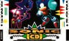
This week, we're going to be looking at Sonic CD for the Sega CD. Launched back in 1993 as a planned enhanced port of Sonic the Hedgehog 2, Sonic CD is a curious entry to the franchise that felt a tad messy at times, but was nevertheless well received for its unique time travel feature and exceptional music.
We've got three distinct variants this week from North America, Europe, and Japan, so it's going to be a proper three-way brawl, which is just the way we like it! So enough chit-chat, let's get on with the show.
Be sure to cast your votes in the poll below; but first, let's check out the box art designs themselves.
North America
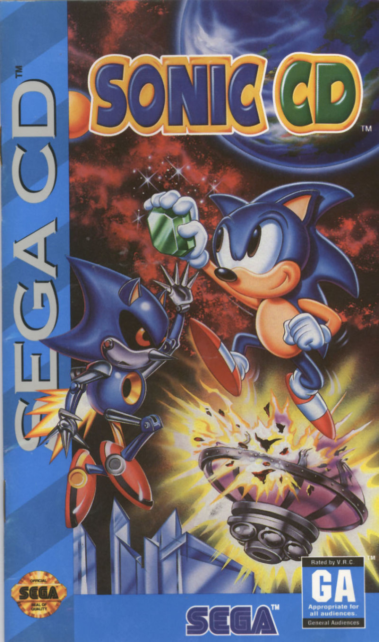
North America's version of Sonic CD is arguably much busier than the other variants, featuring Sonic and Metal Sonic grasping for a Time Stone while a pretty sizable explosion lights up the background. We have to admit, we like the fact that Sonic is just casually smirking here, despite the clear danger he seems to be in. That's the way to do it, Sonic!
Europe
Europe's version is a lot more straight-forward and makes full use of the smaller space available on the game's cover. We see extreme close-ups of both Sonic and Metal Sonic gazing menacingly at each other and... well, that's about it! There's a weird, sort of paint-splattered background effect going on, but really, the focus here is on the two characters. It's certainly impactful!
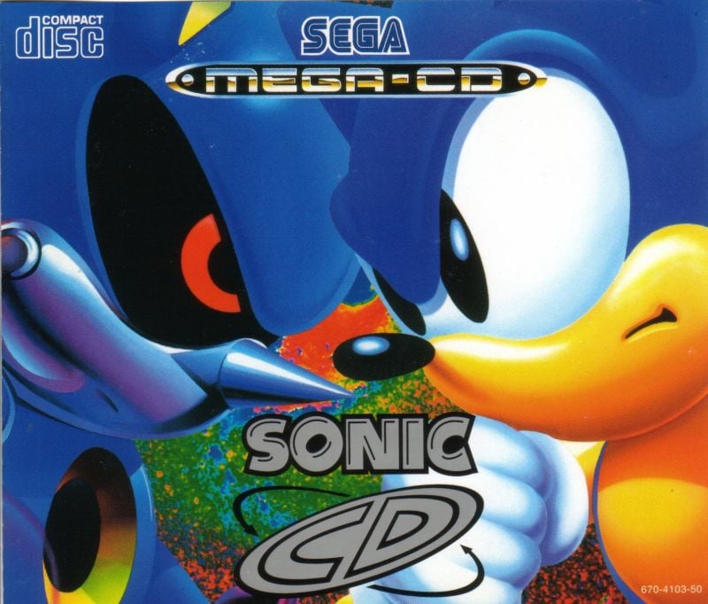
Japan

Finally, Japan's version is an expanded variant of what we saw for the EU cover. Sonic and Metal Sonic are once against glaring at each other against a pure black background, but this time we've got a funky, Sonic-themed border around the outside, which is pretty awesome! We love the font design for the title itself here, even if it is unreasonably squished.

Thanks for voting! We'll see you next time for another round of the Box Art Brawl.


Comments 34
Sees European box art
"sooooooo are they gonna kiss?"
I like both the US and Europe's, but I think Europe takes this one for me. It's pretty simple in comparison but I think it works. Japan is the clear loser here for me, though it's still not terrible by any means, just the worst out of these.
Europe. The others are a bit too busy.
I'm going to go with the EU version. I like how the Japanese cover replicates the graphic design of the other Sonic games over there and would look nice as a set. The US one has a tough time to get any composition to work well with such a narrow format. So yeah, EU version fills the space well even if it is a little underwhelming.
I like that the EU has the title printed in silver.
Doesn't show that good on pics though.
The European one is giving me Action in New York for NES and the AVGN statements about the man and the machine staring point blank at each other.
The style of the Japanese one is similar to that of the other Japanese Sonic games. So at least it has that to its favor, even with that black box the Sonics are in.
Then we have American Sonic, which I'm not a big fan of how he looks.
Guess I'll go with either Europe or Japan.
Going with EU/JP (went with the Japanese version) i like the rival look going on with Metal Sonic and Sonic in JP/EU compare to the US Version.
Box Art Brawls Current Total:
Europe: 43
Japan: 48
North America: 51
Australia and New Zealand: 1
American Sonic looks funny in a good way. His smirking was enough to convince me to vote for him.
Tempted to vote for JP just for the amazing "life of power" text thats front and center, but the whole presentation is too messy. The abstract colors and shapes dont fit as well as Sonic 2 and 3's box. My vote goes to Europe.
I like the NA one. It is the clear winner here for me. More artwork and more actually thought out artwork. The character models on the Europe one are too big. The Japanese boxart with the white and multicolour around the charater models doesn't work. Looks like a bad t-shirt.
The North American box art gets my vote this week.
Interesting that the USA artwork depicts a Special Stage. I never really noticed before that the exploding thing there was one of the UFOs
I think these are all pretty bad.
North America this time. While I like the idea of Sonic visibly squaring off against Metal Sonic on the other two variants, I like the action that the background conveys. Not to mention Sonic and Metal Sonic are actually doing something other than a staring contest.
I’m sorry but Europe is just a classic for me, I have seen that box art so many times it’s hard to view others as better lol.
Plus, I never really liked the na sonic box arts that much, they always looked so off, like I love the colors, but the way they look, idk, I mean look at metal, my guy looks like a literally hieroglyphic.
I like the NA one best. The style ties in with the Genesis trilogy making this a nice bookend to that era of Sonic.
The Japanese and Euro just seem a bit unfinished to me.
U.S. Sonic CD reminds me of the basketball tip.
Honestly they're all a bit ugly, possibly because metal sonic is just not attractive. I chose North America because the background is interesting and the sonics are more active looking.
Can't stand American Classic Sonic and his never changing facial expression. Europe has the best game logo, and perhaps the best cover here, but I would say the Japanese PC cover is the coolest.
https://static.wikia.nocookie.net/sonic/images/3/3f/JP_Sonic_CD_ROM.png/revision/latest?cb=20130311125631
@FishyS 🤨, not “Attractive” you say?
I'm usually a fan of the Japanese Sonic covers, but Europe wins for CD. Never liked the American Sonic art.
https://i.ibb.co/nRvZ7Hg/sonic.jpg
I was expecting some exciting variants for the EU and JP markets. Nope. Had to vote for my original NA case.
NA for me and it's not even close. Europe's cover is too tight in the framing that it doesn't work. The key art for Japan is lifeless. I never liked the border and logo art for Japanese Sonic either.
no fans of japans?
The NA one is certainly memorable don't get me wrong, but the art used for EU/Japan is the first thing that I think of when it comes to CD, so damn iconic. Immensely difficult choice between the two but I'm going to give it to Japan for allowing us to see the art in it's full glory (though EU does have great composition of said art).
The NA box is not only great in its own right, it's super nostalgic for me personally.
“a proper three-way brawl, which is just the way we like it” Me too. Great brawl!
North America looks the best to me. The others aren't bad however.
NA has more character, the others are too focused on Sonic and Metal Sonic squaring off. I still like the JP colors though.
I dislike them all, but after seeing all three, I think I prefer Europe even though it's bland as. I likely would have preferred the NA artwork as a kid though, which is so characteristic of video game box art from the 90s.
Either way, it's Sonic, and that in itself is a turn-off.
I dwelled on it but eventually went with Europe, partially because of that cool MEGA CD logo.
I thought Japan was a little too busy and the NA just didn’t grab me. I never owned the game so I’m not all that invested either way. When I think back to the Sega CD, I was playing Batman Returns, Final Fight CD, and Jurassic Park mostly.
It’s so fun to watch europeans looking so far for a random reason to take EU version over the obviouly better NA version
Definitely have to go North America on that one. Europe one's not bad though.
Makes me wonder how it'd go if you did a poll on which Sonic CD soundtrack is better.
Show Comments
Leave A Comment
Hold on there, you need to login to post a comment...