Hello everyone, and welcome to another edition of Box Art Brawl!
For last week's brawl, we took a look at the fantastic arcade first-person shooter Timesplitters 2 for the GameCube. Largely regarded as one of the most influential games of its time, it's safe to say that the box art for the game wasn't entirely inspiring. Nevertheless, Europe (or rather the UK specifically) won out comfortably, bringing in 83% of the vote.
This week, we're going to be getting spooky with the wonderful Silent Hill: Shattered Memories for the Wii; it is Halloween tomorrow, after all! The game launched back in 2009 and is generally considered the strongest entry in the series after the initial four titles from Team Silent (just so long as you don't count the now defunct P.T demo). It made excellent use of the Wii Remote, allowing playered to shine a torch in whichever direction they saw fit, making for a surprisingly immersive experience.
The box art across all regions for this game was pretty similar, all told, but we reckon the minor differences between the western and eastern designs will make for an interesting brawl this week. It's Europe and North America Vs. Japan once again, so let's get cracking!
Be sure to cast your votes in the poll below; but first, let's check out the box art designs themselves.
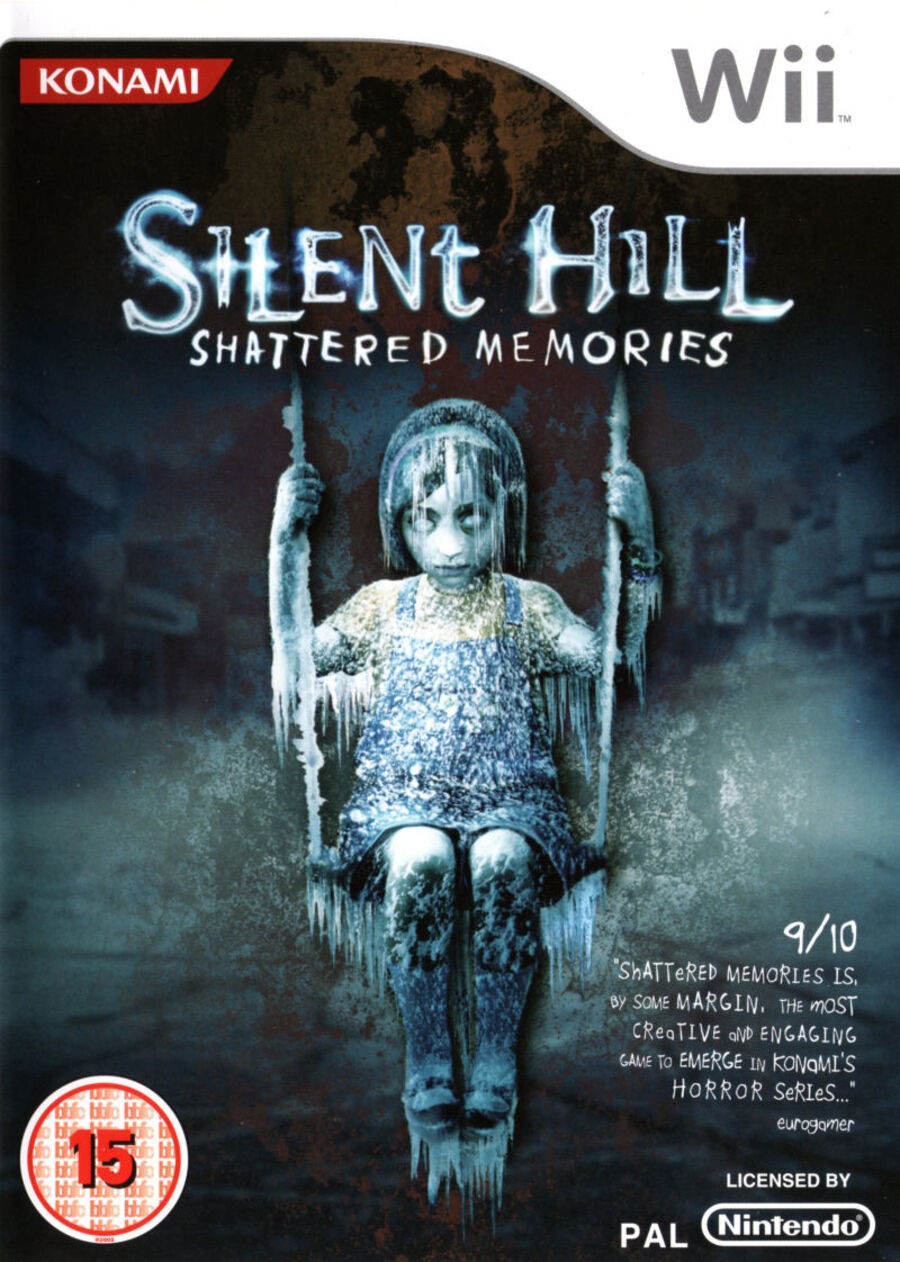
North America / Europe

All regional designs for Shattered Memories feature the same basic image: a creepy girl sitting in a swing. For the western approach, however, the figure and swing are both adorned with icicles, indicating the seasonal weather we might be getting in the game. There are hints of some buildings in the background, along with an overall look of decay that looks pretty darn gnarly. The box itself is the standard white design for Wii games.
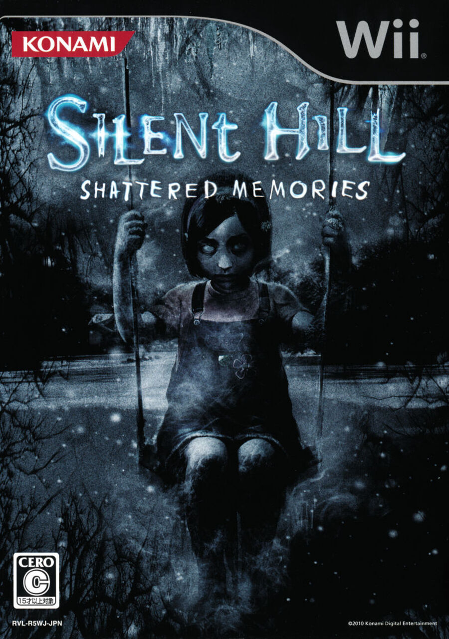
Japan

For the Japanese design, we've got the same girl sitting in a swing, but without the icicles found in the western design. Instead, we've got a more "obvious" indication of the snowy weather with snowflakes tumbling down along with icicles forming on the tree in the top left. It's a darker image overall and this is accentuated further by the black Wii box, making this an incredibly effective design.
Thanks for voting! We'll see you next time for another round of the Box Art Brawl.


Comments 29
I had never seen the Japan box art for this great game before, but man is it better in pretty much every way. The art we got is fine, but the Japan version is on point and creepier, and I love using a black wii box instead of the traditional white.
The Japanese one looks way better imo
It's practically night and day
Box Art Brawls Current Total:
Europe: 41
Japan: 48
North America: 48
Australia and New Zealand: 1
They're both pretty decent. I think the image of the girl on the EU/US box is better, however that garishly bright age rating & the review snippet knock it below the JPN variant (which is pretty effective itself with it's black boarder).
I think if they had went with specifically the US box instead it may have faired better thanks to the more neutral color scheme of the ESRB rating, which wouldn't be as intrusive.
EDIT: Never mind, the US box includes these even more garish IGN & Gamespot award/recommendation icons in place of the more understated review snippet on the EU cover, so they are relatively even. JPN box is definitely the best one then.
Both are good but the western version made the girl a bit too bright in comparison.
The Western one fits how this particular scene is shown in the game, so that gets my vote.
It should be pointed out that that game is a prime example of metaknowledge being a boon: for people playing it as their first Silent Hill game, you will be creeped out, disgusted by Harry and the life Cheryl had, and unnerved by Dahlia.
If you played Silent Hill 1 you will also be majorly blindsided by how it sets up situations similar to but not exactly identical to the original game and then does wild plot twists with them because very few characters other than Cybil fulfil their original roles.
Japan for me.
I loved this game, but I only ever played it once. I'd play the crap out of it on a handheld. Please, please, please, please...
I voted for the Japanese cover as it's slightly more creepy.
Japanese box art gets my vote. I haven't played this game, but I look at the North American box art, how the girl has icicles hanging from every inch of her body, and it just looks kind of goofy to me. It's like Jack Nicholson at the end of The Shining, but with a more serious face.
The Japanese version looks more creepier compare to the West Version.
(also why did Nintendo stop using the darker cover after Wii / Wii U for mature games in Japan? they look so good and fits well for them. would have been neat to see Switch having that.)
I don't think there's much in this one to be honest. Both have their plus points and I can't see a clear winner, I'd call this one a draw.
The Japanese boxart is simply more darker thereby making it more fitting to the game.the black borders are fitting. I remember being attracted to boxart that didn't have the standard white wii boxart border back in the good ol' Wii days.
Japanese box art looks cooler and creepier than PAL/NA one.
if NA little girl was with JP background it would be great imo.
Japanese looks scarier, but the European better represents the game. And what a game! I remember being on smallband internet and loading in the trailer that I watched several times already, just because of how "hyped" I was, and how I loved the game throughout despite its flaws. Actually, I was reminded of playing Shattered Memories by playing Alan Wake on Switch. An equally awesome game that shares some of what I enjoyed most: exploration of a creepy environment with a flashlight, and a great psychological horror story. And it also shares some of the bad parts, being obviously more ambitious than the budget and / or deadline allowed, but still overall having the ambition overshadows the jank and other technical stuttering (for me at least).
I also like how many Japanese horror games on Wii had a black box instead of the white, but in this case I felt like the re-imagining of the game fit perfectly with the Wii's white style.
Japan looks so much creepier!
Both look good, but my vote goes to the Japanese one. Western one lost me on that review quote (or the awards in the North American version). As I said in a past Box Art Brawl, those lose me almost instantly.

Japan feels like a movie poster while America/Europe feels like an online pop up ad you're desperately trying to find the cancel button for
Japanese box art looks better, the darker lighting fits the horror genre better.
I voted Japan. As others have said, due to the overall composition and (lack of) color, the end result is something more creepy which was the goal. The western cover has too much blurring of the environment and that ends up hurting it a bit, I think.
"It made excellent use of the Wii Remote, allowing playered to shine a torch in whichever direction they saw fit, making for a surprisingly immersive experience."
"There are hints of some buildings in the background, along with an overall look of decay that looks pretty darn gnarly."
(note: suggestions of different versions of these parts of this article)
It made excellent use of the Wii Remote, allowing any player to shine a torch in any direction suitable to the player, making for a surprisingly immersive experience.
There are hints of some buildings in the background, along with an overall look of decay that looks very gnarly.
Japanese one feels pretty generic to me, whereas I don't often see frozen girl like that, so NA/EU wins for originality, also for matching the game itself better.
I like them both
It's a completely different kind of horror between the two. In the NA/Europe one, she's dead and frozen. You should be scared of what killed her. In the Japanese one, she looks like the thing that's going to get you. She's looking at you. Is she alive? Is she dead? I don't want to find out. The Japanese one is much more effective I'd say.
I actually prefer the European cover on this case. Didn't know Japan Wii games had black Wii labels.
Still have this game, even if it's not my favorite entry
I prefer the european
I skipped it at the time... is it really that good?
Eh, the Japan art is pretty generic. Every horror game art looks like that.
Japan one has the better background. And overall is better imo.
Leave A Comment
Hold on there, you need to login to post a comment...