Happy Bank Holiday weekend to you folks in the UK, and welcome everyone to another edition of Box Art Brawl!
Last week, it was the turn of Wave Race 64 to come under BAB scrutiny — which was fitting as the game launched on the Nintendo Switch Online + Expansion Pass service. it was a close (wave) race between the top two, but Japan won with 51% of the votes. North America did pretty well for itself too, bagging 42%, but Europe looks like it crashed into the waves with only 7%. It's those black borders, we tell you!
This week, we're going back a little bit further, and it might be worth grabbing a slice of pizza. Teenage Mutant Ninja Turtles: The Cowabunga Collection launches on Tuesday 30th August, so we thought it was about time to put one of the best Turtles games' box art under the microscope. That's right, it's Teenage Mutant Ninja Turtles IV: Turtles in Time's... time.
Europe and North America are back together to take on Japan, and this really is a clash of the titans with two iconic boxes up for a brawl.
Be sure to cast your votes in the poll below; but first, let's check out the box art designs themselves.
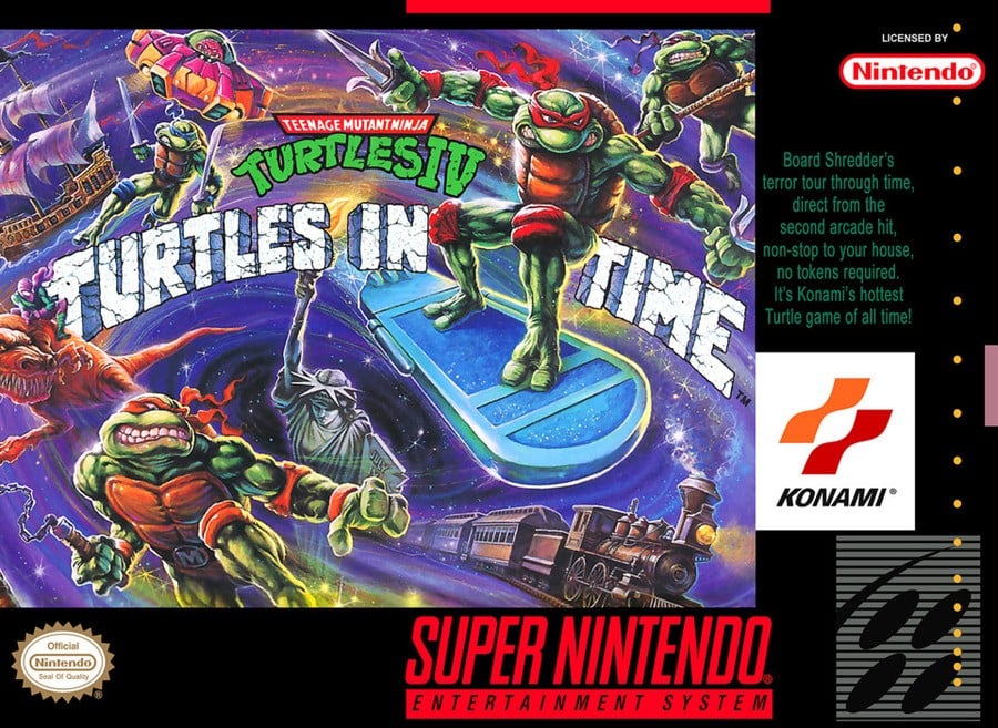
North America & Europe

Hero Turtles, Ninja Turtles. Whatever you call them, it's hard to deny that this box art rules. It's a big part of many of our childhoods! The grittier art style, the cosmic purple background, Raphael on a hoverboard, the ship, dinosaur, train — it screams "what on earth is this game about!?" But in the best possible way, of course. The title in the dead centre is also pretty iconic. 'Turtles in Time' in stone, that looks like the Turtles could kick it down at any time? Yeah, it's all pretty badass.
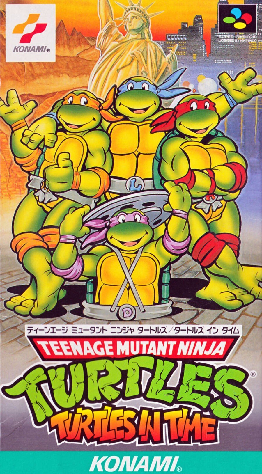
Japan

Japan has gone for the complete opposite end of the spectrum and adopted the same cartoon style that they've previously used. It's a lot cheerier, but we also really love this one. The title down the bottom maybe doesn't have as much impact, but the four Turtles posing together, with Donatello popping his head out of the sewer, is just nice and makes us remember a different part of our Turtles-loving childhoods. Oh, and the Statue of Liberty on both boxes is a nice touch.
Well, we're glad this week isn't up to us! Have your say in this week's brawl by voting for your favourite!
Thanks for voting! We'll see you next time for another round of the Box Art Brawl.


Comments 60
The Japanese box art looks like the cartoon, thus I voted for that one.
NA/EU no contest. Tom Dubois artwork is phenomenal!
That isn't even close. The NA/Europe artwork is vastly better.
They're both really good, but the Japanese box art finally won out. Something about the more cartoony look tickles my nostalgia bone.
@peachflavored
Aye! Tom Dubois really is an outstanding Artist.
I would love to have this Picture in high Resolution.
The framing of the NA/EU one takes a lot from it, but at the end of the day, it's a much more engaging graphic that tells a lot more about the contents of the game
The western one is more dynamic but I also think it's kind of just hideously drawn so giving it to the Japanese one.
I prefer the turtles in the Japan box but it also looks like a generic bit of art that has nothing to do with the time theme of the game. Both have pros and cons this time, no clear winner for me.
Here comes a new challenger (SNES port by using MSU-1 chip) 😅 😅 😅
I prefer Japan's cheerier turtles but I voted for the NA/EU art thanks to its crazy background.
I love the US art but the Japanese one just really reminds me the old school turtle days. It’s not that I think it’s better but I just couldn’t not vote for it.
The japanese boxart made me smile, so I voted for that one.
For me, happy ninja turtles win over angry ninja turtles every time.
I do prefer angry eyebrow Kirby though...
Box Art Brawls Current Total:
Europe: 36
Japan: 45
North America: 45
Australia and New Zealand: 1
@Azuris check on Twitter and you might get a surprise.
I like the Japanese boxart as it shows it is about the 80’s TMNT. The NA looks like where Michael Bay got his inspiration. Because there is a difference between the comics and the more lighthearted cartoon it’s good to have a visual cue of what you will get.
This was tough to decide, but I ended up picking the cartoony Jpn cover. I’ve never owned or even played this game, so no nostalgic attachment this time.
Come on Cowabunga Collection!! 😆
I for one do not need to see their teeth so prominently
I think the actual art piece on the US version is much more interesting & relevant to the theme of the game itself, but I'm not at all a fan of how it's framed with all that black boarder & labels.
The JPN art piece is much more generic (I think they even used the turtles in that exact same pose in another box art this site featured, I think a Game Boy game), however it's still a nice looking piece & the arrangement is much cleaner than the challenger's.
This was a tough one, but I went with Japan.
Note: I've never really been into this franchise, though.
The Japanese box art is the exact same TMNT artwork that was already printed on t-shirts, lunchboxes, and other merch. This one strikes me as lazy.
NA/Europe hands down. While the JP box art looks more accurate to the cartoon, it doesn’t help convey what the product is. It just looks like stock TMNT art that could be on anything, like a cereal box or something.
The NA/Europe art is unique and actually does a good job at showing consumers that this isn’t just TNMT, it’s TNMT Turtles in Time… a badass time-traveling brawler.
the US/EU box art actually gives off a sense of the time travel aspect. so, yeah. US/EU takes this round.
NA/EUR: turle super adventure!
JPN: ayyyy fuhgettaboutit!
I prefer the cleaner look of the Japanese one.
They’re both a bit crap to be honest. US/EUR is so busy and quite hard to see the name of the game at a glance, with a reduced TMNT logo. Odd choice.
Then the Japanese version is better, easier to see etc but the turtles themselves are generic key art used for years. Also lacking in the whole time theme.
Both not great art for a great game.
I prefer the friendly looking turtles on the Japanese cover.
HOWEVER, it looks like a "Turtles USA" cover or something with that Statue of Liberty occupying the center top.
The North American/European cover on the other hand has that excellent time-warpy thing going on. Love the train, dinosaur, and pirate ship as they really communicate the level diversity to expect from a time-hopping game.
I chose the NA/E one this week, despite my preference for those smiling Japanese turtles.
I kind of dislike them both. NA is a bit too chaotic and the turtles look super bloodthirsty. The Japan cover is cute but just very generic. I ended up voting Japan because I don't want turtles which will murder me.
Voted for North America's because it looks metal!
I can't stop staring at it the NA/EU cover; it's just so beautiful.
I think it's a matter of what you want.
You want something that's a little closer to the comics? Western cover for you.
You want something that looks like the 80s cartoon (even if that key art seems to be recycled)? Japanese cover then it is.
Western box looks like it contains a game 900% more fun than the Japanese one. Loving Michelangelo's gritted teeth.
The NA/ Europe one is better and you know it
Japan, the NA one is just too busy.
As much as I enjoy the American cover, I appreciate the classic aesthetics of the Japanese more.
@GravyThief Uh… What? The NA art always wins?
The Japanese artwork by a mile for me. The US/EU one doesn’t look anything like the characters in the game or the cartoon it’s based on. Plus it makes them look very aggressive and misses out the more light hearted and fun-loving characters they are. The enormous black borders around the art don’t help either.
If I saw both at a store, I would buy the Japanese version.
This one'll definitely come down to whether you prefer comic or manga art. Despite that however, whilst I prefer the more cartoonish style of TMNT to the grittier one we usually got back in that era, the NA/EU one does a much better job of showing what the game is all about (in addition to the art looking ****** sick).
I voted for the Japanese box art, love the nostalgic vibes of the late '80s cartoon series.
Even though the North America is more detailed I dislike the background. Gotta give it to Japan for being bright and having everything placed well. I also grew up more with the show then the comics.
@SoManyHaveDied lol
The JP box art wasn't created for the game, it's a repurposed piece of promotional art made for the animated series that's been used on hundreds of other pieces of merch.
The western cover shows more of what the game is about, but it's a mess in terms of composition and doesn't really work as a game cover. Michaelangelo's teeth are creepy too. The Japanese one is basically a generic promotional piece adapted to the game cover, but I think it works better as a cover simply because it's not a total mess.
NA/Europe by far. That boxart is still one of the most iconic boxarts ever, imo.
I like how the Japanese art has the Turtles from the '87 cartoon, but a game like Turtles in Time is best suited with a over the top boxart like the Western version.
NA/Europe for sure; has a lot going on and the emulation of the original comics' art style is nice while the Japanese cover is is a bit too basic with that typical TMNT cartoon key art that's used with everything Turtles related on (admittedly relevant) background and comes across as a little on the basic side.
The japanese one cause is actually the European cover for Hyperstone Heist on MegaDrive (which I adored when I was a kid).
Great move by Konami to not waste such a good cover and reuse it at the first chance.
Whilst I appreciate the artwork on NA/EUR, has to be the Japanese for me, love that cartoon.
@peachflavored
I have no Account there and can't browse much, could you provide a Link?
Japan! Just seeing the turtles like that makes me feel like a kid again.
Steam train on the NA cover cool cool!
I really like the Japanese box art, but... it doesn't really represents the title of the game very well. The NA/PAL box art shows the different objects from different time periods and has the turtles jumping and surfing around this mystical vortex that represents the flow of time. I believe the NA/PAL version have won this one imo.
Got to be honest love em both, but US/UK boxart just wins out for me.
The JP boxart is one of the most commonly used images of the Turtles ever. So that makes the JP version very lazy. At least the NA/EU version has original art that pertains to the content of the game.
Easy choice this time.
No contest, North America/ Europe.
The Japanese art look lifted from a lunchbox, t-short or any other generic 90’s turtle merchandise, nothing special about it.
Can't say I'm super fond of the details in the NA/EU art, but the more dynamic poses, and being more fitting specifically for the game, make it win out over the generic "lifted straight off a random piece of merch" art of the Japanese one.
NA/Europe. Radical and Extreme!
If you love the og cartoon then japanese. Otherwise NA EU.
Haha the Japanese box art didn’t really match the flavour of a side scrolling beat ‘em up
In Australia, I played the hell out of this game. Granted it was a long time ago, but I don’t remember the box art looking like this
I prefer the north america version, it's way cooler than the japanese one.
Japanese box art is usually far more interesting and appealing to me. That is not the case in this instance.
Leave A Comment
Hold on there, you need to login to post a comment...