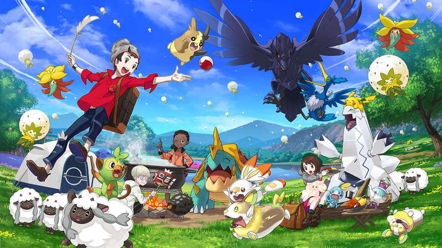
Ever wondered what more recent entries in the Pokémon franchise would look like if they'd released back in the 1990s on the good old Game Boy Color? Well, wonder no more, as talented pixel artist Sindorman has tweeted out a couple of fantastic recreations of some early moments from 2019's Pokémon Sword & Shield, painstakingly remade in Photoshop to make it seem as though they're playing out on Nintendo's 24-year-old handheld.
As reported by Dextero, Sindorman has been showing off his skills as a pixel Pokémon artist in a series of tweets depicting a handful of early sequences from Sword & Shield, the first of which shows a trainer choosing their starter Pokémon in the Galar region of the game. Just look at how cute Scorbunny, Sobble and Grooky look here, and Hop is really rocking that '90s pixel style:
 Watch on YouTube
Subscribe to Nintendo Life on YouTube841k
In another tweet, Sindorman shows off a brilliant recreation of the game's very first encounter with the nefarious Team Yell and rival trainer, Marnie:
The artist also links to an excellent Game Boy remix of Sword & Shield's Postwick theme, which really does make a perfect accompaniment to these super nostalgic recreations.
If only the whole game was playable in this style, we'd be straight into the loft digging out our old Game Boy Color right now! Guess we'll just have to make do with the whole thing whetting our appetite for the imminent arrival of spin-off title Pokémon Legends: Arceus on 28th November.
What do you think of Sindorman's pixel perfect Game Boy Color recreations? As always, let us know in the comments.
[source dexerto.com]


Comments 14
That looks really cool actually.
I love it!
Man, I wish this was real thing!
I ruined my appreciation for this kind of pixel art when I tried retro developing myself. It looks cool but GBC wouldn't be able to render these.
Shhh don't tell Nintendough or the videos will be removed!
That’s actually really cool! Hopefully this guy goes further and starts making a pixel version of the latest games, maybe on something like a Nintendo DS…
Oh.
@Poodlestargenerica No. There are too many sprites on a single row which would result in flickering, the character profile art doesn't follow the 8x8 tile grid and/or uses too many palettes, and the text doesn't follow the grid either. You could use background tiles for most of the character profile but all the tiles with transparency would need to be sprite tiles.
That Postwick Gen II Remix reminds me so much of music from the original Pokemon Pinball.
I would definitely play a Gen II styled Sword/Shield demake.
@moodycat Sword and Shield ARE "actually" good games.
I love the style and the music
Personally, I prefer the GBA style, but these are really cool.
@Late I agree that the GBC cannot render the character art, but disagree that the character tiles with transparency would need to be sprites. The gbc's window layer treats one of the colors as transparent, so each tile associated with the window can use as many as three colors. That said, there aren't enough tile palettes to pull off the effect, this is true. And also sprites exceeding the scan line limit would not necessarily flicker. The sprites after the tenth in the scanline would simply not be drawn by the display hardware. You could of course manually flicker the sprites to push more of them into a scanline, but that might make them transparent depending on the frequency of the flicker.
I ips my Red and Blue games to the Gen 2 colors along with Metroid 2 - Samus returns and Super Mario Land 2 DX in color! All are ripped from my cartridges, the save file as well to not lose data.
@Ebowman I was under the impression that the window layer didn't support transparency? Or is that different between GB and GBC? You are correct about the flickering part.
@Late on second thought I was partly wrong, I was misremembering, sprites display in front of window palette color zero but not backgrounds. So it's only transparent when overlaid over a sprite
Show Comments
Leave A Comment
Hold on there, you need to login to post a comment...