Welcome back to the Box Art Brawl, our weekly poll to find out which regional box art variant of an old video game is best.
Last week we looked at the three main cover variants for Sonic the Hedgehog 3. The North American Genesis version won out in the end, with Japan not too far behind and Europe trailing in third place. Evidently, poor old Europe just couldn't keep up with the blistering speed of the NA cover.
This week we're looking at Beam Software's Shadowrun on SNES, a cyberpunk action RPG from 1993. Adapted from the tabletop RPG of the same name, it was a moody game and an excellent addition to the system's library. Crucially for our purposes today, the three principal regions all got quite different cover art, too. Everyone's a winner!
So, let's begin with a gentle jog and build up to a Shadowrun, shall we?
North America
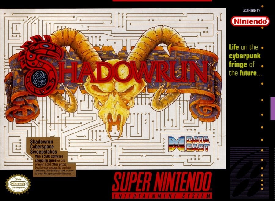
The North American cover puts the emphasis on the rather splendid logo (just look at the 'S') that hooks a horned skull around a scroll emblazoned with PCB-style etchings. Those markings are mirrored in the background in gold on white.
We get a semi-nonsensical tagline ("Life on the cyberpunk fringe of the future...") in the border on the right, plus the awesome Data East logo embedded on the PCB. The gold sticker in the bottom left advertising sweepstakes is cut 'around' the background detail and isn't as obtrusive as it otherwise might have been.
Lots to like, here.
Europe
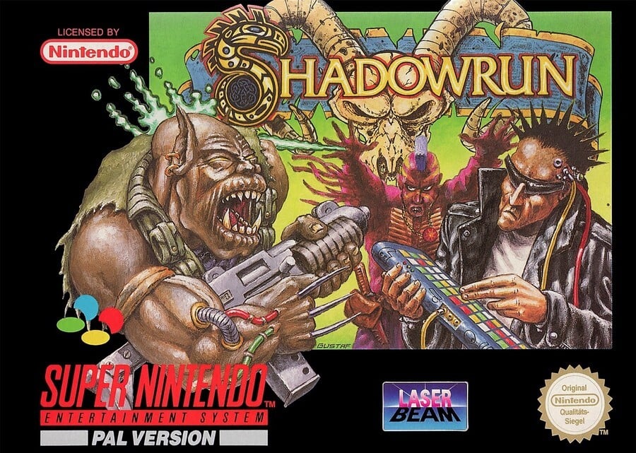
For the European release we see the same logo redrawn and recoloured here, along with a gun-toting goblin-orc creature fighting a couple of '80s punk-ass goons that look like they've wandered off the Streets of Rage.
The green background isn't fantastic, although it helps highlight the figures for the viewer, and we like how the demon dude is breaking out of the border. His Wolverine-style claws look a bit impractical while holding a firearm (we wonder how many times he has stabbed the fingers of his left hand with them), but the mix of the fantasy and cyberpunk styles here holds your attention.
Japan
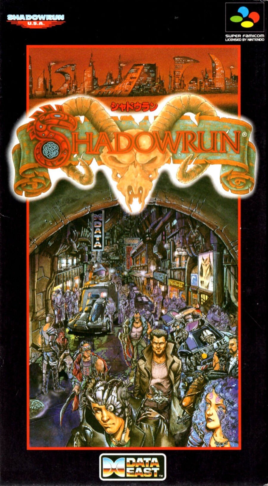
The Super Famicom cover goes full Blade Runner with a street scene and an orange-red cityscape at the top. The bustling street has plenty going on, although the image is a little zoomed-out to be able to pick much out without pressing the box to your nose.
What's there is good, though, and we especially enjoy the Data East logo being used as a street sign. And once again, that's a pretty great Shadowrun logo.
Bonus!
And just for fun, here's the cover of the North American SEGA Genesis version of the game that features guns, l33t hacking, and steamy vents:
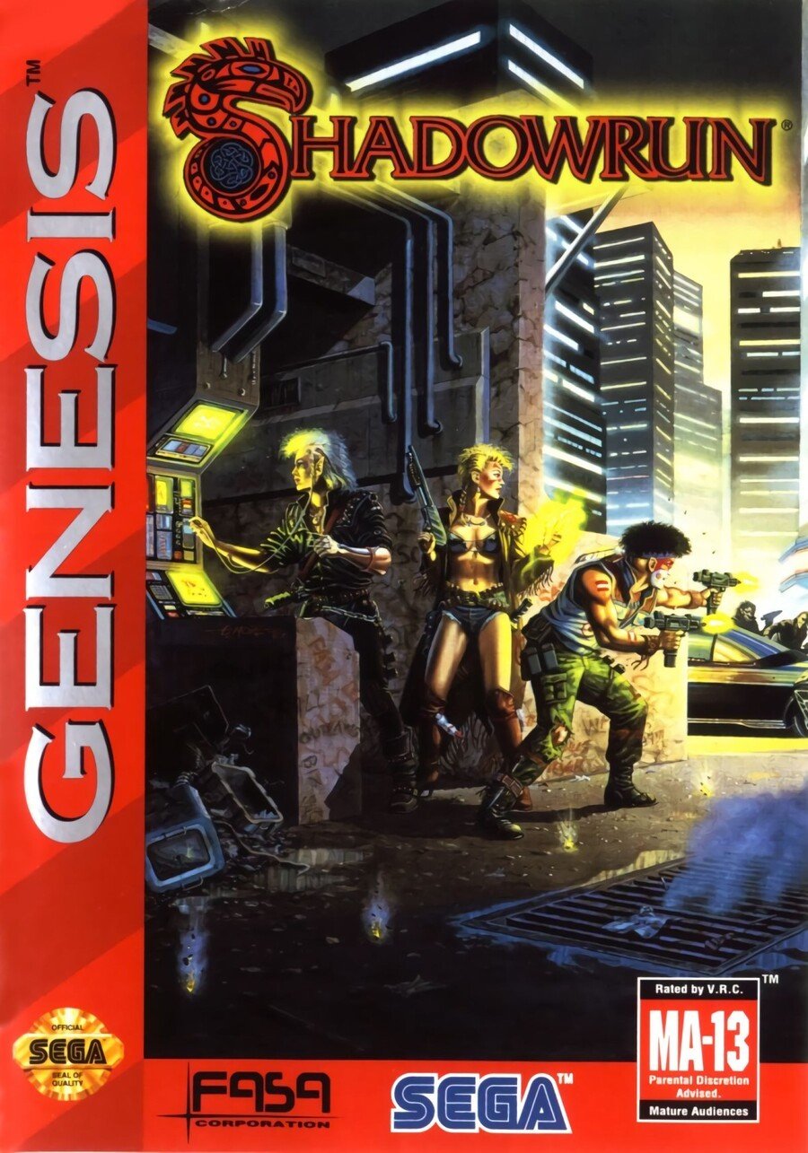
So, three Super covers to pick from, and just one vote. Click your favourite below and hit the 'Vote' button cast your vote thusly:
And that's it for another round of the 'bagarre d'art boîte', as they almost certainly don't say in Paris. Thanks to BionicDodo for this week's suggestion. Have a fabulous seven days until we see you next time, after which you may continue to have a fabulous time in our company before the cycle of fabulousness begins once again. Adieu!


Comments 58
Japan gets my vote, but I like that Genesis cover the most.
Hello Japanese box art! xxx
I like the NA, not sure what’s going on with EU.
The people behind the NA cover didn't put any effort in.
Prefer the genesis cover the European and jap look like something off a spectrum game from the late 80s early 90s
My vote was going to Europe until I saw Japan's box art. Not a fan of NA's in the slightest.
The Genesis one is the best. It's the original Larry Elmore cover art from the 2nd Edition of the pen and paper RPG (got it on my bookshelf next to me).
I loved Shadowrun back in the day, even if the system a complete mess.
My first tattoo was the Aztec-style serpent 'S' from the logo.
I had some cool characters in that game. An orc hacker/gunfighter with a custom cyberlinked Bond & Carrington handgun (from the London sourcebook) was one of my favourites. And my Haitian troll shark-shaman assassin.
Out of the 3 choices, I think the NA cover is best. Nice and simple. The others are too busy and messy. What's odd is that the various gamesbooks had loads of great pieces of art they could have used. I could see one of Tim Bradstreet's pieces making an excellent moody black and white cover with the logo in colour.
Funny how tastes differ. Never saw the Jap version before, and I like it a lot, but the US one is by far my fave. The EU one is poor, the Genesis one not much better.
The NA version is burned into my brain as THE one, but the Japanese one is the best, I think. Europe is fun enough, but looks kinda goofy and gets worse the more you study it.
Love the awful European boxart.
Hate the European one. Looks like bad cover art for a games mag. The NA box is actually really cool - love the circuit board simplicity. But Japan is going to walk away with this one - it captures the William Gibson inspirations of the source material best. Genesis would’ve been third.
Europe is out for looking like an '80s cartoon more than the "future".
The Japanese art is good but as noted, perhaps a bit too "busy" to tell much.
North America. I normally like the ones without humans better (with the exception of banjo man.)
NA is okay, it gets the job done, but isn't anything special. EU looks like they tried to do something more, but it ended up looking ugly. JP looks good, going JP this time.
Agreed that Japan's is too busy. A lot of their covers have this look of puked out ideas jammed in a too-small space.
Waitaminute, there was a Shadowrun ARPG on the SNES and Genesis? News to me!
Gotta go with Japan this time. I like the sweeping street design. It's a lot of eye candy without becoming an absolute mess, which I like. While the NA cover is somewhat plain compared to the other two, they did a decent job with the logo's portrayal. Europe's isn't...bad, but the characters just seem a little slapped on, plus I don't care for that green background.
Man, Sega has some good covers!
I really dig NA’s less is more approach on this one. Everything else is too busy.
I went with NA on pure nostalgia. I remember seeing that cover every time I went to my local video store sitting among the other SNES games.
I actually didn't know there was a Genesis version till just now.
The font is too hard to read on the NA one. I went with Japan’s Blade Runner look.
Box Art Brawls Current Total:
Europe: 14
Japan: 18
North America: 15
I like how the SNES box is the most mysterious, but it's a bit too vague. The Japan one is a bit too busy but I like it as a work of art. I really like the Genesis one, clear and to the point.
Yay, I'd been asking for this one as I loved the game when I was younger, and I like all of the covers. Gotta go with the Japanese one here as it does such a great job of showing the dirty, dark futuristic world of Shadowrun.
I like Japan's, but it's really playing down the fantasy parts of the setting that Europe's mostly showing.
NA has a nice balance, and it's nice and minimalist besides the very good logo.
Japan this week.
I like the Blade Runner vibe of the Japanese box. U.S. second...the European box looks ugly as hell, but I kinda like it.
Never heard of shadow run, but based on these covers I want to play it NOW.
I dislike the US cover, It could easily be the cover for a high fantasy game, all the others are clearly cyberpunk
NA is too minimal for me, though the logo looks great. I'm not a fan of the art on the Euro cover. Japan's cover is quite busy, but it's interesting. Japan is the one I like best.
@TG16_IS_BAE
https://i.ebayimg.com/images/g/UPQAAOSwxYxUyfsW/s-l300.jpg
Well— can’t win them all
Genesis one is by far the best one, but I couldn’t vote on that one.
So Japanese SNES one it is! It is only busy from afar (Looks like a texture), once your eyes move down to study the details it’s like the image suddenly reveals itself (including awesome Data East logo as a neon sign)
That said, the JP one would have never looked right on the horizontal ratio of the American Super Nintendo box. The American version has an absolutely amazing logo that grabs your attention (for instance, among other items on a standard rental shelf of the time ), but the background doesn’t say much about the cyberpunk world (I didn’t even realize it was circuit leads— thought it was just a ‘maze’ pattern).
(The EU one is way too messy, although the gaudy art has its certain charm)
The Japanese cover is actually quite beautiful. They're all cool in their own way.
@Tyranexx there was, and it was AMAZING. Young me couldn't get past a certain timed event but the game was amazing.
I gotta go with the Japanese box art this week.
I love how ridiculous the European box is. Anyway, Japan for me this week.
Went with Japan this week.
Although the NA's blurb about "Life on the cyberpunk fringe of the future" has me hyped for Cyberpunk 2077.
@Northwind
Wouldn't even make the top 3 stupidest things my crew did playing the pnp RPG back in the day. And anyway, they've got an Elven
meatshieldcombat mage to soak up some high velocity rounds.@abe_hikura
That impression could be because Shadowrun is a mixture of high fantasy and cyberpunk. For me I love the NA cover, but I played Shadowrun before it came out on consoles so that logo alone is fairly iconic for me. I can understand how it would say much less to someone unfamiliar with the original game though.
The bonus one gets my vote!
They're all good in their own way, but I would vote for Japan if I had to choose.
As boxart I think the American version is the most effective, simple and the title pops out.
Europe is just goofy and the Japanese one I would rather hang on my wall than have as a cover.
I remember ordering the Genesis version for a buddy of mine. Always liked that cover the best. Out of these the Japanese cover takes it.
Toss up between Japan and NA, for opposite reasons. I like the simplicity of the NA but the Japanese one looks great, as busy as it is. Slight edge goes to Japan though.
Oh, the Genesis one is the cover of the original RPG book! Too bad I couldn't vote for that.
The japan art is way to crowded and messy for me. I like the simplicity of the NA one.
Japan has the best box art, why can't we all get the same box art that Japan gets.
@Daniel36 Shadowrun seems to be a game that's overshadowed by other games on the SNES/Super Famicom. I'm honestly surprised I've never heard of it lol. I had frequent access to a SNES growing up, but we didn't own it. Pretty much all of the games for it were platformers. I've been playing catch-up over time lol.
@Tyranexx Oh I am sure. The onl breason I know it was because our rental place had someone with good taste in videogames. I never owned it myself but rented it plenty.
That Genesis cover is the best one, kind of bummed you didn't put that up for vote. Genesis>Japan>Europe>USA
@Daniel36 It definitely helps to have someone around who knows what gems to look for!
Most of the platformers I had access to ranged from decent to amazing (Super Mario World, the first DKC, Super Mario All-Stars, Toy Story), but they were only a chunk of the SNES library. I've played more classics such as EarthBound, Super Mario RPG, Chrono Trigger, Super Castlevania IV, and Kirby Superstar since then. Mainly thanks to ports, the Virtual Console, and the SNES Classic.
@Tyranexx Are you still looking for hidden gems or have you since found them all? Because I can definitely name a few more for SNES.
@Daniel36 Sure, I'll take a list for future reference!
@Tyranexx Well, let's start with a few hidden gems you may not have heard of then.
Ever heard of Illusion of Time / Illusion of Gaia? (depending on region)
And Terranigma? Those are both action RPGs, part of a series but not really connected. Both are awesome in their own rights.
Time/Gaia is both epic and small scale in that it focuses a lot of friendship, and has some very mature moments, especially for its time.
Terranigma is more epic in its premise but still has some very personal vibes going for it. It was never released in the US so few people know of it. This was in the era where most of the best games were never released in the EU, so this was the one time where the US got the short end.
Any particular genre you like?
@Daniel36 I tend to gravitate towards various RPGs and platformers of that era, though I'm up to about anything for at least a little while as long as it isn't a shmup or sports related. Racing and fighting games (with the exception of the occasional Street Fighter session) are fun but don't hold my attention for long.
Funnily enough I have heard of Terranigma via a YouTube channel before. I think I might have also heard of Illusion of Gaia from the same source, but I'm not fully certain. I'll wishlist them both! Though I'm assuming I'll need a translation patch or something similar for Terranigma.
@Tyranexx Nope, Terranigma was fully English. It was released in Europe and Australia but not the US.
I take it you already know of Final Fantasy 6, but if you don't, may I advise the GBA version. It's the best one. Also pretty much the best RPG period, at least to me.
@Daniel36 Ah, I misread up there and caught that it hadn't been released in the US but not that Europe did get it. I know the complete opposite happened with EarthBound.
Yep, I'm aware of Final Fantasy VI's (or III according to its original release) existence! I'm currently planning on playing it via the SNES Classic, though you have me reconsidering. You aren't the first who has suggested the GBA version.
@Tyranexx Well if you have a SNES Classic then that version is fine too. It's minor differences. But yeah, FF6 is a masterpiece.
It wasn't only Earthbound that was US only. FF6, Breath of Fire 1 and 2, Chrono Trigger, Super Mario RPG, the list goes on... They were hard times for European RPG lovers haha.
@Daniel36 I knew about some of those (only listed EarthBound as an example), but I didn't realize the list was more extensive either. Granted, I didn't get into RPGs at that period of my life; I was very young and wasn't exposed to a form of them until the Pokemon games.
Better late than never! XD
@Tyranexx Yes. Both of them are different games and from what I hear, both of them are good. There is also a Sega CD game that is a visual novel/RPG hybrid based on the manga. Unfortunately it is Japanese only. It is also the last Sega CD game.
@SuperRetro64 You have me curious about that Sega CD game now....
Show Comments
Leave A Comment
Hold on there, you need to login to post a comment...