Hello folks, and welcome to another edition of Box Art Brawl!
Before we get onto this week's very special one-off battle, let's see how things went down last time. We looked at Tomodachi Life to celebrate the newly-announced sequel for the Nintendo Switch, and it wasn't even remotely close. North America absolutely killed it with 65% of the vote! Europe came second with 18%, and Japan third with 17%.
This time, we thought we'd do something a bit different. We're going to look at every Nintendo Switch 2 box art that's been confirmed so far and throw them all into the ring. Yep, all of them!
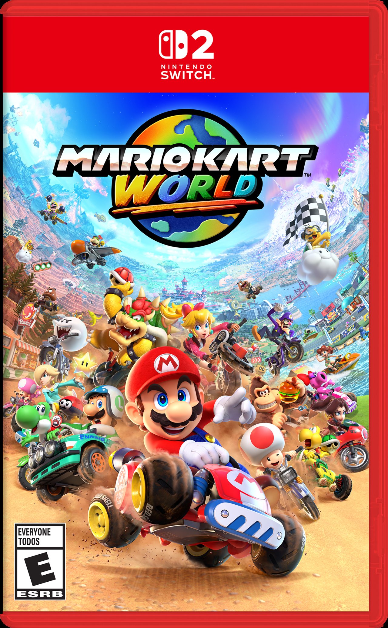
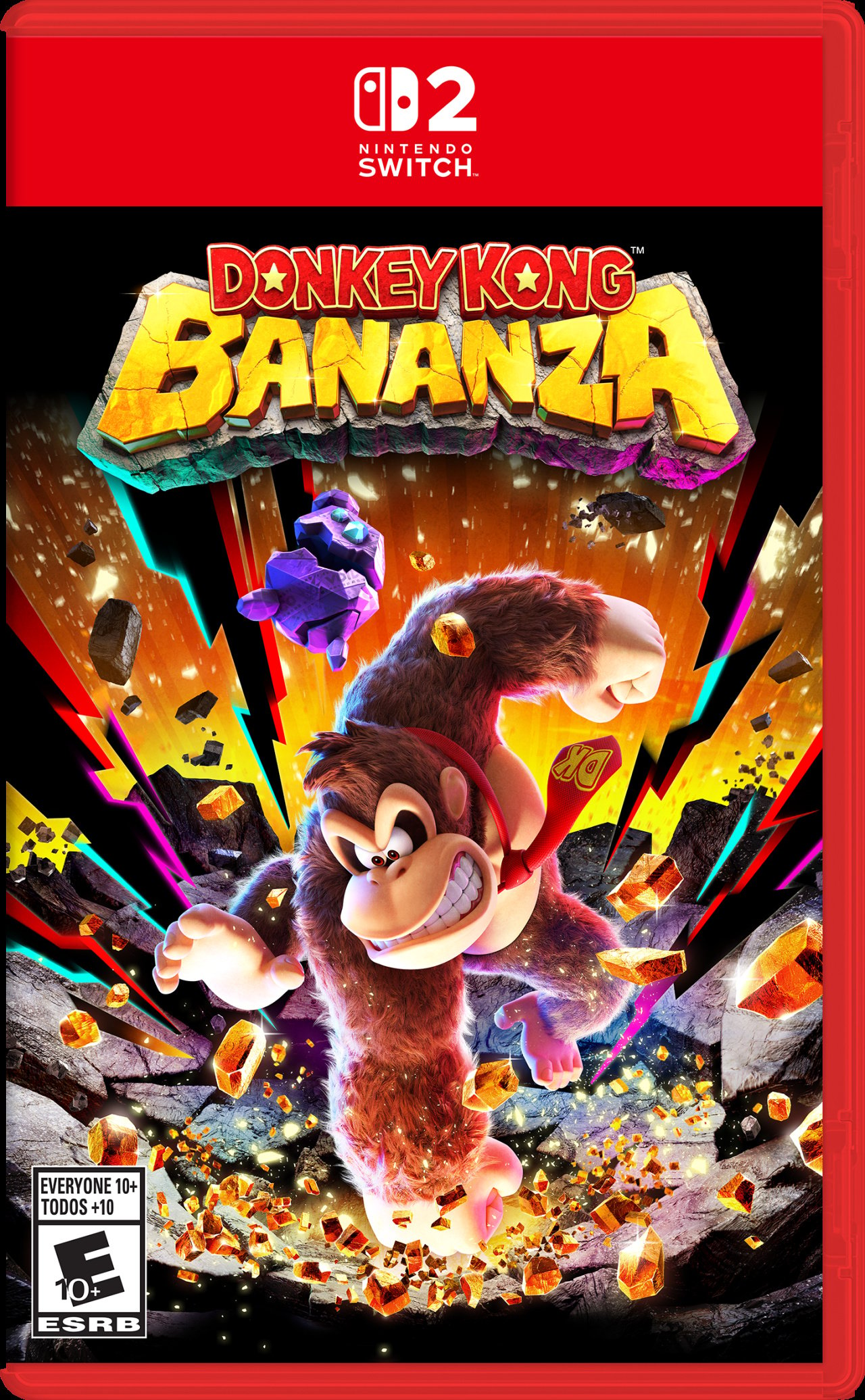
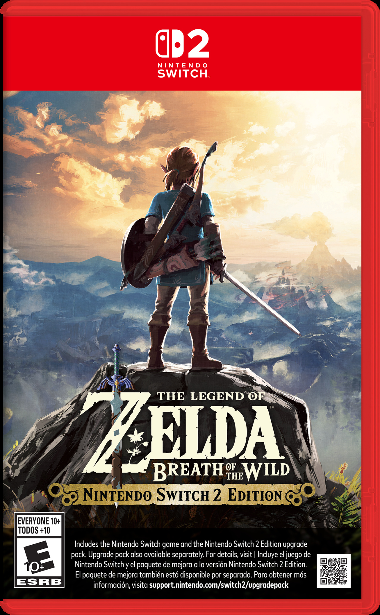
So we've got Mario Kart World, Donkey Kong Bananza, Zelda: Breath of the Wild (both US and UK variants), Zelda: Tears of the Kingdom, Super Mario Party Jamboree + Jamboree TV, Kirby and the Forgotten Land + Star Crossed World, and Metroid Prime 4: Beyond.
It's going to be a tough one because they're all quite lovely in their own way, but it'll be interesting to see just how all that text at the bottom of the Nintendo Switch 2 Edition games affect their overall standing...
Now, let's get to it.
Mario Kart World
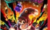
Donkey Kong Bananza
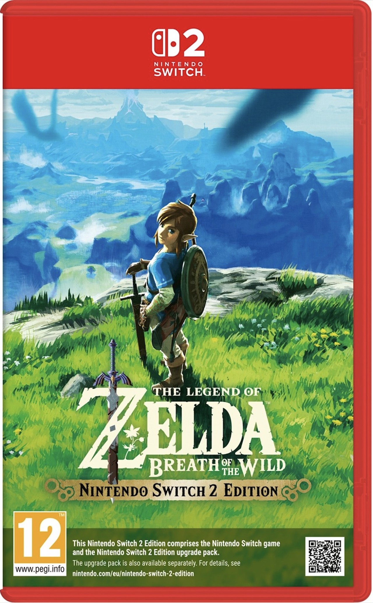
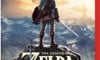
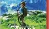
The Legend of Zelda: Breath of the Wild (US)
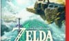
The Legend of Zelda: Breath of the Wild (EU)
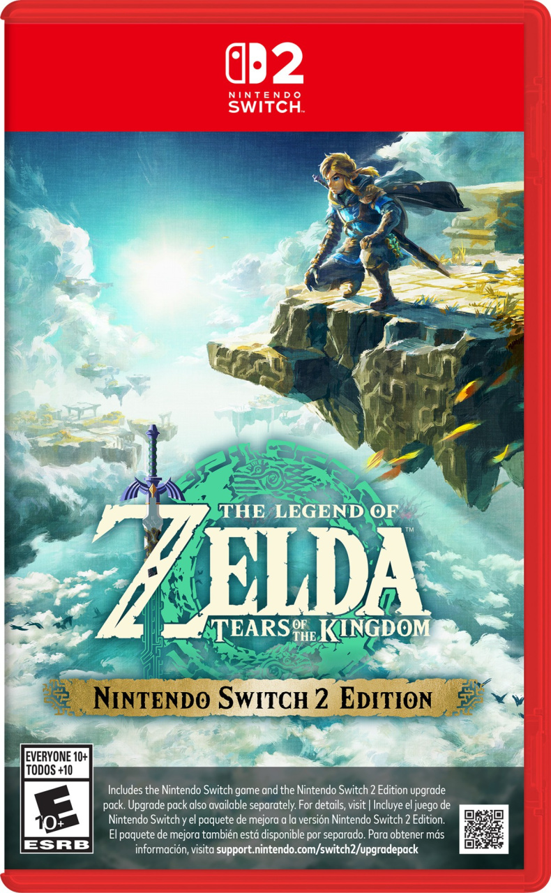
The Legend of Zelda: Tears of the Kingdom
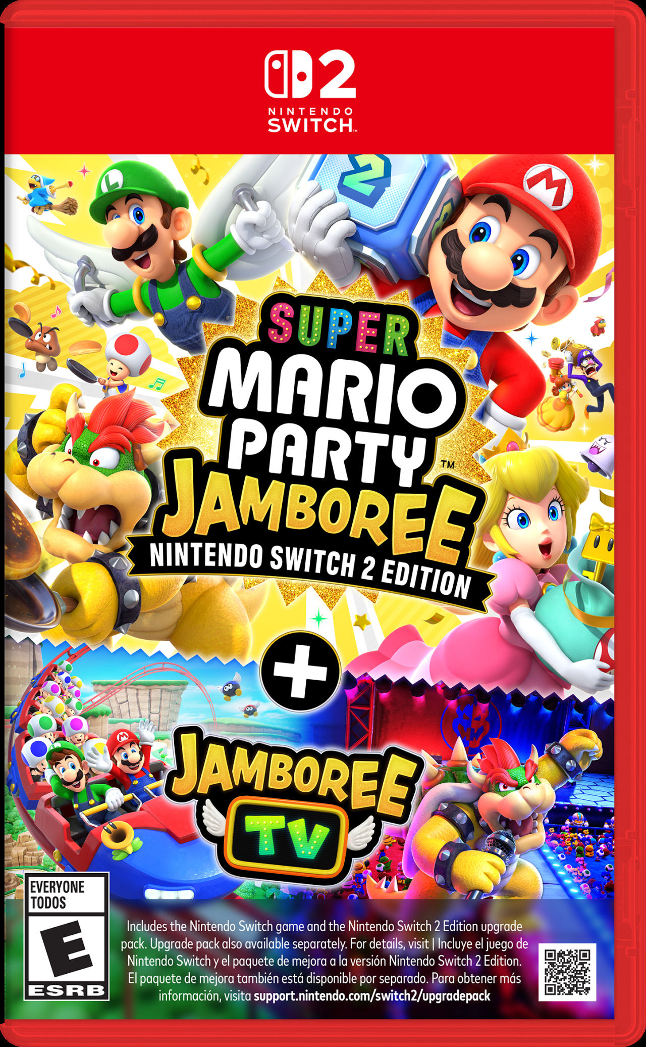
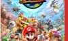
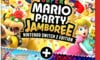
Super Mario Party Jamboree + Jamboree TV
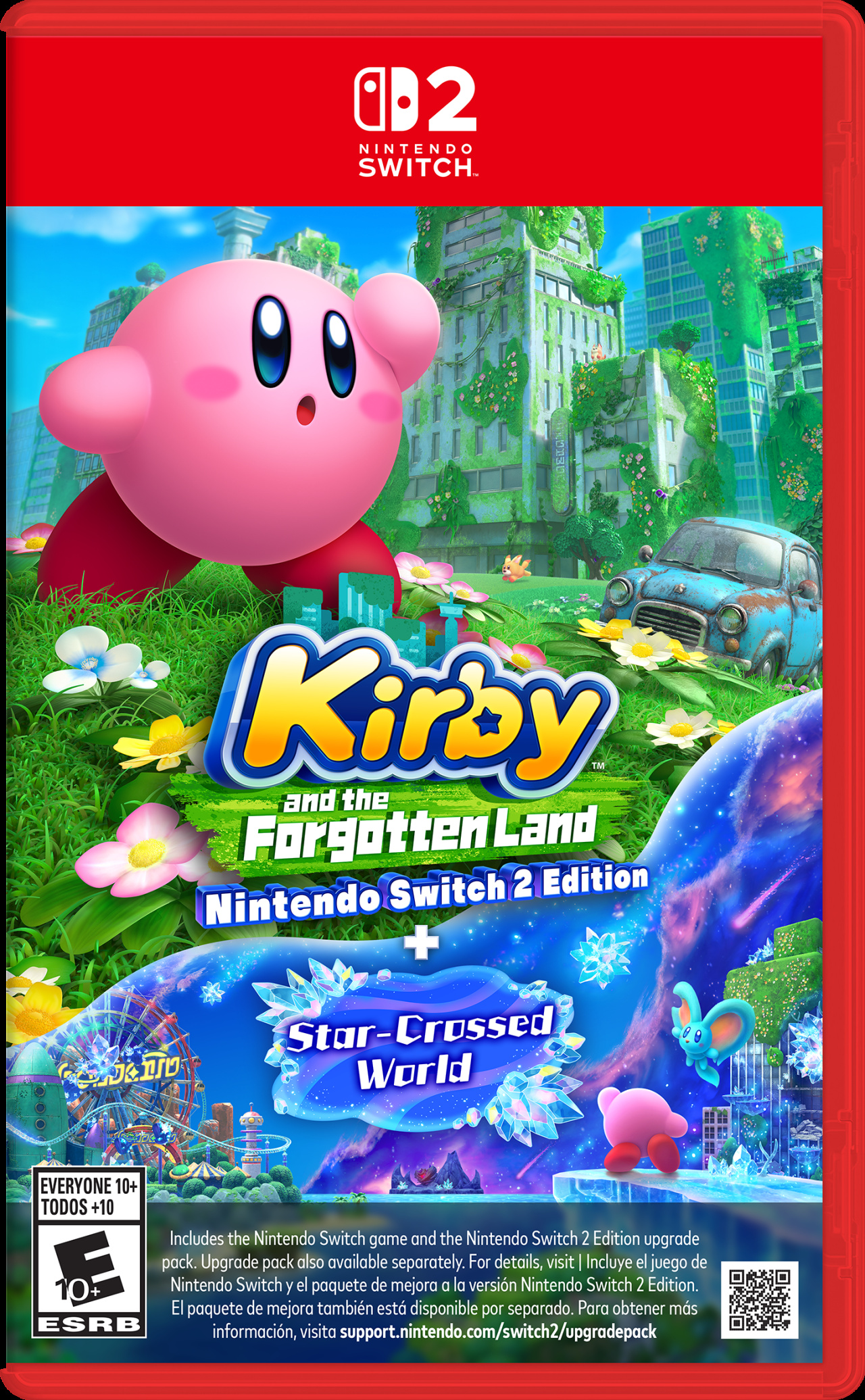
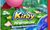
Kirby and the Forgotten Land + Star Crossed World
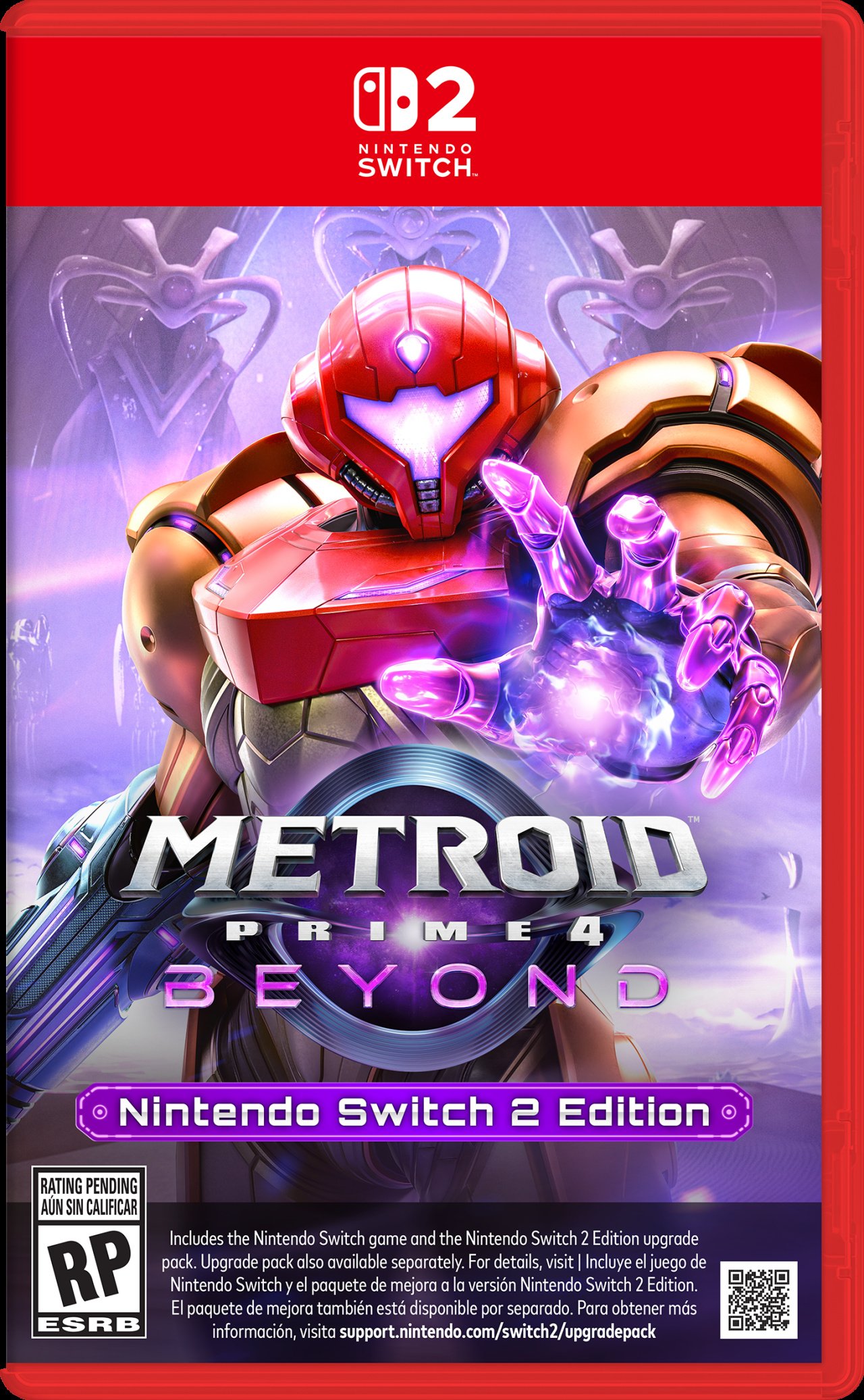
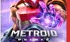
Metroid Prime 4: Beyond
Thanks for voting! We'll see you next time for another round of Box Art Brawl.


Comments 55
Mario Kart's key art is top tier! I wonder if they'll keep adding characters to it ala SMash Bros?
I think this one may be subject to recency bias - we all love the Zelda covers, but the anticipation for the upcoming games might skew the results here.
I know this is a one-off piggybacking off of the Switch 2 hype, but I also think it's less interesting than the box art brawls that compare different artworks made for the same game.
Let's be real, this is just a toss up between Mario Kart and Donkey Kong if only because the other ones are all Switch 2 Edition games, and therefore have the ugly text box on the bottom ruining the whole thing.
Anyway, my vote goes out to Mario Kart.
Tears of the Kingdom because I love that game
Went with MKW instead DKB cause we know this Box Artwork is edited version of Main Artwork to spoil less game before release at this moment! And secondly I will buy NS2 with MKW while not planning own DKB or any DK game now or in the distant future!
Those upgrade pack ones are awful with that text bar. Could have had all that info on the back or on a sticker.
That EU Breath Of The Wild cover is awful. It looks like I drew Link.
I'm still blown away when I look at the BotW boxart we got in Europe. It encapsulates the game so well!
Definitely a close one between DK and MK, I love the detail in both but I think DK just tips it for me, awesome cover art
@larryisaman
+1
They better have reversible covers
Those big empty red spaces at the top... 🙄
The upgraded versions were the occasion to refresh the designs but noooo, better slap an ugly text box onto the original one.
I think the DK game looks the best, even though the game in itself doesn't really do it for me from the previews I've seen.
Mario Kart World for me because it really shows how vast the game is and its contents, but Bananza is a close second!
Outside of the horrible extras Metroid Prime is absolutely stunning. Love it to bits.
I have been struggling with what Donkey Kong reminds me of since it was announced and I think the art is most reminiscent of Kung Fu panda!
@larryisaman with some people you NEED it front and center on the, uh, front of the box.
You just know Nintendo would get s*** if it was a blurb on the back. Hell, you know Nintendo will get s*** by the morons who don't read said blurb and then get mad they bought a switch 1 game with a pack in code, regardless.
I haven’t voted because I’m torn between donkey Kong bananza and the BOTW where link is NOT looking back toward the camera.
I’ll probably go for bananza because it’s original
Does anyone know if these boxes are the same size as the Switch ones?
There was a rumour a few weeks ago that they would be bigger than the og boxes.
I'd quite like the two collections to sit side by side seamlessly if upgrades are not on cart.
Not a fan of the big red space at the top and then there's the text on the upgrade versions that ruin the art. Probably the worst game cases I can remember in a long time if not full stop.
Not smart to include the two Zelda games. They are both winners, but not new, so were never going to get a meaningful number of votes.
The actual switch 2 games are a-ok, but the switch 2 editions are terrible. Even ignoring the disclaimer at the bottom, you have the red banner at the top cropping the art and making the whole thing look amateur. Ffs the Metroid box makes my eyes bleed!
Mario Kart with DK in a close second.
World and Bananza are winners. I went with World because it looks more friendly.
They all look fine
Mario Kart World and then DK. Art is on point and packed for them!
I was really hoping they’d take the opportunity to phase out the UK/ EU Breath of the Wild box art, the US box art is so so good.
mp4 as a huge mk fan. red border compliments samus along w the bizarre text like scanning something
Switch 2 game cases sucks. So, all of them sucks and none of them will get my vote. 😎
Well... since all the Switch 1 cases are comparably a million times better than that ugly red border on top, it's really a battle between MKW and DKB. My choice is MKW, but DKB is nice too.
@aardvaarkchi Agreed. Baffling that they still keep it. The EU one looks like he needs to go to the toilet real bad and tries to hold it in. US one is amazing!
I feel the Forgotten Land Switch 2 stuff adds a lot to the box.
Mario Kart World because it looks very lively, though a bit cluttered. I don’t why anyone would vote for the Switch 2 Edition games.
I think Mario Kart's key art does it more justice than the box art so I'm gonna go with Donkey Kong.
Also am I the only one who...doesn't mind the game case design?? The 'Edition' game's text at the bottom is ugly as hell but I really don't think the general design is that bad.
The upgrade packs/NS2 versions are awfully laid out with all that text. Also a bit of a bummer that Switch 2 editions are just Switch 1 games + download codes. But at least it makes it easy what version of Metroid Prime 4 I'm buying (Switch 1 physical).
BotW and TotK are genuinely two of the best box arts of all time, so it’s a bit of a cheat that they’ve got the option to challenge another generation. I couldn’t vote for them on that premise. Nintendo’s certainly made some cover art for the ages.
I voted for Mario Kart. It’s a really solid and exciting Mario artwork. I like the Prime 4 art a lot too, and DK, of course, but I just feel like MK has a little edge.
My vote is for less legalese on box art!
(Incidentally, I went with MKW.) 😁
Really, either of the first two boxes have the advantage over the SW2 Edition boxes, mainly because they don't obfuscate their key visuals with unnecessary information.
Just one EU box art? I just see one PEGI logo
None. The huge red band is horrible. Too big and it eats the art.
And don't get me started with all the crap on the Switch games.
Any of the switch 2 games that have the switch 1 cart in them I am just going to get them on the original switch 1 version. All that text really ruins the art of the box for me.
I was even debating going to get Kirby for the switch 2 to have a complete version of that game even though I have it already but since it will be the same version I already have but with a upgrade code there is no point.
I haven’t played Breath of the Wild myself but I thought the US box art is better than the European box art.
Mario Kart's really the only one of these I care for.
Why is the red bar above the artwork so BIG man they look so ugly because of that
I went Donkey Kong. It's pretty much perfect for what it is. Mario Kart is also amazing so I see why they are top 2. If Metroid didn't have all the writing at the bottom, it would be my number one. But the switch art for that one is better, so how can it be my favorite here.
I really love box-arts that show how big the game is by showings its landscapes, so I guess Mario Kart World
Even if I didn't factor in the writing on the boxes like Metroid's, Donkey Kong would be my favorite here. It's just really well executed for what it is. I saw someone above say the Mario Kart cover is cluttered, and I expected that. There is a lot going on, but the composition does a good job of containing it. Mario is the focal point and there's still some space to let everything breath a bit, despite the clutter. It's another strong one. Metroid is another good one, if a bit basic.
None of the Zelda covers do anything for me and are probably the weakest overs of this batch for me. I get what they wanted to depict with the covers and they succeeded, but they're not great as game covers as a result, in my opinion.
The obvious answer for me here is the Metroid Prime 4 boxart because of the nice combo of colors and the simplistic design overall.
Worst for me is the new boxart for the Kirby game aswell as that new Mario Kart game or whatever it's supposed to be.
I dunno why, something about both of those just rubs me the wrong way.
I initially wanted to go with DK, but for some reason, couldn't not go with Mario Kart...
I love that DK is radically stepping away from the green/cerulean palette that was on almost every game cover for a while.
Switch 2 edition games box art suck, with big "switch 2" banner in the upper section and huge writing in the lower section. And since it's still a switch 1 cartridge with additional download, just buy a real switch 1 cartridge and download the update from the eshop.
Real switch 2 games box art is a bit better, although I wish the huge "switch 2" banner is more refined, maybe use the teardrop upper banner design like wii u games box art.
Wario seems to have upset Nintendo, they pushed him as far away from the rest of the gang as possible. I really like both of Switch 2 box art, but DK takes the edge, the bold black works well with the red and the energetic picture and title font all looks great.
The Switch ones are worse than the originals versions
Mario Kart World is just that much more emblematic of the galaxy of possibilities a new console launch should evoke. Maybe on another occasion it'd look a little too crowded, but as the herald of the Switch 2 age it really deserves the crown.
Kirby.
Other games - 0 Kirby on cover
Kirby - 1 Kirby on cover
Mario Kart World looks nice too
Box Art Brawls - Nintendo Switch 2 Special:
1st) Donkey Kong Bonanza
2nd) Mario Kart World
3rd) Metroid Prime 4
4th) The Legend of Zelda: Breath of the Wild (US)
5th) Kirby and the Forgotten Land + Star Crossed World
6th) The Legend of Zelda: Tears of the Kingdom
7th) The Legend of Zelda: Breath of the Wild (EU)
8th) Super Mario Party Jamboree + Jamboree TV
All of them are gorgeous. Really nice box arts!
Except of course the ridiculous text banners on the Switch 1 games. What an awful decision. People aren't even going to read that text anyway.
@GrailUK Grok agrees with me that it's ridiculous that Wart has never been in Mario Kart. He was tied with DK and Bowser at one point for being Mario's nemesis in precisely 1 game each.
@Thomystic Absolute madness I reckon!
I don't have a problem with any of them, and it came down to Mario Kart World in Donkey Kong Bonanza for me. Both have a good flow to their images, but I went with Donkey Kong as we haven't seen him in a while with a new game, so I gave him the edge.
Leave A Comment
Hold on there, you need to login to post a comment...