Hey everyone, welcome to another edition of Box Art Brawl!
Before we get cracking with this week's battle, let's see how things panned out last time. We took a look at Balloon Fight for the NES, a bonafide Joust-inspired classic from legendary developers such as Satoru Iwata and Yoshio Sakamoto. It was a close call on this one, but ultimately the pixel art black box seen in the US won the day with 42% of the vote. Japan managed 33%, while Europe scored 24%.
This week, we're sticking with the NES to look at another classic: Kid Icarus. Released in 1986 in Japan and 1987 in the west, Kid Icarus went on to become a true favourite amongst Nintendo fans. Masahiro Sakurai's 3DS sequel, Kid Icarus: Uprising, is also largely considered to be one of the handheld's best games.
It's another three-way brawl this week, and the participants share quite a bit in common with last week's Balloon Fight in terms of their overall approach. Let's get to it.
Be sure to cast your votes in the poll below; but first, let's check out the box art designs themselves.
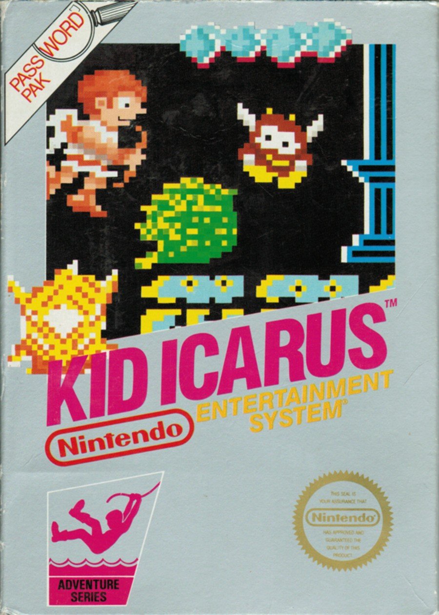
North America

So yes, this is very much the quintessential pixel art box design seen with many NES titles in the US. It's not quite the 'black box' we're used to, but the overall design is very familiar. It showcases the prospective gameplay quite well, and we're still really quite fond of that Pit sprite.
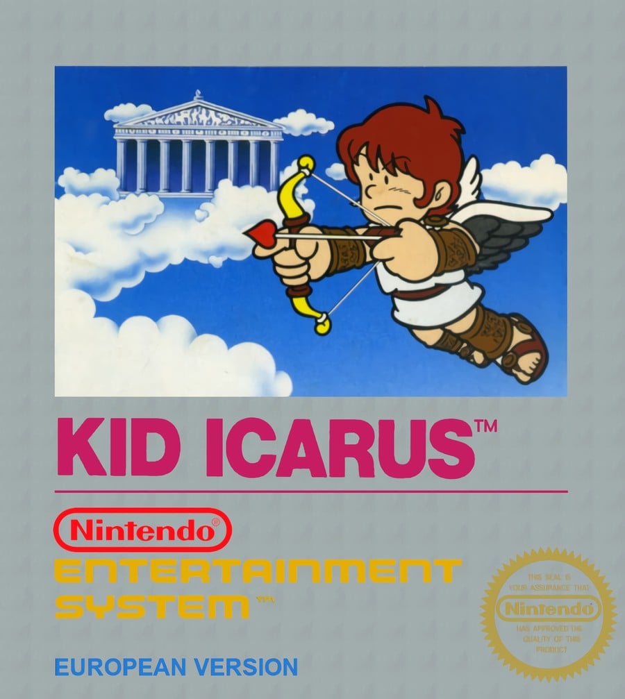
Europe

We get a better look at Pit in this strangely tranquil image adorning the European box. Floating in mid air as he aims his trusty bow, Pit's design is certainly quite different from what we might be used to nowadays, but it's quite pleasant in its simplicity.
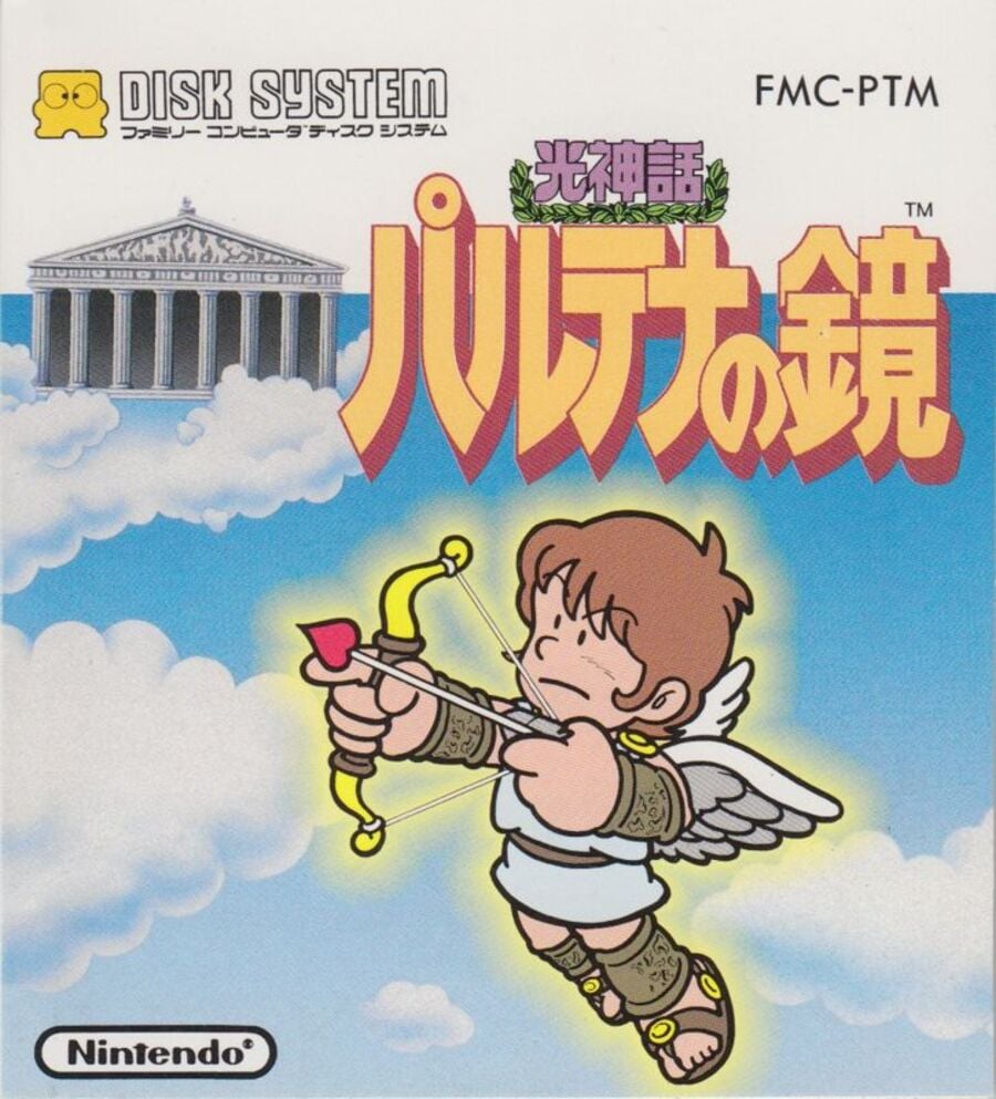
Japan

Japan shares the same Pit image as its European counterpart, but get this... He's angled a bit more (inspired!) and he's been given an angelic yellow glow (resplendent!). The overall colour hue is quite a bit lighter too, and we absolutely the japanese text used for the game's title. Lovely stuff.
Which region got the best Kid Icarus box art? (2,136 votes)
- North America

- Europe

- Japan

Thanks for voting! We'll see you next time for another round of Box Art Brawl.


Comments 40
That face on the NA box art 🥴😂
Not a fan of adding details to the pixel art like that, breaks the pixels. It’s between Europe and Japan for me but went for the latter in the end.
Fairly even split today. That's cool
I chose Europe for this one. It feels more true to the game, with Pit jumping and aiming horizontally, instead of at an angle like in the Japanese version.
Just like last week EU is litteraly the best of both worlds.
Also Pit's face on the NA cover is terrible and not even faithful to the in game sprite, which is supposed to be the whole point of these american nes covers. The yellow outline on the japanese one is also rather ugly especially combined to Pit's position he looks like a sticker.
The American one is awful. It looks like he's just farted out an explosion while mildly enjoying watching a giant bee vomit. It's between Europe and Japan, and since they use the same artwork, it's down to if you prefer it being framed or not, and if you like the Japanese writing.
Kid Icarus was the first game I owned, a Christmas present when I was 10 or 11. But it was definitely the North American version I received here in the UK.
I feel like people always want the Japanese version to be better, but that weird cartoon version looks awful in my opinion.
Japan wins again, what a shocker!
Europe is the best of them, but I wouldn’t say any one of them is good.
Nostalgia wins here for me. Even then, I recognized that the pixel art was all wrong for the game, but I still liked that format and the "Password Pak" logo on the corner connected this to Metroid. They released at the same time in NA if I remember correctly and the whole thing just makes it hard for me to be objective.
I like the style of the of the character in the other two except that it's a little lifeless in its presentation there - disconnected from the background and no context. I believe the manual has plenty more of that style and I like it there.
I loved this game so much back in the NES days! And I’m too nostalgic and fond of the old NA box art to vote against it.
The NES black box (and later silver box) covers were just so minimalist and iconic. You could pick them out from a distance, which was nice when strolling through the cavernous displays at Toys R’ Us, KB Toys, or your local department store or boutique. They were like the polar opposite of the Atari 2600 boxes which often had that fabulous painted artwork. But sometimes less is more and they got the job done.
Also I’ve gotta say, Kid Icarus and Mega-man are probably THE best localized re-titles I can think of. There is no way this game ever would have resonated as well in the West with “Paltena’s Mirror: The Tale of Light” on the cover!
Japan for me this week!
I give at least a few surreal humour points for the face on the NA box art, but it's one of the worst Black Box covers in my opinion, and the EU one is the worst aspects of both the JP and NA box arts in my opinion.
Nothing against 70's-cartoon Icarus, but I'm going pixels.
Hmm, looks like I'm in the minority this week since I went with Europe. I like Pit's cartoon-y design. I almost went with Japan, but I can't get over how washed out the background looks in comparison to the EU box art. I may be more partial to darker blues lol.
Japan. I hate the pixel boxes. They are so ugly...
Whenever I think of Pit for some reason the Captain N version always pops into my head. I am sure @Neonpizza knows what I am talking about.
I'm gonna go with the European cover, it's more true to what you'll be constantly doing in-game: falling off to your doom.
EDIT: Thank you for reminding me I didn't get 3D Classics: Kid Icarus.
I prefer the pixel box arts from this era. Lets you know what you're in for. NA it is!
None of these are what I would consider good. The NA black-box design, even when it's silver, is terrible in my opinion. Also, why is there a magnifying glass as part of the "Password Pak" banner? Europe is better because it doesn't use the pixel art, which is especially bad for the game's NA box compared to other games, but it's still not a great layout. And that leaves Japan as the winner! I don't think it's all that good — just boring, really — but it's the one I think is the best of this bunch.
@Matroska I don't know, being able to fart out explosions sounds like an awesome video game character trait I'm surprised hasn't been done yet. (Unless you want to count Bomberman.)
@sdelfin I guess because the passWORD feature allows the game to "find" your last game data?
EU > JP > NA
Once more for the people in the back! EU > JP > NA!
And again, large parts of Europe got the NA variant. Only a few European countries got the EU one on display here.
Europe / Japan. The retro illustration is pretty neat.
I also like this look and feel of Pit much more than the anime style version that originated from Sakurai’s vision.
US for me. Those 8 bit covers just hit the right nostalgia buttons.
I went with Japan but I don't really love any of these.
North America gets my vote easy. It's nostalgic and really captures the vibe of the game.
Europe is a perfect compromise IMO
My Italian “Mattel” version has the NA type depicted above. Didn’t know somewhere else in Europe there was this other one
Box Art Brawls Current Total:
Europe: 85
Japan: 84
North America: 100
Australia and New Zealand: 1
the drawing on the sprite is gross lookin
@NeonPizza I didn't dig Captain N's version of Mega Man I thought they made him so creepy and Simon ugh. But Pit I liked. I know alot of people liked Captain N's version of Link but for me it was the Super Mario Super Show Link that will be so iconic to me. With the Excuuuse me Princess and all that. I couldn't wait for Fridays when it came to the Mario Super Show. I remember being in a Best Buy and saw The Legend of Zelda DVD set and I had to have it. Still got to this day and every time I watch it I am a kid again.
I was probably 6 or 7 when I bought this from a Pamida with my Christmas money. It was the first game I ever bought and I based my decision off the box art
@Steel76 The reason for these was because a contributing factor to the US Video Game Crash in the early 1980's was Atari and other companies using very flashy box art to cover what were in fact VERY simplistic graphics. Look up Atari box art - a lot of it absolutely rules! Nintendo wanted to be very clear about what a potential buyer was getting - hence the black-box pixel art covers. They may not be 100% accurate, but they are pretty honest about what the game will look and feel like - which was incredible at the time. Once the NES had saved the gaming industry in the US, they moved away to more fanciful and less representational covers, as people knew what to expect.
As much as I appreciate seeing also some enemies on the North American box art, what the heck is going on with Pit's face? So Japan for me as I prefer its verticality compared to Europe.
This is a hard one. I prefer the dressing and font work on the Japanese version but the actual key art does very little for me. So that double rules out Europe.
But the classic screen shot NES box art is... well it is what it is. It served a function at the time but they're hardly lookers.
So I guess Japan wins just for the logo treatment.
@KingMike That's a pretty good response, creatively speaking. I have to give you credit for that one.
Probably the EU one as it looks more 'organised' to my eye for some reason. None of them have aged well tbh. Ha.
I can't support any of these. The NA looks like a garbled mess, and the others are just too empty.
Show Comments
Leave A Comment
Hold on there, you need to login to post a comment...