Hello dearest pals, and welcome to another edition of Box Art Brawl!
Before we dive into this week's battle, let's see how things panned out last time. The lovely Jim took the opportunity to crank out a few LotR quotes with a look at the GBA version of The Lord of the Rings: The Third Age. Unsurprisingly, the Western design absolutely crushed it with 90% of the vote. Sheesh... Normally Japan provides us with some rather tasty box art designs, but this one was a bit naff, right?
This week, to celebrate the upcoming addition of Wario Land 4 to Nintendo Switch Online + Expansion Pack (which, sadly, has the same box art design across all regions bar the added landscape orientation in Japan), we're going to be looking at the rather lovely GameCube entry titled Wario World.
Developed by Treasure, of all teams, and released in 2004, Wario World took the series in a new direction that kind of, sort of worked. It was very much one of those "good, but not great" games, but it's certainly got its fans, including us.
It's another Duel this week, and we've a feeling this will be quite a close one. The Western design is rather tasty, but we had no idea just how flashy the Japanese box art was. Ooof.
Be sure to cast your votes in the poll below; but first, let's check out the box art designs themselves.
North America / Europe
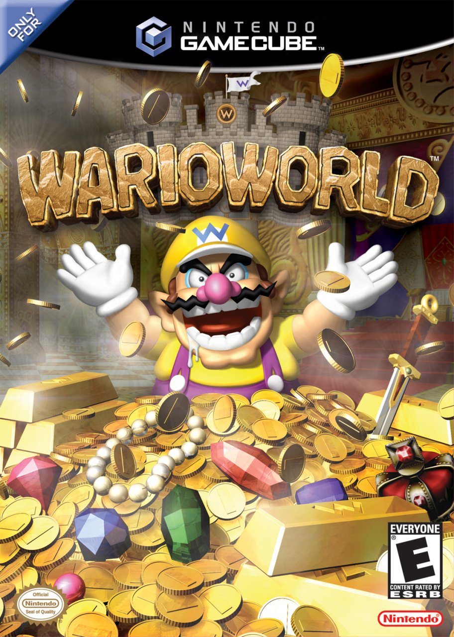
Aw, just look at that lovable oaf.
Yes, here we can see Wario gleefully chucking a bunch of coins up in the air as he basks in the glory of his treasure haul. It's a simple, straightforward image, but an impactful one nonetheless, and we love how Wario's pose works in tandem with the game's logo too. Lovely stuff.
Japan
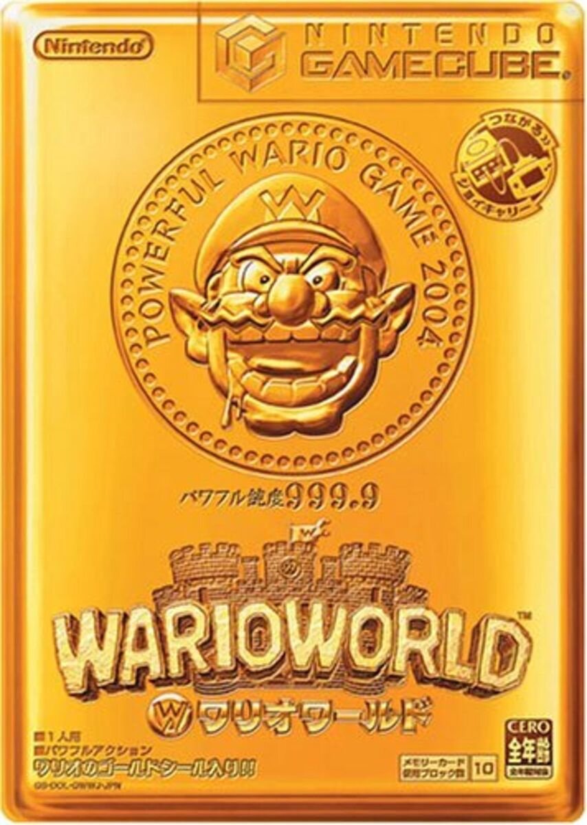
Japan's approach simply couldn't be more different, and utilises a golden composition not entirely dissimilar to that of Super Mario All-Stars on the Wii. You've got Wario in the centre with the words "Powerful Wario Game 2004" surrounding his head, while the Wario World logo sits comfortably below.
We love how the golden design extends to the GameCube logo at the top too.

Thanks for voting! We'll see you next time for another round of Box Art Brawl.


Comments 55
Gooooooooold
I voted the USA version for having balance of gold and purple color.
Powerful Warioware Game 2004 FTW
Definitely inclined to say the western one.
As for the game itself, I was never super huge on Wario World back in the day but I revisited it a year or two back and wow is this game rough to play. Between the slow, plodding gameplay, the giant empty levels that take forever to try to disguise the fact that there are only eight of them, the nonexistent enemy variety, and the obvious $7 budget, it's just a dull chore of a game where the only thing to actually like about it is the soundtrack.
As hilarious as the Japanese box art is, I'm voting for North America/Europe because in addition to Wario and his castle it shows his treasure and his throne room, too - even more so since the game literally starts with Wario laughing while sitting on his throne surrounded by his treasure!
Eeeuuurrooopppeeeeeaaannnn! 😊
Anything with Wario on it is a winner.
@Lizuka but it was developed by Treasure!
Honestly they're both good in their own ways, but I like the western version just a little more for not just being a single color.
They are both very very good and the scores being nearly 50-50 shows it.
Do you think that we will ever get this game again for Switch/2? Never played it, but would like to.
I love how the drool has been maintained on the Japan cover! 😆
The real Box Art Duel should be Gold Wario World Vs. Gold Wind Waker
I went for Japan because even though I had the NA/Europe cover, I HATED that Wario looked great but the treasure surrounding him was low res crap.
It's a tough one. But, I like the weird approach of JP art in this case, so, JP one for me this week.
That split is shocking, I would of expected it to be 90/10. The American version is demonstrably better.
This game deserves a re-release so more people can play it. Really hope they add GameCube to NSO for Switch 2
That Japanese cover reminds of the Golden Ticket so I had to go with that.
The Japanese one is designed to look like a gold bullion bar. That's infinitely cooler than the generic European cover art.
NA / Europe boxart purely cause of the MetalKingBoo memes
I vote for gold duh
The Western one is the clear winner for the box.
The Japanese design would have been fun for the manual.
My brain thought the Na/Europe box was clearly better...but the siren song of "Powerful Wario Game 2004" made me vote Japan.
Warioland & Warioworld games are some of my favourite platforming.
The warioware stuff is just trash in comparison and I understand that warioware sells better than land but come on Nintendo give land a chance again!
I kinda love the box art I grew up on, but I had to let Japan have this one. It’s creative to me because it goes beyond just “it’s gold” and looks like an actual gold brick with Wario engravings on it.
Europe for the win. One of the last GameCube games I purchased.
I still have this game, it's great.
I went with NA. I like what they were going for with the gold brick, but it'd be much cooler if it were actually embossed, as opposed to just a print.
Every Sunday, I'm astounded by my inability to predict the majority vote on the polls. I guessed 80% for Japan for this one.
I do not like the way Wario looks on the Western one.
The Japanese one.
Also, man, do I hope we’re getting a full on Wario game on Switch 2 that isn’t just Warioware (as much as I love those games). I want Super Wario Odyssey.
I think JP has the most creative one, but the western one just gives it to me straight with no mystery.
They're both good, but I went with NA/EU. While Japan's is more creative overall, I wish they'd went with a wider range of color. Plus, the NA/EU cover more than encapsulates Wario's personality and leaves a bit less to the imagination.
I mean either way I'm getting a good look at God's gift to man so I'm just gonna call it a tie.
While I feel like the Japanese cover may be objectively worse, it got my vote for “Powerful Wario Game 2004”
I remember the time I started playing this game when I was a kid, and I disliked how the enemies respawned in this game too quickly, and that made me quit lol.
Japanese version is nice, but went for the US / EU version as it's framed really well with Wario in the center and his treasure surrounding him.
Also a great game to play.
Fun fact: You know how the pause screen music has Wario constantly saying "nyah nyah" over and over and over? If you wait a whopping 50 minutes (seriously), he says "sorry" and then stops doing it after that lol.
NA/E really catches the eye and works perfectly. But for some reason, Japan is much more intriguing. It’s the contradiction between the simplicity of the design, and the absurdity of that face in gold.
While I do like the Japanese version with it being gold I prefer the US/EU because it captures the essence of wario perfectly.
Also fun fact the final boss of the game is given a second phase where they get new attacks and the music from the E3 starts playing. And honestly I wanna see a wario world remake just for the improved final boss.
Picked our box art purely due to this: https://youtu.be/h1SEi1qWrqI
I actually like the design of the western cover much more, but the golden one is... I mean... It's golden! And so original. I would love to have it in my collection!
The greed of Wario is so great in the Western release. LOVE IT!
I love when products are made to look like different ones, so I’m going with the gold brick design. I can’t tell if it’s actually metallic though.
Wario World, the epitome of mediocrity.
Ooh dang, those are both awful.
Japan’s would be a cooler case to have in a collection but not better box art
Why is he salivating in both of these? Does he have rabies?
@Tempestryke objectively incorrect. Both these box arts are worthy of the Louvre.
There are things I like and dislike about each one. The Japanese one is well executed, but I find it hard to get into the concept of making the box resemble a gold bar or something like it. It's a bit much. I don't love the renders on the western cover, but the concept and composition are good. I vote for the western cover this week.
North America/Europe. I actually know what I’d be getting into.
I bought the Japanese version a few months ago. It's beautiful in person so I voted for that.
Eh... It's close for me. I like the more colorful US/Europe box more, but I also like "POWERFUL WARIO GAME 2004".
Regardless of which one I truly like best, I regret not playing this game back in the day.
Box Art Brawls Current Total:
Europe: 94
Japan: 89
North America: 108
Australia and New Zealand: 1
These are both dope! But I have to go with the US one. But one to look like a gold bar is brilliant.
This game is never talked about
I own this game, but I remember that I felt disappointed playing it the first time. It just didn't have the same appeal as Wario Land 4 on GBA...
Leave A Comment
Hold on there, you need to login to post a comment...