Hello there! Welcome back to another edition of Box Art Brawl!
Before we dive into this week's content, let's see how things panned out last time. We looked at DK: King of Swing for the Game Boy Advance in what turned out to be a pretty solid contest. In the end, Europe took home the trophy with 50% of the vote. North America settled with 30%, while Japan managed 20%. Well done, Europe!
This week, to mark the addition of seven new NES titles on Nintendo Switch Online, we're looking at Urban Champion. Launched in 1984 in Japan with a worldwide release following in 1986, it was Nintendo's first proper fighting game. It didn't pan out too well though, and most critics found it to be a bit naff. Still, it went on to spawn a successor of sorts in Japan called Joy Mech Fight.
Subscribe to Nintendo Life on YouTube841k
Europe and Japan share fairly similar designs this week, so we're looking at a classic duel. We know folks in the UK have probably done enough voting to last a lifetime this week, but a bit more couldn't hurt, right..?
Be sure to cast your votes in the poll below; but first, let's check out the box art designs themselves.
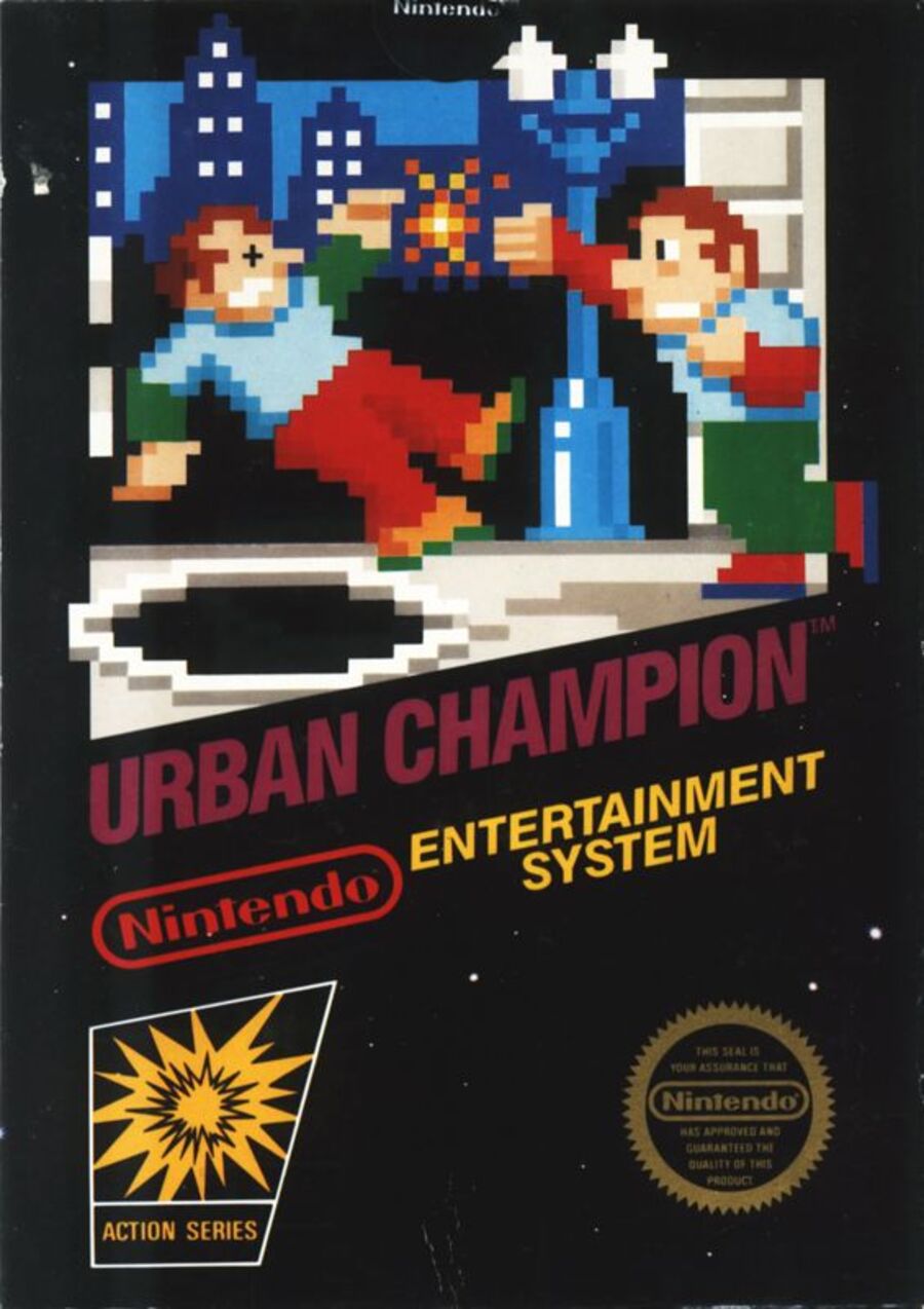
North America

We suppose this week's brawl kinda boils down to whether you're a fan of pixel art or not. Well, even if you are, we can't claim that this is the finest example we've ever seen. It's your quintessential 'black box' release for the NES, but we do appreciate the fact that its cover art is essentially a pixelated version of what you see in other regions.
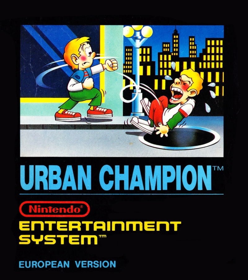
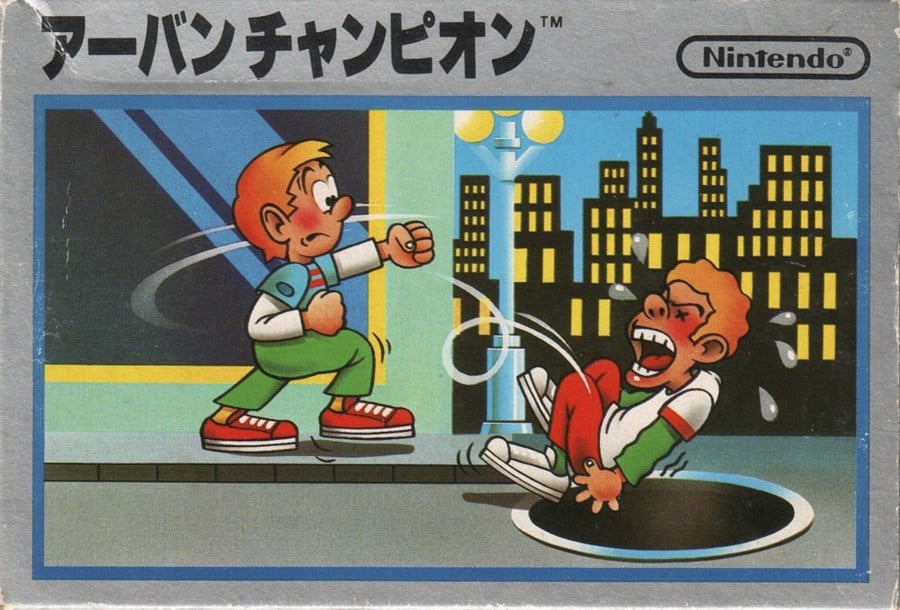
Europe / Japan


What tickles us about this image is the facial expression on the chap doing the punching; almost like he's not quite aware of what he's managed to do. It's a mildly humourous piece and the art style just isn't something you frequently see these days. Almost like something from The Beano or The Dandy. We dig it.
Which region got the best Urban Champion box art? (1,601 votes)
- North America

- Europe / Japan

Thanks for voting! We'll see you next time for another round of Box Art Brawl.


Comments 38
That's some bad boxart
NA has the dead guy complete with the little Xs on his eyes. Easy choice for me this week!
I had this game as a kid, I like the pixel art!
Bit ironic that the pixel-approximation actually sells the impact of the punch better than the hand-drawn boxart XD
Still going with EU/JP though; while I appreciate what they were going for with early NES boxarts in making them accurate to the game they were for, the hand-drawn version is just more visually appealing (plus its the general image I associate Urban Champion with for good measure).
I don't tend to default to the pixel art but this one I've always just found charming.
The NA cover is rather charming, I feel, but the EU/Japan one gets my vote. I too love the expression on the face of the guy doing the punching... "Oh no! Who left that manhole open! I didn't mean for that to happen!" 😆
Europe/Japan for me as it shows what the game is about and does so with some really nice hand-drawn artwork although I have to say that the pixel art of the North American one is way better compared to other NES ones both at showing what the game is about and visually so I wouldn't mind it at all if it won!
@Poodlestargenerica this is standard for back then. You want bad box art, check out the early Master System games.
They all looks lame. Also, why JP/PAL box art shows some boys, while NA one shows some twin brothers in their 30s? lol.
@Ooyah
Exactly he's like come on I just wanted to break that dude's jaw, not to kill him!
Still voted for America though. I just love these black boxart and in that particular case I don't think the artwork version works better. Actually even though it's charming, I think it doesn't work as well as the pixel art to convey what's going on here. Which is pretty rare. Like, the movement lines for example, they make no sense at all. It's all very goofy and charming but I think the pixelart version is just better overall.
European version would have caught my eye as a kid when NES games were on shop shelves. The pixel artwork put me off buying Super Mario Bros 1 and instead focusing on Mario Bros 2 and 3.
At the time it wasn't retro, it just looked cheap. No, I don't think like that any more, just saying how I saw it at the time. The power of good marketing on a primary-school-age child!
@Olliemar28 : As is often the case, it seems, when it says "European Version" on the box art, it's not actually all of Europe. I for one do not recognize this one, and the same has happened with other European versions.
We usually got the US versions instead, in the Netherlands.
Here, it is actually quite evident that the "US version" is actually a European one, as we got the round Seal of Approval whereas the US always had the oval one.
My best guess is, "European version" covers Spain and the surrounding countries. I seem to recall another European Version having Spanish stuff on the box. Not sure though. Couldn't find a lot of information online.
The NA black box games were what I grew up with, and once again gets my vote. The Famicom art this time just doesn’t grab me. Did the guy get decked, or stung on the butt?
EU/Japan gets my votex I was never s fan pf the. Black Box art on NES. And I can’t stand the two “arrows” pointing up into nothingness
Yeah I voted for EU/Japan just for how comical it looks. Sure it has zero representation of how the game looks but I like it.
I generally like pixel art. But I don't think it aged well in this case. I much prefer the illustration with its expressions. So EU/JP it is.
NL: Mentions that the game launched in Japan 2 years before any other region.
Also NL: Still gives EU top billing for reusing the JPN art (on a JPN developed game).
Anyhow, I don't think any variant is all that great, but I did indeed end up voting for the JAPAN/EUROPE art.
as bad as they are, at least NA looks like adults. the others looks like little bro finally retaliating and big bro with a "Moooooom" before going in the sewer.
These are both awful.
Weird that Europe/Japan is one vote when they're still very different.
I chose Japan because it looks most like something I would have wanted to play at the time.
@JohnnyC I was the opposite back then, after seeing the graphics of the Atari 2600 for so long, I was like WOW! These graphics are AMAZING! haha
North American version for me.
Side note: I wish I knew someone who bought this game back when it was new. It would be interesting to see if they were happy with their purchase, or if they pretty much had instant buyers remorse.
Whenever one of these involves a black-box game, I immediately assume I'll be voting for something else before I even see it. The black boxes just are not very good. The pixel art blown up like that simply makes for a poor cover. Is the art for the Euro/Japan version all that great? Not really. But it's still better.
Honestly I didn’t know what to pick because I like both of them but I decide to pick the EU/JP box art because of the hand drawn art style. Although the face on the puncher is a bit goofy and the guy falling in the manhole looks like that crying chopper meme.
NA. I hated the era of bad video game art. When I was a child the games were behind glass and you couldn’t take them out until you were ready to buy (or risk the wrath of the store clerk and your mother). Show me what the game looks like. Also the font on the EU version is all over the place.
Not a fan of many indies resurrecting this trend either.
All horrific. No vote
I'm gonna go with the hand-drawn one. As much as I like the pixel art being representative of the actual gameplay, so does the hand-drawn art this time.
My tiebreaker was the pixel stripe at the bottom of the shoes in the NA one.
✅🇯🇵
The pixels give the cover an added punch.
@Bass_X0 I think the getting knocked into the sewer is particularly ugly though.
Neither are good for me this time.
Japan/EU the kid looks like he didn’t mean to do it.
NA does the cardinal sin of pixel art with inconsistent pixel sizes (the X eye and the finger details on the fist).
But if I had to pick one it would be Japan/EU.
I get real Beano vibes from the Non-American one.
@Branovices did you like it? I played it on NSO today and I think it sucks. Even if it's old. I had the Nes as a kid but am glad, that i did not own this game.
Nothing like that black box that mimics what the game looks like. NA for me.
Box Art Brawls Current Total:
Europe: 81
Japan: 77
North America: 92
Australia and New Zealand: 1
Not great for either. I think it'll be NA though as the animated artwork for the EU cover looks poor & ultra cheap. It hasn't aged well. The NA pixel art actually looks okay. The black box style around it looks questionable I guess
I just love the early NES box art for NA.
I don’t usually like the pixel art ones, but in this case the characters at least look like adults. The other one is like children fighting on the street (gone wrong, shocking results)
Went with the Europe one as I too love the look on the guys face like did I just do that??????
Show Comments
Leave A Comment
Hold on there, you need to login to post a comment...