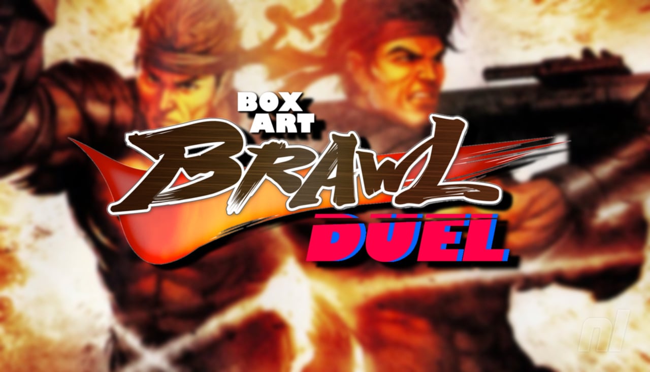
Hello folks, we're back once again for another edition of Box Art Brawl!
Before we get started, let's take a look back at how things played out last week. We checked out the GameCube classic Pokémon Colosseum, originally released in Japan in 2003 before making its way West in 2004. All three covers were admittedly pretty similar, so the scores here were relatively even. In fact, things ended in a draw between North America and Europe, both of which scored 37% of the vote.
This time, we're moving over to the DS with WayForward's remarkable revival of the Contra franchise with Contra 4. Released in 2007 in the US and 2008 in Japan, this one curiously skipped Europe altogether, so we'll be interested to see how the votes go this week.
But enough chit-chat - let's get to it!
Be sure to cast your votes in the poll below; but first, let's check out the box art designs themselves.
North America
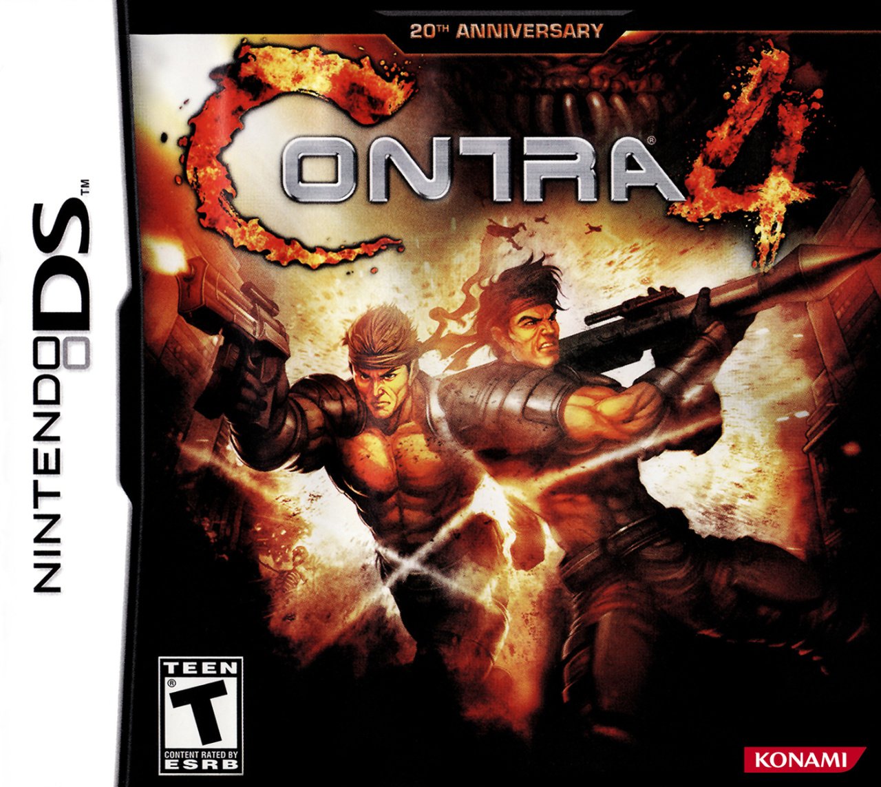
We love the composition with North America's variant of Contra 4. The logo looks fantastic at the top, with protagonists Bill Rizer and Lance Bean striking an awesome pose in the centre of the image. It's pretty dark overall, but we like how it gives the whole piece a bit of a moody atmosphere. Nice stuff.
Japan
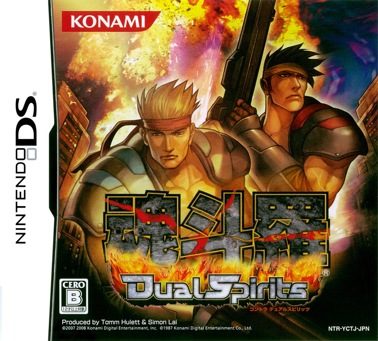
Japan's variant, in which the game title is Contra: Dual Spirits, takes on a more stylised approach with its character design. It's not quite venturing into the realm of anime, but it's certainly close. It's a bit brighter than its Western counterpart overall, but again, there's a certain moodiness to the colours utilised here.
Thanks for voting! We'll see you next time for another round of Box Art Brawl.


Comments 30
I find North America being more dynamic and powerful, while
the face expressions on the JPN cover just look weird to me.
I prefer NA's composition, and I don't like the slightly funny-looking faces on the Japanese cover either.
Wow, the NA cover is gorgeous. No competition for me this week!
Can't help being biased when they put 魂斗羅 on the Japanese cover, not to mention that the rest of the title, "Dual Spirits", is also pretty cool, but both covers are great at showing what Contra is about even if in different ways so at the end of the day I don't mind either!
Easy win for NA.
Both not the best.
If you look closely, the North America is definitely the better piece of art, but if you just see it in passing, the Japanese looks better. They're both pretty ugly though
NA this time. That's it. I can't think of anything more to say... teehee
The only thing I don’t like about the NA cover is the strange streams of light forming an X over Bill Rizer’s crotch. If someone could explain that, I’d be grateful.
Nonetheless, I prefer the NA style overall as Japan’s faces just look a tad goofy.
@TotalHenshin Bullet trails? That's how I interpreted them, anyway.
What I don’t like about the NA one is that with all the fire around the cover the C is lost and looks like ONTRA
Box Art Brawls Current Total:
Europe: 83
Japan: 82
North America: 98
Australia and New Zealand: 1
I gotta go with the North American box art.
The C4 in the North American Contra 4 title, gives me the impression, that the game is full of explosions.
NOrth America for me.
The Japanese one looks cool, but the expresionless faces kinda bug me.
@TotalHenshin Maybe Triple H and Shawn Michaels really like this game and wanted to give it their Degeneration-X seal of approval?
In all seriousness, i just noticed that myself. Now i can't unsee it.
Forgot this was called Dual Spirits in the East. Loved all the 'DS' titles companies attached to their games. My two favorites; RESIDENT EVIL: DEADLY SILENCE and NINJA GAIDEN: DRAGON SWORD. But I digress. I wish it had been called CONTRA 4: DUAL SPIRITS I'm the West. At least we got the better cover ; ) Oh, and what sort of BS is that... NOT releasing this game in Europe!?!?
North America for the win!
The derp face on the Japanese cover isn’t gonna win anyone over.
@TotalHenshin They might be bullet trails? Not entirely sure tho.
On the on hand, the Japanese one highlights Tom Hulett and Simon Lai as the producers(how odd). But on the other hand, the two guys on the cover are so lifeless. The cover also barely depicts anything about the game. The NA cover does have "20th Anniversary" on it which counters the producer credit. It's also just better. NA for the win!
@TotalHenshin
i think its the kind of thing that you are supposed to see but not look at 😆 its definitely supposed to be smoke trails coming off some kind of hot flying lead, being lit by the sunbeam peaking through the narrow space between their bodies. it's heavy handed but what isnt in this series lol 😂✌️
EDIT - the more i look at it the more awful it gets. really kind of a Liefeld approach to the effects there.
I was torn but I prefer the Contra 4 logo in the North America version.
Lance's face looks very odd in the Japanese boxart and, overall, there is something about the chaos behind the characters and their facial expressions not lining up at all that bothers me.
I hafta go with North America. It looks great.
This is one case where I believe the "tougher" action-oriented North American art is superior to the more sedate, thoughtful Japanese style.
Voted Japan but yeah the American box art looks better.
The NA cover is over-the-top in a good way. Those look like tough dudes that bang chicks. The JP cover looks like sensitive Emo-boys.
One of my favorite NDS game covers. VERY striking composition. The Japanese cover just looks really weird in comparison.
Still a top three Contra game, by the way. Simply fantastic.
@TotalHenshin "The only thing I don’t like about the NA cover is the strange streams of light forming an X over Bill Rizer’s crotch. If someone could explain that, I’d be grateful."
Bill Rizer is clearly too much man to escape censorship on the cover.
@Ryan_Again
"The NA cover is over-the-top in a good way. Those look like tough dudes that bang chicks. The JP cover looks like sensitive Emo-boys."
I dunno, man. The North American box has them showing off their chests, and Lance is gripping that rather phallic rocket launcher pretty confidently. Definitely screams masculine, but I'm not so sure about how heterosexual it all is.
North America obviously. The character designs look more polished and the pose is better.
Leave A Comment
Hold on there, you need to login to post a comment...