We are back, back, back for another edition of Box Art Brawl!
Last week, we took a look at a trio of Contra: Hard Corps covers for the Sega Genesis / Mega Drive. Despite three rather sweet designs (by our eye), the vote wasn't even close. You lovely lot crowned the North American variant the clear winner with 64% of the vote, leaving Japan and Europe to pick up the remaining 29% and 7%.
This time we are rocketing into the future as we match up two different covers for Astro Boy: Omega Factor on the GBA. This side-scrolling beat/shoot-em-up was released by SEGA (THQ in Europe) in 2003, 2004 and 2005 in Japan, North America and Europe respectively, staggered to match the premiere of the TV anime in the States. It's a treat for fans of Astro Boy and Osamu Tezuka's wider work, with high-octane action and gorgeous pixel art to boot.
Subscribe to Nintendo Life on YouTube841k
Europe and North America opted for the same design on this one, so we've got a good old-fashioned duel on our hands, with the shared design facing off against Japan's variant. Let's get into it...
Be sure to cast your votes in the poll below; but first, let's check out the box art designs themselves.
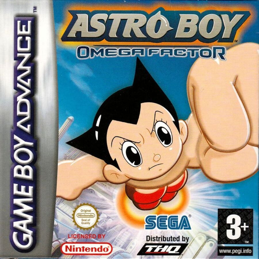
Europe / North America

The European and North American cover is all about action. There's no denying who this game is about as Astro Boy flies directly at us, front and centre. It's a somewhat simple take, for sure, but we respect the 'no-nonsense'-ness of it all. You might not know what the game is about, but you certainly know its star.
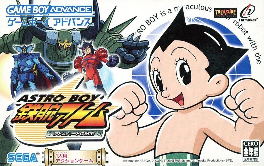
Japan

Now here's something different! Making use of its wider regional box design, the Japanese cover still puts Astro Boy at the forefront, but it saves some space for the villains too with Blue Knight, Atlas and Pluto standing menacingly above the title. With the animated TV series already popular in Japan, it makes sense that the design would show a little more of what's on offer, though we can't help but feel like this one looks a little busy compared to the simplicity of what we saw before. Hmm.
Thanks for voting! We'll see you next time for another round of Box Art Brawl.


Comments 38
Japan cover: Play my game and we can have fun!
Western cover: WHO GAVE YOU PERMISSION TO TOUCH MY GAME!?
Japan for me as it shows also the villains and not just the protagonist so more contents of the game!
It's good to see the Treasure logo on the Japan box. That's the most important piece of info, as far as I'm concerned! The problem for me with that cover, though, is that Astro Boy just looks like a weedy kid! So I voted for the EU/NA one.
The Western cover makes it look as if he has breasts. Voting Japan.
50/50 as of my vote. Both have their merits and weaknesses, this is a good battle
@Markiemania95 Lol, I never noticed that before, but I can't unsee it now
Got to be Japan people. Don't vote because of nostalgia or anything like that.
The Japan one has a cooler logo and more characters. I'm going to go with that one. (But they are pretty close.)
It's amazing how US covers almost always have angry faces. Even some of the Kirby ones.
I hate that Japanese cover so much. To my artistic sensibilities, the layout is a train wreck.
Japan has the Treasure logo. Japan wins.
surprised its so close, japan is clearly a way better design.
I gotta give this one to Japan. It's a bit busier, but it also showscases more of what the game is about.
Europe/North America. It looks more like a movie cover.
I like the simplicity of the western cover.
@ederenzi78 I think there were some Kirby games where the US/Japan covers were completely identical other than the face changed to angry!
For once Japan has a a cool cover for an anime game. It baggles me how the JP covers for anime games so often totally suck, but this time I like them.
Somehow, besides all the amazing artwork, Japan often have crappy covers... or intro songs to anime shows, for that matter.
Definitely the Western box art. The layout and hierarchy of the typography in the Japanese box art is just awful.
@sketchturner Thank you! I was afraid I was the one with bad taste, reading all the comments gushing over the Japanese ‘design’
Nothing is the right size for anything! Gives me cheap flyer vibes
Europe/NA is pretty uninspired.
Japan is overly busy and the cut off text bugs me.
No good options for me this week.
The proportions look really odd on the Western boxart, so I voted for Japan's.
Too many people just vote for whatever their region is, this one shouldn’t even be close.
Japan is way better this week. Whatever issues it may have with its layout, such as the Treasure logo covering some (useless) text and the game title being a bit small, it's still far better as a game cover.
The western cover isn't badly drawn, but that image doesn't work as a cover for me. Plus, the limited space available for the artwork just kills it. The framing is so tight it just crushes it. The logos make it worse. If the perspective was pulled back a bit, so there was a bit more space around Astro Boy and he wasn't cropped by the edges(who thought that was a good idea?) The NA cover is a bit better because it doesn't have five logos on the bottom like the Euro one does, with one being the size of two logos. But even with that change, I'd still pick Japan because the other issues remain.
Well this is a close one! 1% in it!
I LOVE THIS GAME!!!! Another amazing Treasure developed high-octane shooter with some great control and a varied move set. This and FF ORIGINS had a permanent place in my GBA SP at the time. Sadly, all were stolen when someone broke one of the back door windows of my car. Still one of my saddest losses as this game sells for a pretty-penny now on the aftermarket. Oh, and NA FTW cover-wise!
How can y'all vote for a sentence that's ugly, out of place, covered up, and cuts off? This one shouldn't be close but yet is. 🇨🇦🇺🇸🇪🇺
RO BOY is a maculous [TREASURE] robot with the
To me, definitely the western boxart. I love that giant fist bump and that in your face look of Astro Boy flying above Metro City in that radiant Sega style blue sky background. The Japanese boxart is nice too but similar to my complaint with the Super Mario RPG JPN boxart, it got too much white of nothingness in there making it look too bland for my taste. I like that they paste the villains and logos in the boxart to give it a more detail look but the bland white background just doesn't do it for me.
Box Art Brawls Current Total:
Europe: 82
Japan: 82
North America: 95
Australia and New Zealand: 1
Neither. They’re both awful.
This one is great, but I can't separate the game from it. Treasure developed 4 player fighter for the MD that was way before it's time. The DS Bleach fighters that Treasure made were pretty similar. There's translated roms and carts out there in the wild too.
EU /NA wins this round. The Japanese one looks too much like a megaman cover while the EU/NA cover does more to differentiate itself and is extremely efficient in catching the potential buyer's eye.
japanese makes me want to play the game, western juist seems like a random robot
These are really bad covers! This time I didn't even vote for one ;-D One so aggressive, the other so... unreadable! Moving on...
Japan just kind of feels a lot more distinctly Astro Boy to me.
It's weird how the Japanese and Western versions are different (with new enemies) which makes it feel like the Japanese build is a beta.
Perfect 50/50 as of Tuesday at 8:45 GMT.
That can't be a draw out of 1543 votes people! That's not an even number so there is necessarily a winner.
We might never know the truth though. How mysterious.
Show Comments
Leave A Comment
Hold on there, you need to login to post a comment...