We are back, back, back with another edition of Box Art Brawl!
Before we swing into this week's match-up, let's take a look at what went down last time when we looked at two regional covers for Metroid Prime 3: Corruption. Despite a duo of swanky designs being on display, it was Europe and North America's dark, moodier cover that walked away with the win, taking 65% of the vote and leaving Japan's brighter take with 35%.
Barelling into this week, we thought it was only right to show Donkey Kong some love, so we're taking a look at three regional covers for DK: King of Swing on the GBA. It might not be topping anyone's list of the best Donkey Kong games, but King of Swing is still a refreshing take on the ape gameplay from developer Paon, taking the essence of Clu Clu Land and making a fun little peg-climbing adventure out of it.
Subscribe to Nintendo Life on YouTube841k
There are cover variants from Europe, North America and Japan to take in this time, so let's get things rolling, shall we?
Be sure to cast your votes in the poll below; but first, let's check out the box art designs themselves.
Europe
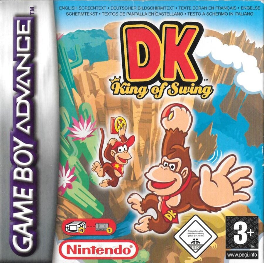
We'll start off with the bright European design. In this instance, DK and Diddy take centre stage, each grabbing onto one of the in-game 'pegs' which float ominously in the air. It doesn't make the most sense and the outer glow on the characters feels a little Photoshop-y, but we like the character art and the bright background is certainly eye-catching.
North America
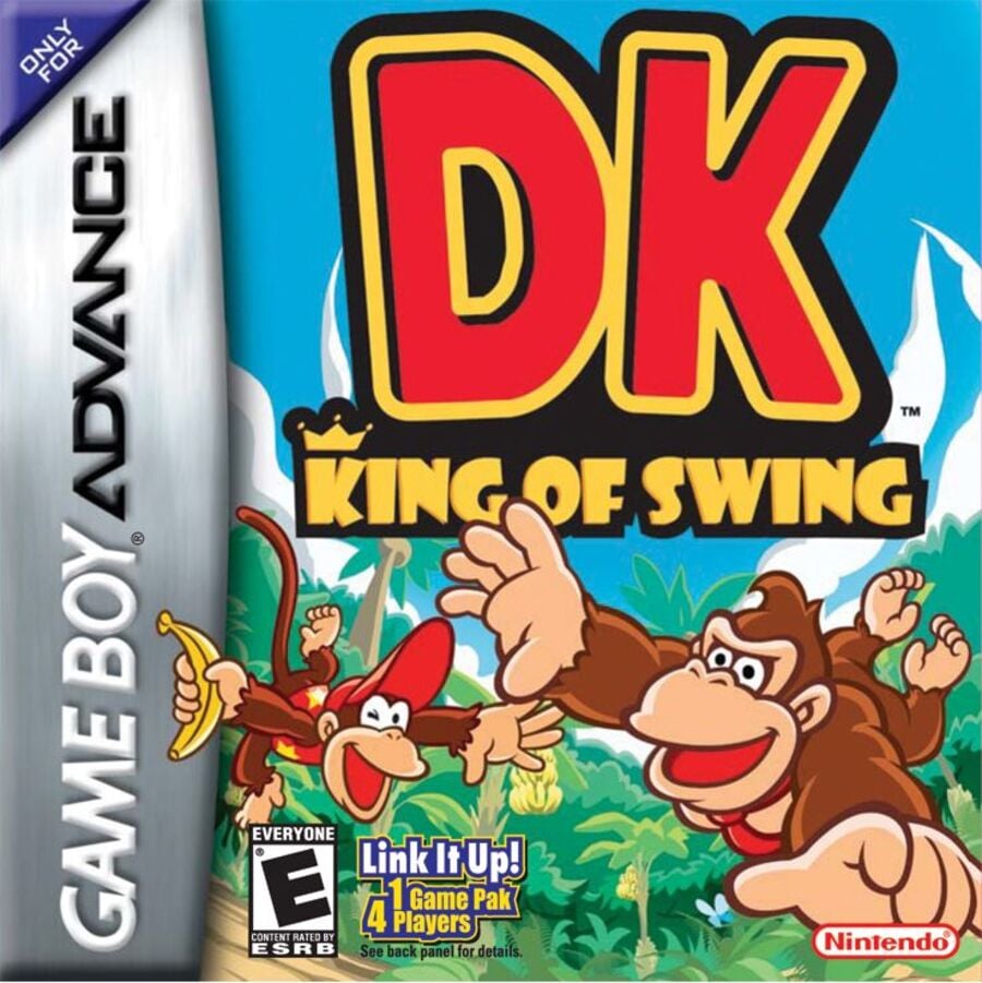
The North American variant is also nice and bright, but it's missing the key 'Swing' component of the title. Instead of clinging onto a handhold, DK and Diddy are seen free-falling here. Hey, at least they look happy about it.
Japan
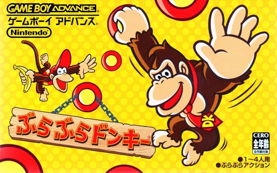
The Japanese cover takes the character art from each of the above editions and puts it onto an all-new yellow background. This is arguably the 'plainest' of the three variants, but the multiple pegs are in keeping with the gameplay and we particularly like how the title hangs from one of them on a wooden sign.
Thanks for voting! We'll see you next time for another round of Box Art Brawl.


Comments 27
Europe for me as it combines the best of both the Japanese and North American box art: it shows the gameplay more clearly by having Donkey and Diddy grabbing some pegs like the former while having an actual background like the latter (but also showing better the verticality of this game unlike it).
Diddy looks so incredibly cute on the European box art, I had to choose that one.
Oh yeah, I forgot about this game when I was commenting on the article about ports that still need to come to Switch. I never had the opportunity to play this one, but I enjoyed the DS sequel, Jungle Climber, back in the day. Hopefully, this comes to NSO sooner rather than later.
japan easily
Ah, they got the D and the K the wrong way around. This is a Kong Dong game, correct? Well, even with that mistake, I will go for the Europe cover.
Japan for me, just a much cooler design!
I really like the Japanese box,
feels like a more retro vibe.
None of them look particularly standout but none of them look particularly bad either; I've always really liked the artstyle for the first King of Swing game (especially when you compare it to the woefully dull look of the DS sequel) and all three boxarts show it off in pretty nice ways.
Overall though, I'm gonna go with the Japanese one as its more vibrant in its colour choice, shows off the game's gimmick with the grabbable circles and has some very nice art of DK and Diddy.
I prefer NA, the jungle background fits it better.
Box Art Brawls Current Total:
Europe: 81
Japan: 77
North America: 91
Australia and New Zealand: 1
If I were going to have one of these as a poster on the wall I would pick the Japanese one. No contest.
It looks great.
Second place: North America.
The European one feels a bit cluttered with info and text.
And I'm not thrilled with the white glow around the logo og characters.
Also it looks very strange with those handles hanging in mid air.
I get that they do so in the game, also that things hanging in mid air is rather common in platformers - but here it looks extra strange. I think it is because the angle of the bacground and the handle Diddy Kong is hanging from and the handle of Donkey Kong is hanging from does not seem to align at all.
Europe by a mile. That art is gorgeous.
No way EU is winning with them hanging onto pegs that are just unnaturally connecting to absolutely nothing (I get that's how it may be in game, but it makes for a sloppy looking art piece).
Going for the US art this week. Looks like they're mid swing.
Japan's is too basic in a way that doesn't work. It's just random placement of things on a random background. On the NA cover, the logo is way too big and it crushes the artwork. On that artwork, DK looks like he's trying to be featured on "When Animals Attack" as he looks like he's about to assault someone. Europe has the issues people have stated. It isn't perfect. However, it has great composition, an actual background you can see, and it is far more pleasant than the other two. The European cover is far better than the other two.
NA: I like how they look like they could be reaching to swing on something, but it looks like they're going to free fall to their death before catching onto something.
Europe: Background is gorgeous, swinging is right, but floating handles? Nothing ungame-like, just ask Mario, but it seems odd.
JP: Swinging look is good, and though banana yellow hits home with DK, the background is bland and doesn't convey anything of where they're swinging. I liked it and voted on it, but now that I think about it, all 3 are bad, so Europe gets it done for me.
Side note: Missed opportunity, but if this series was Kong Dong, "Kong Dong: King of Swing" could have competed for the raciest title ever.
I think this art style should come back! It’s very cute, and I love DKs little smile
North America looks pretty bad imo.
I went for Japan in the end because it doesn't have the weird white outline and the yellow background looks vivid and cool.
They are all kind of "meh." Went with NA as it was the one I was most likely to grab off the shelf and look at the back to find out more.
I went NA because of the jungle.
I would've went with EU but thought the colors were a bit dull where as NA is more vibrant.
This time I'm going with Europe for having pegs and a level, but that's a big fall, though.
If the North American one had pegs, I'd vote that instead. The Japanese one has pegs but no level, unless it is supposed to be a training level or a simple wall climbing.
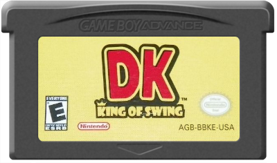
Cartridge art. I'd go as far as to say Europe also wins on the cartridge art.
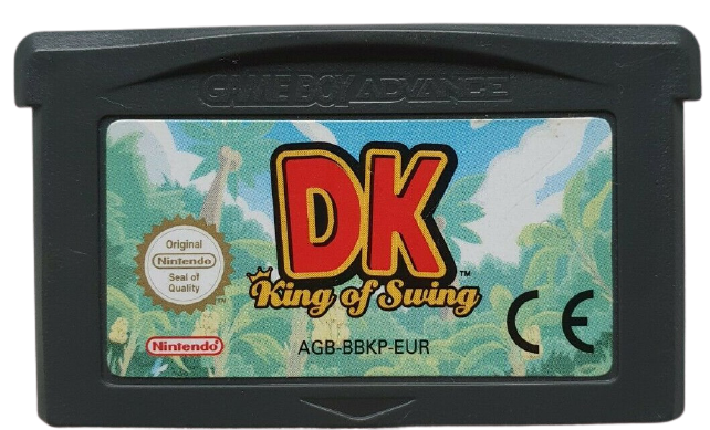
Europe
North America
Japan, whose name is Bura Bura Donkey (Swinging Donkey).
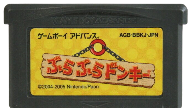
I don't know why it has a copyright year of 2004, though. The game came out in 2005 and none of the other versions mention 2004.
HALF of the NA box is two letters. Who approved that? The EU one has mountains behind the hooks, so why this talk about them in mid-air? They are artistically separated, but still there is a mountain right there. It's also the only cover which shows gameplay which is important in the first game in a spinoff made by another developer. This was a time of rhythm based GCN DK games too which meant showing upfront how this DK game plays is extra important. The Japan one doesn't deserve any comment.
The EU one has the one misfortune of a typeface that looks like a sleazy reality show (e.g. Flavor of Love), which is exacerbated by the game's subtitle.
I'm going NA but not really feeling any of them.
Europe emphasized the swinging, so I went with that.
NA all day, EU looks dumb with them grabbing onto pegs that are just floating there. It's not even the way it is in game, there are no other pegs to grab onto, how'd they get up there? Just looks sloppy imo.
Wow, US and JP look terrible this time.
The ‘DK’ on the NA cover is massive, takes up half the box! Not particularly sold on any, but chose Japan this time.
Show Comments
Leave A Comment
Hold on there, you need to login to post a comment...