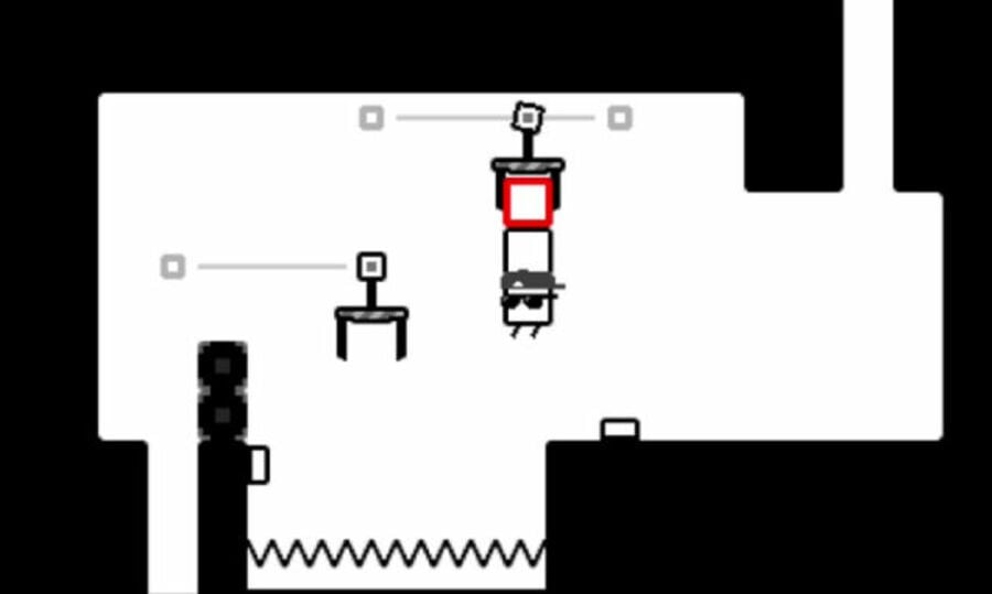
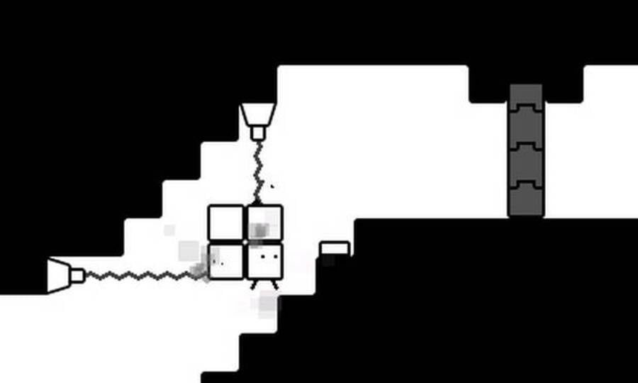
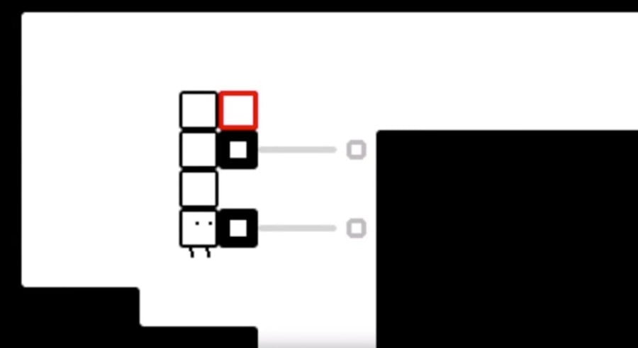
HAL Laborary Inc has been busy of late, bringing Kirby into the HD era with Kirby and the Rainbow Curse but also, on a much smaller scale, developing BOXBOY! for the 3DS eShop. With a Game Boy style and retro approach to puzzle solving it's charmed plenty of portable gamers, and also showed that the house of Kirby is more than capable of producing new concepts and ideas - even if they are founded on retro ideals.
We've had the opportunity to pose some questions to Mr. Yasuhiro Mukae, the director of BOXBOY!, to talk about the title's development, design and that undeniable retro charm.

Can you please introduce yourself and tell us about your role with BOXBOY!?
I handled concept planning and director duties for BOXBOY!
This game marks my début in handling either of those duties.
How was the original concept for BOXBOY! conceived, and when was this?
BOXBOY!'s concept began with me trying to come up with a project featuring NES or Game Boy-style retro gameplay. The project plan was officially born in July of 2011, but that simply marked the end of the original brainstorming; I didn't formally submit it to the company as a product proposal until 2013.
What drove the retro Game Boy aesthetic for this project?
As mentioned above, I conceived this design in an effort to come up with a retro-like game in the style of NES and Game Boy titles.
As for why I decided to think up a concept for an NES- or Game Boy-style retro game, that comes down to my experience as a game designer.
Before I created BOXBOY!, I had no experience in game design or direction.
I felt that NES and Game Boy-style retro games feature simple, compact designs focused on the fun of the gameplay, with a lot of the other elements simply removed from the game.
I did have an interest in the design and planning process, though, so I wanted to try coming up with one of my own.
For me, though, the idea of conceiving a game suited for the current era seemed really difficult.
Games these days are packed with all kinds of different elements.
You have a well-refined game system, a large variety of modes, a huge mass of collection elements, an epic story, movie-like cutscenes, a huge game world you can freely roam within and so on.
Someone like me with no design experience trying to come up with a modern-style game with all these elements seemed really tough to me, and I figured it'd be difficult to try and collate all these elements into a single unified design.
So, to start out, I decided to go with a simple, compact game plan, something that even someone as inexperienced as I was could come up with.
Along those lines, I felt that NES and Game Boy-style retro games feature simple, compact designs focused on the fun of the gameplay, with a lot of the other elements simply removed from the game. A retro-like project plan like that was something I figured even I could come up with, so I tried coming up with a concept based on the aesthetics of NES and Game Boy titles.
What were some of the more influential Game Boy games on your life?
In terms of Game Boy games, I'd say The Legend of Zelda: Link's Awakening. I think it's a very complete game, one where every element — the story, the game world, the background music, the puzzle-solving fun — is incredibly engaging!
The Virtual Console version of The Legend of Zelda: Link's Awakening is also installed on my Nintendo 3DS, of course!

Can you tell us about the design process for puzzles and levels in this game? How would you bring a level's structure together?
First, I decide what will be the main gameplay element for each world (lasers, cranes, etc.) in order to choose gameplay themes for all of the worlds.
Coming up with a single element to serve as the gameplay theme of each world allows for a structure where gamers get exposed to new elements as they keep playing, expanding the depth of BOXBOY!'s gameplay and surprising players along the way.
I also came up with a puzzle theme for each stage in a world, trying to ensure that each stage is designed so it's easy to notice how to solve the puzzle.
For example, the first stage may offer a simple puzzle to teach gamers how to solve it. The next one offers a variation on the first stage's solving method to help people gradually get used to the puzzle, and then the last one asks you to adapt your solving methods to match with the puzzle presented. Our aim was to keep things from feeling unfair and letting users figure out how to solve puzzles by themselves.
Working within the Game Boy aesthetic surely brings certain limitations to what you can and can't do. What were some of the more challenging design decisions for the team?
Our aim was to keep things from feeling unfair and letting users figure out how to solve puzzles by themselves.
There were two design elements that provided particular difficulties.
One was how we expressed the line art in the game.
BOXBOY! features some innovation to allow us to express evenly drawn lines within the game in an attractive fashion.
The lines always appear to be in proportion with each other, no matter whether the camera's close-up or pulled back in the stages.
That wouldn't appear to be anything special at first, but it took a few tricks to ensure the lines remained even-looking throughout.
The second thing was the design, which expresses everything in black and white only.
BOXBOY! is a simple game visually, featuring monochrome graphics, so all the designs in the game had to be expressed in black and white.
We had to express both things that have physical presence and things that don't in this world, which presented assorted challenges to the design staff.
But thanks to all of their efforts, we were able to create the unique BOXBOY! world you see in the game. I'm really satisfied with it!

How does the design approach differ when designing a retro-styled game versus a "modern" game?
Retro-style games feature simple game designs and graphics that have a major symbolic element to them.
They're geared toward interesting gameplay mechanics, and my impression is that they're often put together with the bare minimum of required elements.
Meanwhile, I feel that modern games are packed with all kinds of different elements. At the same time, they're geared less toward fun gameplay and more toward helping you lose yourself in the game world, so in that way, they offer a lot of entertainment.
Easy Miiverse integration and a built-in shareable demo show that the team had a social element in mind. Did this line of thought extend to considering a possible multiplayer mode?
We did naturally consider the potential for a multiplayer mode for BOXBOY!
However, this is the first BOXBOY! game; it isn't an established franchise or anything, so we decided that introducing people to the single-player fun should take priority.
If we have an opportunity to continue with BOXBOY!, I'd certainly like to think about multiplayer.
The gameplay concept of creating boxes from your body to get through stages seems simple at first, but it actually winds up becoming really deep and exciting.
What's your favourite aspect of BOXBOY!, individually, that you'd like to share with our readers?
Personally, I have two favourite aspects.
One is Qbby, the player's character.
It's a really simple design, but we managed to make him into a very vibrant and charming character.
We worked hard to flesh out all of Qbby's little reactions, so I hope you'll keep your eye on everything he does!
Also, be sure to check out how his animations change with the costumes he puts on!
The second lies in BOXBOY!'s game play.
The gameplay concept of creating boxes from your body to get through stages seems simple at first, but it actually winds up becoming really deep and exciting.
Also, a lot of the stages can be completed in different ways depending on who's playing, so I think it's just as fun to watch other people play the game!
Retro-like games were something I had on my mind as we made BOXBOY!
I can easily imagine that people who enjoyed Game Boy games in the past could feel a twinge of nostalgia playing this.
We created the stage structure to be easy to play and enjoy, so I'd definitely suggest that your readers try it out.
We'd like to thank Mr. Yasuhiro Mukae for his time, and Nintendo of America for arranging this interview.


Comments 20
I actually love this little game. Surprised it got a 6 in the review. I like Mr. Yasuhiro Mukae's honesty and respect for game design.
That's it... I'm buying this tonight. Great interview by the way! I really enjoyed reading this.
@audiobrainiac I think Eurogamer were much more favourable to the game. They gave it a recommended. It's a great game that's real hard to put down.
Wonderful game at a fantastic price! I was also surprised NL only gave it a 6. Maybe it would be a 6 if it were a $20 game or some other premium price, but it's not.
This is one of the eShop gems, along with the Gunman Clive games, that you can pick up with your pocket change. Must buy!
I love BOXBOY! Such a fun game! & a great price too. Great interview!
Been playing it pretty consistently since it came out. Deserved at least an 8. I can't even wrap my head around why the NL reviewer gave it a 6.
I thought Nintendo life review was pretty bad. The game deserved better.
The game is good. The complaint I have is that only the last few worlds were challenging. At some point I almost dropped the game because I was not having fun. I went on because I am a completionist, then at some point (around world 15 I think) puzzles got harder and the game got fun till the end.
I like it but I have only been doing one or two levels at a time. (Maybe it would make me lose interest otherwise).
"Bringing Together the 3DS and Game Boy in BOXBOY!"
Boxboy looks nothing like a Gameboy game to me!
"We did naturally consider the potential for a multiplayer mode for BOXBOY!
However, this is the first BOXBOY! game; it isn't an established franchise or anything, so we decided that introducing people to the single-player fun should take priority.
If we have an opportunity to continue with BOXBOY!, I'd certainly like to think about multiplayer."
Multiplayer in BOXBOY! is something that never occurred to me, but my god would that be incredible. I'd love a sequel with multiplayer somewhere down the road.
This game was awesome, needs more love.
Glad I didn't read the NL review and bought it solely on its trailer from what the other commentors said. The game is definitely not a 6. Its a fun little puzzle platformer that may be lacking in a few areas but makes up for it in creativity with its simple mechanics. A low price point make it an easy decision to give it a go. Granted it gets better when the difficulty starts to increase later on, I still found it a joy the whole way thru.
I've completed every world and now I'm doing Time and Score Attacks. Score Attack 6 was a nice surprise. One complaint I have is that you need to speedrun every world if you want to 100% the game. I don't understand speedrunning in puzzle games. I'm so close to 100% though so I guess I have to do it.
@Late you don't have to. Nobody is going to care if you 100% or not.
This was a beautiful game to play and I thoroughly enjoyed it! Recommended
@Grubdog: No. Not anyone else but I do. I still like the game and it's going to bug me if I don't. I've lately felt a sudden urge to 100% my games even though I normally don't.
As I said I would, I bought this last night and I'm definitely in agreement with a lot of others — so far, I think this game deserves better than a 6. I beat the first 2 worlds and am into the third and although it is a bit easy at first, it's definitely showing signs of getting more difficult. Very glad I made the purchase and I intend to give this a good few more hours this weekend. Also, really like the Smash Bros. font! It's making me want to play that again too... ☺️
I wonder if it is possible to ask Mukae-san if Boxboy! was made using the Nintendo Web Framework?
It's Qbby's little diddly feet animation that I especially like.
Leave A Comment
Hold on there, you need to login to post a comment...